Stepper
The Stepper component is a useful UI element that can be used to display a process or workflow in a step-by-step manner, allowing the user to easily understand where they are in the process and what steps remain. The Stepper typically consists of a horizontal or vertical bar with numbered steps, with the current step highlighted and any completed steps shown as filled. The Stepper can be used for a wide range of applications, from a checkout process in an e-commerce website to a multi-step form in a web application. The Stepper is visually identical to the Ignite UI for Angular Stepper Component
Stepper Demo
Type
The Stepper component supports two types - Linear and Non Linear. In Figma, you can switch between the two using the Type property from the properties panel. Linear type is used to prevent the users from proceeding with the next step, without firstly completing the previous, non-optional ones.
Orientation
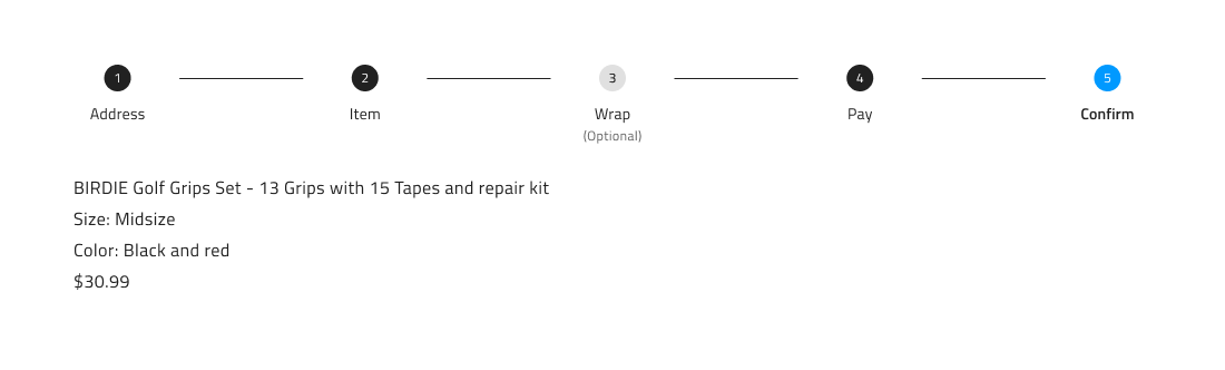
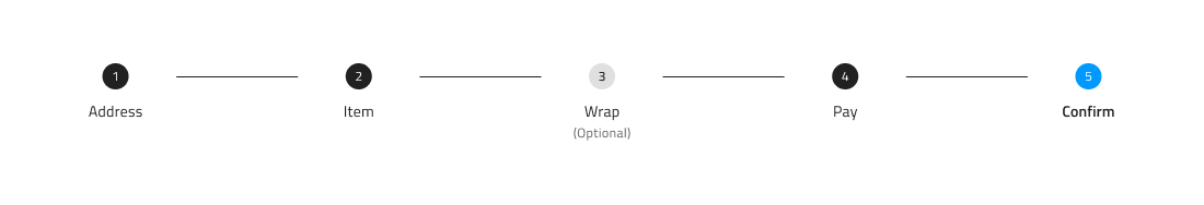
Both Stepper component types come in two orientations - Horizontal and Vertical. In Figma, you can switch between the two by changing the value of the Orientation property from the properties panel.
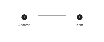
Structure
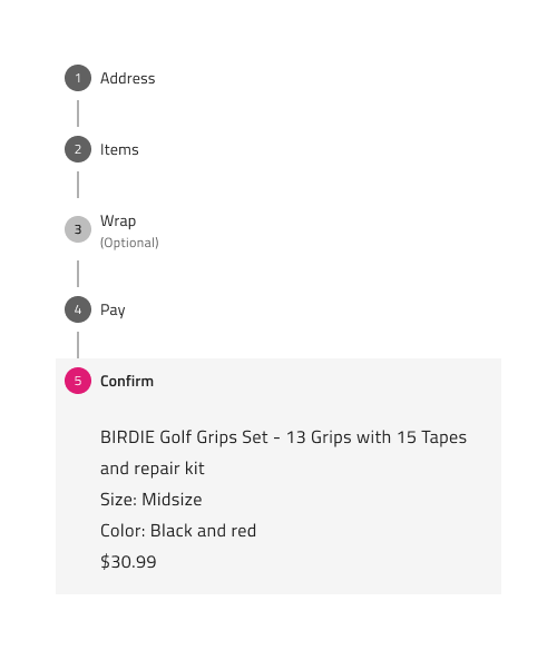
The Stepper component consists of a number of nested Step and Progress Line components. In terms of the structure, there's one major difference between the horizontal and the vertical Stepper. While the Content of the current Step on the vertical Stepper is positioned right under the Step's heading, the Content of the horizontal one is positioned under all Steps.
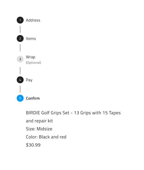
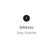
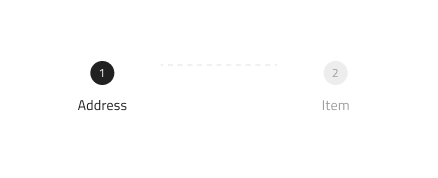
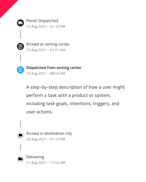
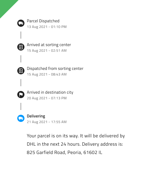
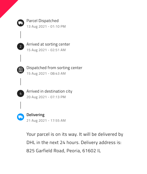
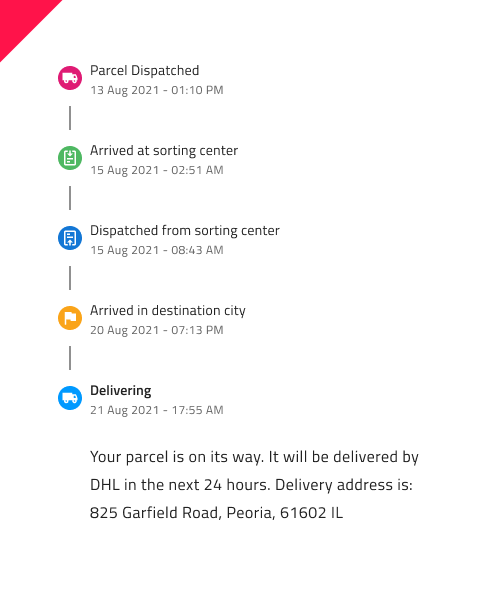
Steps
Each Step consists of an Indicator and Information. The Indicator can be either a Number or an Icon, which you can toggle using the Type property in Figma’s right properties panel. You can also choose to display only the Indicator or only the Information by enabling or disabling the respective Information or Indicator boolean properties. Additionally, the Subtitle can be shown or hidden by toggling the Subtitle boolean property within the nested Step component.
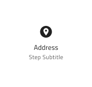
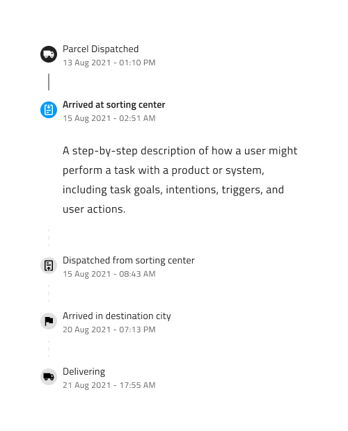
We also provide a number of states for the Step, which should cover all use case scenarios. These include: Complete, Incomplete, Disabled, Invalid and Active. These can be switched from the State property on the right properties panel. In addition to the Step state, there is an Optional Step property that enables you to designate a step as either optional or required by switching on/off the boolean property. This Optional Step property is accessible for all provided states and is presented as a nested option within each Step.
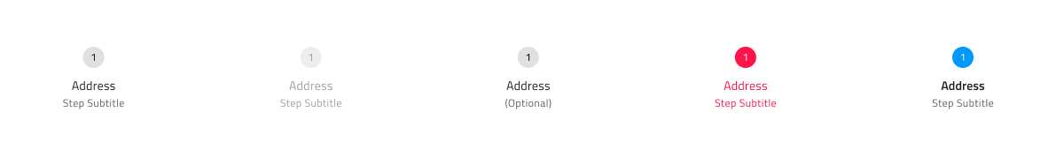
We also provide two additional states: Hover and Focused, which can be used by switching on/off the boolean properties Hover and Focused.

We also provide two types of Progress Lines - Active and Inactive. These can be swapped by using the property State from the properties panel, after selecting the nested Progress Line component.
Content
As mentioned above, when a Step is set to Active state, a frame called Content is displayed underneath the Header of the active Step on the vertical Stepper and underneath all steps on the horizontal Stepper. By default, the Content comes with a simple text layer, where you can add information about the active step. If you'd like to customize it in some way, you'll need to detach the component by right-clicking on it and selecting Detach instance. You can also fully hide it by using the Content boolean property on the horizontal Stepper or by going into the nested Step component and switching off the boolean property Content on the vertical Stepper.
Styling
The Stepper comes with styling flexibility through the various options for its indicators, texts and progress line colors, as well as through the customization of the different states' look.
Usage
When using the Linear Stepper, make sure you set the incompleted steps to Disabled state, as well as the progress lines to Inactive in order to clearly communicate to the users that they may not proceed with the next steps, until the previous ones are complete. You should avoid combining indicators with icons and indicators with numbers. Keep the active step prominent, in order to give the user adequate feedback on where he is within the process.
| Do | Don't |
|---|---|
 |
 |
 |
 |
 |
 |
Additional Resources
Related topic:
Our community is active and always welcoming to new ideas.
 GitHub