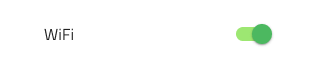
Switch
Use the Switch Component to allow the user make a selection, which most often expresses turning on/off a configuration in a list of settings. The Switch is visually identical to the Ignite UI for Angular Switch Component
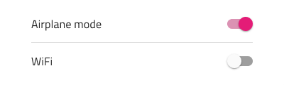
Switch Demo
Interaction State
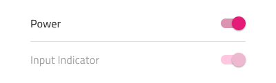
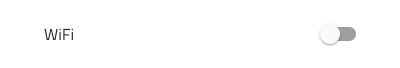
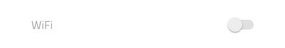
The Switch can be inserted in an Enabled or Disabled state.
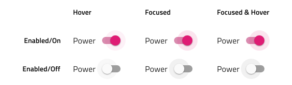
In Enabled state, the switch also supports Hover, Focused and Focused & Hover states.
Layout Template
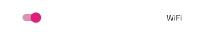
In Figma, the Switch supports label position variants where the Switch label is placed after or before the Switch element.
State
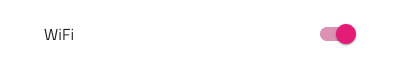
The Switch provides on and off selection states. In Figma, you can switch between them by using the Checked boolean property in the right sidebar.

Styling
The Switch comes with styling flexibility through the available options for the Thumb and Track colors, as well as changing the Label text color.
Usage
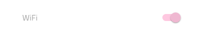
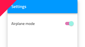
Use the same or very similar colors for the Switch Thumb and Track.
| Do | Don't |
|---|---|
 |
 |
Additional Resources
Related topic:
Our community is active and always welcoming to new ideas.
 GitHub