Tree
The Tree component is used as a visual representation of the hierarchical relationship between categories, presented in a list structure. The Tree component is visually identical to the Ignite UI for Angular Tree Component
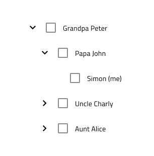
Tree Demo
Tree Sizes
The Tree component offers three sizes: Large, Medium, and Small. In Figma, you can switch between them by adjusting the Size property in the properties panel.

Tree Type
We support two types of Tree component: Basic and Checkbox, where you have a Checkbox component after the Expand Icon. In Figma you can switch between the two types using the Checkbox boolean property from the properties panel.


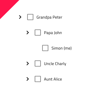
Tree Node Structure
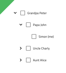
The Tree component is built from a number of nested components we call Tree Nodes. Each Node consists of Expand Icon and Text. If you've chosen the Checkbox type, there will also be a Checkbox component after the Expand Icon.


The Text in each node can be switched from normal to hyperlink text. In Figma this can be achieved by using the Hyperlink boolean property of the .Base Node component from the properties panel.

We also support two states of the Expand Icon - Collapsed and Expanded. In Figma you can switch between the two using the Expanded boolean property of the .Base Node component from the properties panel.

Tree Node Level
In order to represent the hierarchical relationship between the nodes, the Tree Node supports three Level types: Root, Child and Grandchild. In Figma you can switch to a different level using the Level property of the .Base Node component from the properties panel.
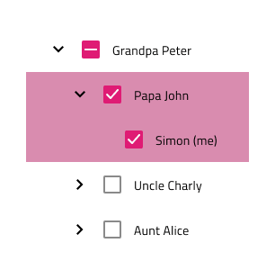
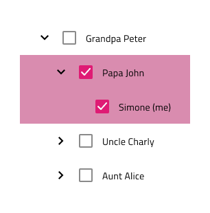
Tree Node State
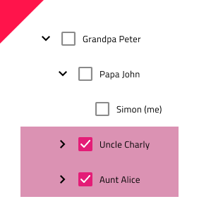
The Tree Node has two primary states: Idle and Disabled, with additional interaction states available. In Figma, you can toggle the Active, Hover and Focused properties in the properties panel to adjust these states. Additionally, you can control the Checkbox state by toggling the Selected and Indeterminate boolean properties in the properties panel.

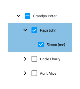
Tree Presets
In addition to the basic Tree component, you can also choose from three Tree Presets - Active, Cascading Selection and Multiple Selection. These can make building your design easier and faster. In Figma these are separate components, positioned on the same page as the Tree component and you can insert them from the Assets panel.
Styling
The Tree comes with styling flexibility through the available options for the Expand Icon, Checkbox and Text colors, as well as the colors used in different states of the Tree Node.
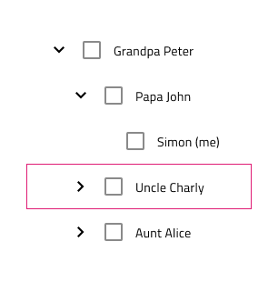
Usage
Ensure the Expand Icon state is set to Expanded for expanded Tree Nodes. When presenting cascading selection, switch the Checkbox state of parent nodes to Indeterminate to reflect partial selection.
| Do | Don't |
|---|---|
 |
 |
 |
 |
Additional Resources
Related topics:
Our community is active and always welcoming to new ideas.
 GitHub