Colors

    There are five palettes with 10 color variations each for the primary, secondary, grays, and two chart series colors, as well as special colors such as success, warn, error, info, and surface in the Indigo.Design System. In Figma, we also have 10 color variants for the success, warn, error and info states. This lets you change the complete look of the library and all projects that use it with just a few clicks. The way Colors are set up is identical to the Ignite UI for Angular Themes.

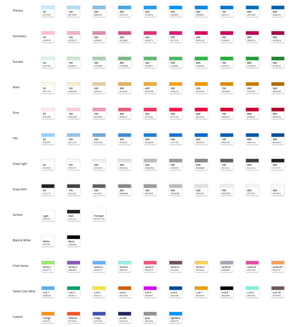
    In Figma, they are placed on a separate page called ↳ Colors and can be applied to any shape element through Color styles, which are positioned under the Design tab in the right sidebar. In Sketch, these can be found on a separate page named 🎨 Colors and are available as Layer Styles that can be applied to any shape element. In Adobe XD they are placed on an Artboard with the same name in the left column of the library file and exist as Colors that are used across components and patterns.

    The Indigo.Design System features special color palettes, optimized for various data visualization scenarios. Both ensure good contrast between adjacent series colors so that the palette can be used e.g. to colorize ranges of a gauge. One of the palettes is further optimized to be 100% inclusive and facilitate easy comprehension by people with color blindness deficiencies.

    Palette Generation in Figma

    To change the primary palette in Figma, you need to first open the Indigo.Design UI kit file. In the properties panel you'll see a section called Color styles. The color styles are organized into various categories, representing different color variants.

    To modify a color, click on the Edit style icon, positioned on the right of the color's name. A dialog will be displayed, where you can specify the new color.

    After making the desired changes, the color style will be applied automatically to all elements, which currently use it.

    This procedure can be applied to each available color style in the Indigo.Design System.

    Palette Generation in Sketch

    To change the primary palette in Sketch open the Indigo.Design library file and select View -> Components. Then in the Sketch menu you will notice a group of four buttons, where the one to the right is an icon of a pantone guide and stands for Show Color Variables.

    On the canvas below you will see a collection of colored circles representing all color variables we have defined in the library. You need to find the one called primary, select it and use the panel on the right to specify a different color. You are all set, this change will not only update all variants and Layer Styles for the primary palette, but also propagate these changes across all Components and Patterns automatically.

    The same procedure can be followed for the secondary colors and other colors with special meaning in the library.

    Palette Generation in Adobe XD

    To change the primary palette in Adobe XD open the Indigo.Design library file and show the Libraries panel. Then, right-click on primary.500 and choose Edit from the contextual menu that appears to specify a different color. You will notice that this will update the palette on the 🎨 Colors artboard, but only the primary.500 color in the Libraries panel will reflect the change.

    The rest of the colors in the Libraries panel have to be updated manually. To achieve this, draw a rectangle and use the eyedropper tool to set its fill by picking a color variant from the palette on the 🎨 Colors artboard. Then use the hex value to edit the respective color in the Libraries panel. Follow this process until the whole palette is updated.

    The same procedure can be followed for the secondary colors and other colors with special meaning in the library. This will propagate to components and patterns automatically.

    Creating Custom Colors in Figma

    There are cases where we need more colors than the ones we have available. There are two approaches for creating custom colors that differ in terms of the scope we do this for.

    If you want your added colors to be accessible only within the scope of your current project, you can create local styles within your project. To do so, go to the plus button on the right of the Local styles section, placed in the properties panel. A new contextual menu will be displayed and you need to choose Color.

    A new dialog will be displayed, where you can set the new color, give it a name and description, relevant to the color's usage in the design project.

    If you want the colors you added to be available to all users in your team, you need to create the new styles in the Indigo.Design UI kit file, but this time you need to add them under Custom colors. You should then publish the changes to make them accessible for your team.

    Creating Custom Colors in Sketch

    There are cases where we need more colors than the ones we have available. There are two approaches for creating custom colors that differ in terms of the scope we do this for.

    If you want your added colors to be available across all the projects that use the library, navigate to the Colors page in it, and zoom to the empty Custom section underneath the series palettes.

    Then complete the steps below to finish the process. If you want your added colors to be accessible only within the scope of your current project follow the steps below from any page in it.

    1. Draw a rectangle and set its fill to the color of your choice.

    2. In the color picker you will notice a Create Color Variable button which you need to select once you are happy with your choice.

    3. Apply the same color variable to the border of the rectangle and name it accordingly e.g. cool gray.

    4. Now you have to create three color styles using the custom color rectange: one with just the fill, one with just the border, and one with both naming them accordingly.

    5. You are all set, your custom color will appear as a Color Variable and show up in the overrides for your Components and Patterns.

    Creating Custom Colors in Adobe XD

    There are cases where we need more colors than the ones we have available. There are two approaches for creating custom colors that differ in terms of the scope we do this for.

    If you want your added colors to be available across all the projects that use the library, navigate to the Colors artboard in it, and zoom to the empty Custom section underneath the series palettes.

    Then complete the steps below to finish the process. If you want your added colors to be accessible only within the scope of your current project, follow the steps below from anywhere in it.

    1. Draw a rectangle and set its fill to the color of your choice.

    2. Then, in the Libraries panel, click on the + icon to the right of Colors to create the style and give it an appropriate name.

    3. You are all set, your custom color will appear as a Color in the Libraries panel, and you can use it like any other color with your Components and Patterns.

    Additional Resources

    Related topics:

    Our community is active and always welcoming to new ideas.