
Run Fast with High-Performance, High-Volume Charts
Introduction
While most mobile apps only need simple visualizations like a pie chart or basic line chart, there are times when you need the robustness of thousands to millions of data points rendered flawlessly on a mobile device with millisecond refresh rates and immediate touch-responsiveness. In this lesson you’ll learn how to render the Infragistics Ultimate UI for Xamarin chart with default settings to experience high-volume, real-time data for your most demanding scenarios.
Lesson Objectives
At the end of this lesson, you will have a high-performance chart visualizing hundreds of thousands of data points, without sacrificing quality or framerate. The steps you’ll perform to do this are:
- Define the data source
- Create a category chart
- Test the solution
For more information on the control used in this lesson, see the Xamarin Data Chart Control page.
Step 1: Setting up the Project
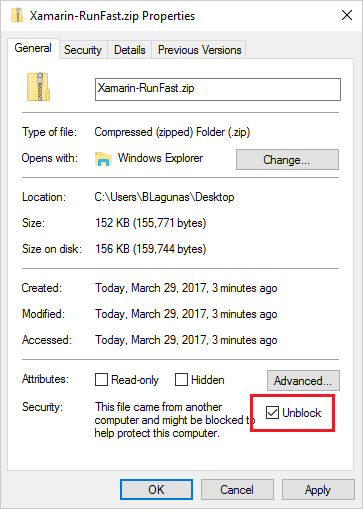
You can download the project used in this lesson by clicking here. Be sure to unblock the zip before extracting.
Then, to run the projects for the first time after un-zipping, load the entire solution into Visual Studio, right-click on the Solution, and select Restore Packages.
Once that is complete, add a reference to both the Portable Class Library and the Android project to DataSource.DataProviders.OData.Core.dll. This file is in the OtherDependencies folder that is part of the ZIP download. You can do this by right-clicking the Reference folder in the Project, browsing to the OtherDependencies folder, and selecting the DataSource.DataProviders.OData.Core.dll.
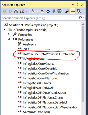
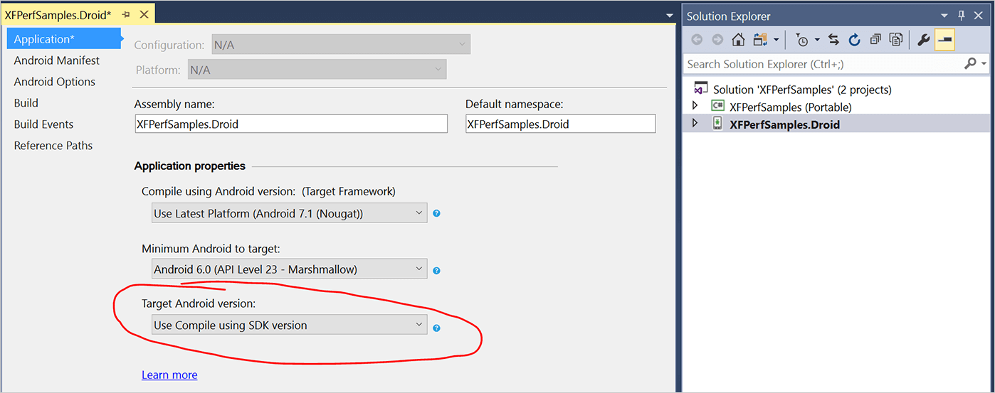
Do this for both projects in the solution. Then, finally, ensure the Target Android Version is set to "Use Compile using SDK version." You can find this setting by right-clicking on the Android project and selecting Properties.
Step 2 Creating a Category Chart
Open the ChartHighFrequency.xaml file that is located in Views. This file contains pre-defined code for the Infragistics Charts namespace, as well as a grid with row definitions and labels. With this sample, you will meter how much data is used by the app. The sample project contains a slider that you can use anywhere from 200 to 500,000 data points.
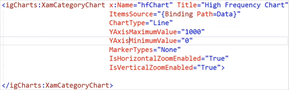
In the Grid, insert the following code segment to define the category chart.
<igCharts:XamCategoryChart x:Name="hfChart" Title="High Frequency Chart" ItemSource="{Binding Path=Data}"
                                          ChartType="Line"
                                          YAxisMaximumValue="1000"
                                          YAxisMinimumValue="0"
                                          MarkerTypes="None"
                                          IsHorizontalZoomEnabled="True"
                                          IsVerticalZoomEnabled="True">
</igCharts:XamCategoryChart>
This code segment creates a high-frequency chart using the specified data source. It also pre-defines the Y-axis values to prevent additional calculations during runtime. By default, markers are enabled and this code segment disables them. We also make the chart more touch-friendly by enabling vertical and horizontal zoom.
Step 3 Test the Solution
After configuring the high frequency chart, you can now test the solution on an emulator or physical hardware device. For this lesion, we will test using an Android 6.0 emulator. This will compile the application, build the APK, and deploy the package to the emulator or device. The debugger will start in the background in Visual Studio, and you will be able to interact with the app. From the app, click CHART – HIGH FREQUENCY.
The line chart will be generated. The frames per second (fps) and amount fields will be updated at the bottom. In our example, there are approximately 10,000 data points being used, and the chart is being displayed at over 35 fps.
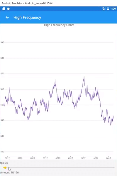
You can zoom in or out to view the line chart in real time. Move the slider bar to adjust the number of data points that is being used by the chart. In our example, we increase the number of data points up to over 333,000 data points, and then up to 500,000 data points.
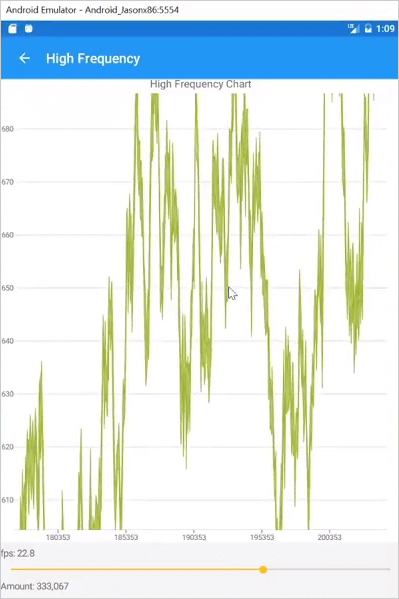
Test the chart by zooming in and see how the data is updated in real-time without sacrificing the frame rate.
Conclusion
The XamCategoryChart enables you to create a high-frequency chart using hundreds of thousands of data points, without sacrificing quality or framerate.