Version

Configuring the Ranges (XamLinearGauge)

Purpose

This topic explains, with code examples, how to configure ranges in the XamLinearGauge™ control. This includes the number of ranges and their positions, lengths, widths, and formatting.

Required background

The following topics are prerequisites to understanding this topic:

Topic Purpose

This topic provides conceptual information about the XamLinearGauge control including its main features, minimum requirements, and user functionality.

This topic explains how to add the XamLinearGauge control to a WPF application.

Configuring Comparative Ranges

Comparative ranges configuration summary

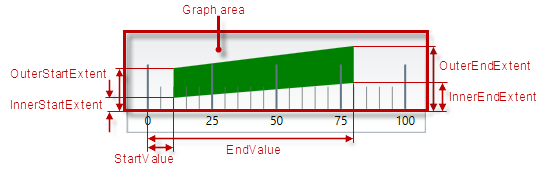
The XamLinearGauge control supports multiple comparative ranges through populating its Ranges collection.

XamLinearGauge Overview 11.png

Each range can be configured individually by specifying its starting and ending value (in the measures of the scale), fill color, and border thickness and color. The size of a comparative range in the across-the-scale is configurable by adjusting its inner and outer margins.

Comparative ranges configuration summary chart

The following table explains briefly the configurable aspects of XamLinearGauge control’s comparative ranges and maps them to properties that configure them.

Configurable aspects Property Default value

Number (of ranges in the graph)

Not set

Caption

Not set

Length, width, and position

Not set

Not set

Not set

Not set

Not set

Not set

Fill color

Defined in the default theme

Border color

Defined in the default theme

Border thickness

1.0

Tooltip

The start and end values of the range separated by a hyphen (-)

Note
Note:

If you do not explicitly provide values for the Brush and Outline properties for each range, the values are retrieved from the values of XamLinearGauge ’s RangeBrushes and RangeOutlines collections. They can also be used to predefine a set of brushes to be used consecutively for setting each range’s color or outline fill.

Property settings

The following table maps the desired behavior to its respective property settings.

In order to configure: Details Use this property: And set it to:

Name

A name for the range.

Used for displaying in the tooltip.

A string expressing the name of the range

Range start

Position on the scale at which the range begins

The desired value (in the measures of the scale)

Range end

Position on the scale at which the range ends

The desired value (in the measures of the scale)

Inner vertex of the starting edge of the range

The position of the inner vertex of the starting edge across the scale relative to the edge of the Reserved area.

(Inner vertex is the point of the starting edge that is the closest to the edge of the Reserved area.)

The desired value as a relative part of the height/width of the Graph area depending on the orientation (horizontal / vertical) presented as a fraction of 1 (e.g. _0.2 )

Inner vertex of the ending edge of the range

The position of the inner vertex of the ending edge across the scale relative to the edge of the Reserved area

The desired value as a relative part of the height/width of the Graph area depending on the orientation (horizontal / vertical) presented as a fraction of 1 (e.g. 0.3 )

Outer vertex of the starting edge of the range

The position of the outer vertex of the starting edge across the scale relative to the edge of the Reserved area.

(Outer vertex is the point of the starting edge that is the closest to the edge of the Reserved area)

The desired value as a relative part of the height/width of the Graph area depending on the orientation (horizontal / vertical) presented as a fraction of 1 (e.g. 0.7 )

Outer vertex of the ending edge of the range

The position of the outer vertex of the ending edge across the scale relative to the edge of the Reserved area

The desired value as a relative part of the height/width of the Graph area depending on the orientation (horizontal / vertical) presented as a fraction of 1 (e.g. 0.8 )

Fill color

Fill color of the range

The desired color

Border thickness

Thickness of the range’s border

The desired value in pixels

Border color

Color of the range’s border

The desired color

Tooltip

Content of the tooltip of the comparative range(s)

The desired string, UIElement, or DataTemplate (See Configuring the Tooltips.)

Example

The screenshot below demonstrates how a comparative range added to the XamLinearGauge looks as a result of the following settings:

Property Value

“Green”

“range1”

“6”

“89”

“0.5”

“0.5”

“0.8”

“0.8”

“Black”

XamLinearGauge Configuring Ranges 1 17 1.png

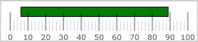
Following is the code that implements this example.

In XAML:

<ig:XamLinearGauge x:Name="linearGauge" >
      <ig:XamLinearGauge.Ranges>
            <ig:XamLinearGraphRange Brush="Green"
                                       Caption="range1"
                                       StartValue="6"
                                       EndValue="89"
                                       InnerEndExtent="0.5"
                                       InnerStartExtent="0.5"
                                       OuterEndExtent="0.8"
                                       OuterStartExtent="0.8"
                                       Outline="Black"/>
      </ig:XamLinearGauge.Ranges>
</ig:XamLinearGauge>

In C#:

var range1 = new XamLinearGraphRange();
range1.Brush = new SolidColorBrush(Color.FromRgb(0, 255, 0));
range1.Caption = "range1";
range1.StartValue = 6;
range1.EndValue = 89;
range1.InnerEndExtent = .5;
range1.InnerStartExtent = .5;
range1.OuterEndExtent = .8;
range1.OuterStartExtent = .8;
range1.Outline = new SolidColorBrush(Color.FromRgb(0, 0, 0));

In Visual Basic:

Dim range1 As New XamLinearGraphRange
 With range1
      .Brush = New SolidColorBrush(Color.FromRgb(0, 255, 0))
      .Caption = "range1"
      .StartValue = "6"
      .EndValue = "89"
      .InnerEndExtent = ".5"
      .InnerStartExtent = ".5"
      .OuterEndExtent = ".8"
      .OuterStartExtent = ".8"
      .Outline = New SolidColorBrush(Color.FromRgb(0, 0, 0))
 End With

Related Content

The following topics provide additional information related to this topic.

Topic Purpose

This topic explains, with code examples, how to configure the title and subtitle of the XamLinearGauge control. This includes the title area width the start position of the text and the title/subtitle text itself.

This topic explains, with examples, how to configure the scale of the XamLinearGauge control. This includes positioning the scale inside the control and configuring the scale tick marks and labels.

This topic explains, with code examples, how to configure the needle of the XamLinearGauge control. This includes the needle’s value, width, and formatting.

This topic explains, with code examples, how to configure a background for the linear gauge. This includes setting the background’s size, position, color, and border.

This topic explains, with code examples, how to enable the tooltips in the XamLinearGauge control and configure the delay with which they are displayed.