
This topic provides conceptual information about the XamLinearGauge™ control including its main features, minimum requirements, and user functionality.
This topic contains the following sections:
The XamLinearGauge control is an Ultimate UI for WPF control which allows for visualizing data in the form of a linear gauge. It provides a simple and concise view of a primary value compared against a scale and one or more comparative ranges.
The XamLinearGauge control provides you with the ability to create attractive data presentations and has multiple application usage scenarios.
The features of XamLinearGauge include configurable orientation and direction, configurable visual elements, and more. The control has also a built-in support for animated transitions.
The following table summarizes the main features of the XamLinearGauge control.
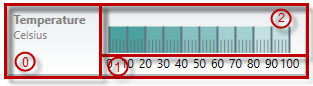
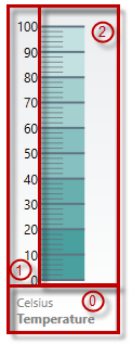
The user-visible area of the XamLinearGauge control is logically divided into the following areas: Title area, Reserved area, and Graph area.
Each of the areas serves different purpose related to some of the visual elements of the XamLinearGauge control.
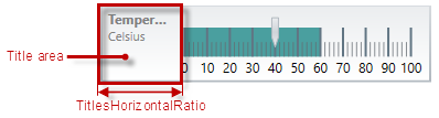
Title area (0) - The Title area is the area in which the title/subtitle of the linear gauge are displayed. This area cannot overlap the scale (i.e. the Reserved area and the Graph area).
Not set by default, when the linear gauge is oriented horizontally, the Title area configures its width automatically to fit the title and/or subtitle (whichever is longer). In addition to that, you can set the width of the Title area explicitly, a capability which comes handy when you have several XamLinearGauge controls placed on top of each other and you want their Title areas to have the same widths for a well-aligned look-and-feel.
Reserved area (1) – This area spreads:
Along the scale – the Reserved area begins either at the edge of the control (when no Title area exists) or at the edge of the Title area (as in the pictures above) and ends at the edge of the control.
Across the scale
In horizontal orientation: the Reserved area begins at the bottom edge of the control and spreads upward as much as the height of the numbering labels is (depending on the size and the other formatting of the font used in the labels)
In vertical orientation: the Reserved area begins at the left edge of the control and spreads to the right as much as the width of the numbering labels is (depending on how large the numbers of the measurements of the scale are and the size and the other formatting of the font used in the labels).
The main purpose of the Reserved area is to provide enough space for the numbering labels of the scale at any orientation – horizontal or vertical (The Reserved area automatically re-sizes when the orientation changes in order to accommodate the specific space requirements for displaying the numbering labels in each of the orientations: in horizontal orientation, the area has to fit the labels’ height and in vertical orientation – their maximum width.) This doesn’t mean that you must necessarily place the numbering labels in the Reserved area: actually, you can position the label row across-the-scale anywhere within the Graph area. However, even if you place the label row outside Reserved area, this will have no bearing on the spread and location of the Reserved area itself – it remains where it is, automatically defined through the height/width (depending on the orientation) of the numbering labels.
Another aspect in which the Reserved area is significant is the fact that its inner edge specifies the beginning edge of the Graph area in the across-the-scale dimension. This is important, because this edge serves as a reference mark for the extent-related properties that position some Configurable visual elements and visual elements across the scale. (Positive values for these properties – the most common case – position the visual elements inside the Graph area and negative values – inside the Reserved area.)
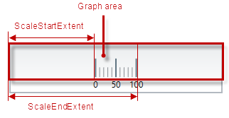
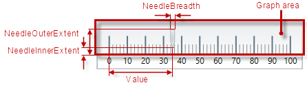
Graph area (2) – The area for displaying the needle, the tick marks, the ranges, and, optionally, the numbering labels of the linear gauge. All extent-related properties for these visual elements (except for labels) are measured against its edges. The Graph area serves not as a placeholder but as a frame of reference for positioning the scale inside the control (More precisely, for positioning the visual elements of the scale).
Spread of the Graph area:
Along the scale – the Graph area begins either at the edge of the control (when no Title area exists) or at the edge of the Title area (as in the pictures above) and ends at the edge of the control. Both the starting and ending positions of the scale are measured against the starting edge of the Graph area (the left edge at horizontal orientation or bottom edge at vertical orientation).
Across the scale – the Graph area begins at the edge of the Reserved area (this is the bottom edge of the Graph area at horizontal orientation or its left edge at vertical orientation). The edge of the Graph area that borders with the Reserved area serves as reference point for the extent-related properties of some of the visual elements of the scale (for positioning these elements across the scale).
Note that the Title area, on one side, and the Graph and Reserved areas, on the other, can be configured with swapped positions (e.g. the Graph and Reserved areas on the left and the Title area on the right at horizontal orientation): in this case, the Title area starts at the end of the scale so the Graph and Reserved areas begin at the edge of the control and end where the Title area begins. (For details, refer to the Configuring the Title/Subtitle topic.)
The XamLinearGauge control features the following visual elements (See the picture below.) :
Needle (3) – This is the primary measure displayed by the control and is visualized as a bar.
Comparative range(s) (4) – The ranges are visual elements that highlight a specified range of values on a scale. Their purpose is to visually communicate the qualitative state of the performance bar measure, illustrating at the same times the degree to which it resides within that state.
Tick marks (5) –The tick marks serve as a visual division of the scale into intervals in order to increase the readability of the linear gauge.
Major tick marks – The major tick marks are used as primary delimiters on the scale. The frequency they appear at, their extents and style can be controlled by setting the corresponding properties.
Minor tick marks – The minor tick marks represent helper tick marks, which might be used to additionally improve the readability of the scale and can be customized in a way similar to the major ones.
Scale labels (6) – The labels indicate the measures on the scale.
Border (7) – The line visually delimiting the dimensions of the control.
Background (8) – The background on which visual elements is placed is configurable in terms of pattern and color.
Title/subtitle (9) – Title of the graph and additional details in the form of a subtitle. Both elements are displayed in the Title Area and their position on the control is adjusted against it.
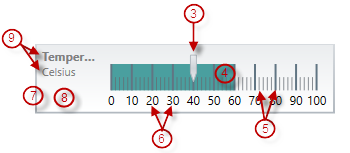
Tooltips – show the values used to create the needle or the values, corresponding to the different ranges respectively.
There are several specific aspects in which each element can be configured.
The following table provides an overview of the configurable aspects of the visual elements of the XamLinearGauge control. Further details about the configurable aspects with illustrations and the properties that configure them are available, for each visual element, in the blocks that follow the table:
The following picture illustrates the Logical areasTitle-area-related extents, listed in the table below.
The following table maps the configurable aspects related to the title/subtitle of the linear gauge to the XamLinearGauge properties that manage them.
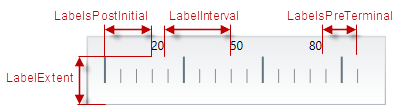
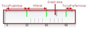
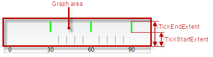
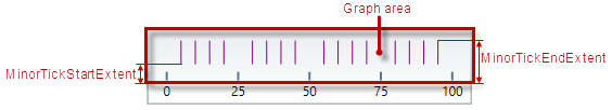
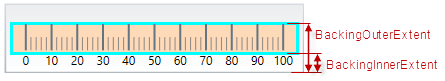
The following pictures illustrate the scale-related extents, listed in the table below.
The following table maps the configurable aspects related to the scale of the linear gauge to the XamLinearGauge properties that manage them.
The following picture illustrates the needle-related extents, listed in the table below.
The following table maps the basic configurable aspects related to the needle of the linear gauge to the XamLinearGauge properties that manage them.
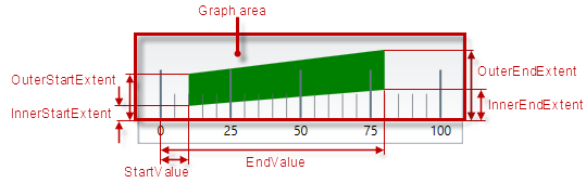
The following picture illustrates the comparative-ranges-related extents, listed in the table below.
The following table maps the configurable aspects related to the comparative ranges of the linear gauge to the XamLinearGauge properties that manage them.
The following picture illustrates the background-related extents, listed in the table below.
The following table maps the configurable aspects related to the background of the linear gauge to the XamLinearGauge properties that manage them.
The following table maps the configurable aspects of the XamLinearGauge control related to tooltips to the properties that manage them.
The XamLinearGauge control provides built-in support for animation by its TransitionDuration property. The animation effect occurs on loading the control as well as when the value of any of its properties is changed. By default, animated transitions are disabled. Providing a value in milliseconds for the TransitionDuration property of the control determines the timeframe for swiping the control into view by smoothly visualizing all its visual elements through a slide effect (from bottom-left to top-right). Setting the value to 0 disables the animated transition.
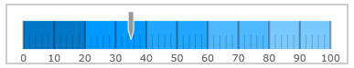
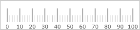
By default, the XamLinearGauge control is oriented horizontally. It displays with a scale starting at 0 and ending at 100. The major tick marks of the control are located at an interval of 10 and the count of minor tick marks between each pair of major tick marks is 4. The background color is white and there is no title/subtitle displayed. The border is 2 pixels thick colored in dark grey. No needle or ranges are displayed. Animated transitions are disabled.
The following picture demonstrates a XamLinearGauge displayed with default settings.
The XamLinearGauge is a WPF control and a part from the assembly , containing the control itself, it depends on several other assemblies. In order for the linear gauge to display a value, the Value property has to be set.
For the full requirements listing, refer to the Adding XamLinearGauge
The following topics provide additional information related to this topic.