Blazor Grid Sizing
The Ignite UI for Blazor Sizing feature in Blazor Grid is an important aspect of creating responsive and user-friendly grid interfaces. The Blazor Grid Sizing feature enables users to adjust the Width and Height of the grid to accommodate different screen sizes, content, or user preferences. In terms of border and padding size for the IgbGrid, they are taken into its width/height size calculations or also known as Border box sizing. It is applied in all scenarios.
[!Note] If the Border box sizing is overridden by the user we cannot guarantee that the
IgbGridwill size correctly.
Blazor Grid Width
If the Width input does not have value assigned, its default value is 100% and the IgbGrid tries to fill the available space. You can check how the grid reacts to it in the Percentages section.
[!Note] Setting manually the
Widthstyle of theIgbGriditself will result in an unexpected behavior.
Null
The grid's Width can accepts value of null, which when set, renders all columns in the DOM. The grid sizes accordingly so there is no grid horizontal scrollbar since column virtualization is not applied.
- If there are 6 columns and none of them has width defined, the grid will have
Widthof816px, because each column by default have assignedWidthof136pxin this scenario. Same will happen if the columns haveWidthin percentages. If vertical scrollbar is rendered or there are features that render additional columns their width will be added also.
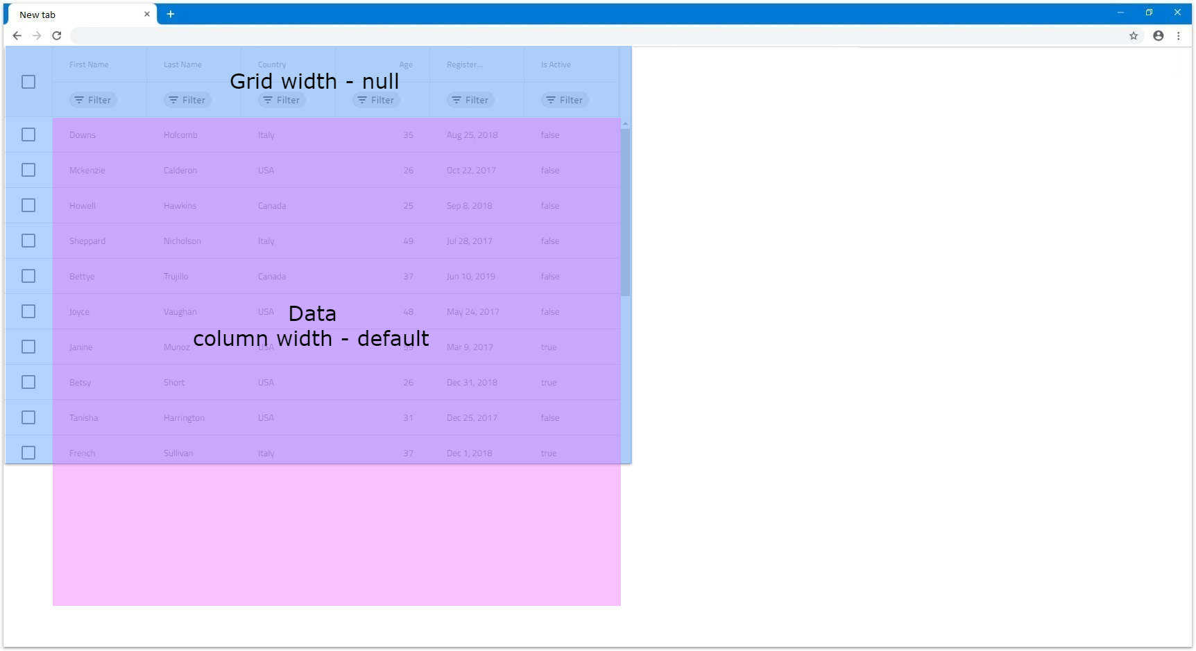
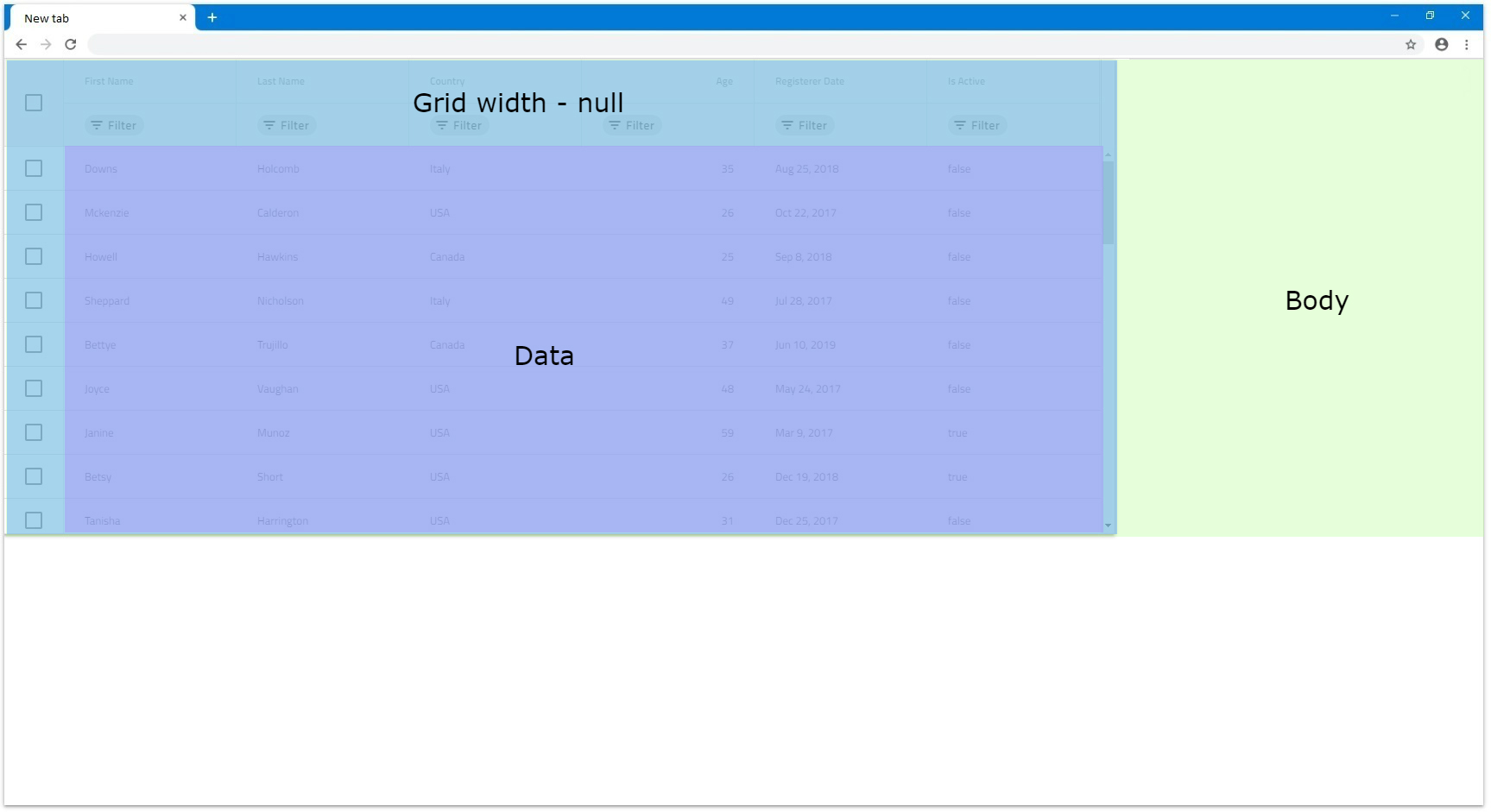
- If there are 6 columns with column width set to
200pxthey will fit in our window and all will be visible:
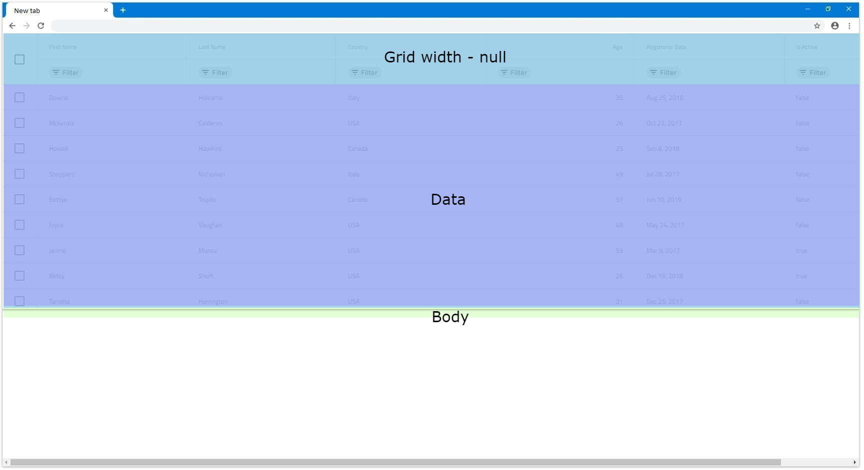
- If there are more columns or ones with bigger width that go out of the browser's view, they will all still render. Let's have the same amount of columns but each with column width of
300px. Since they don't all fit in the browser view area, it will create a scrollbar natively. The next example displays this exact scenario:
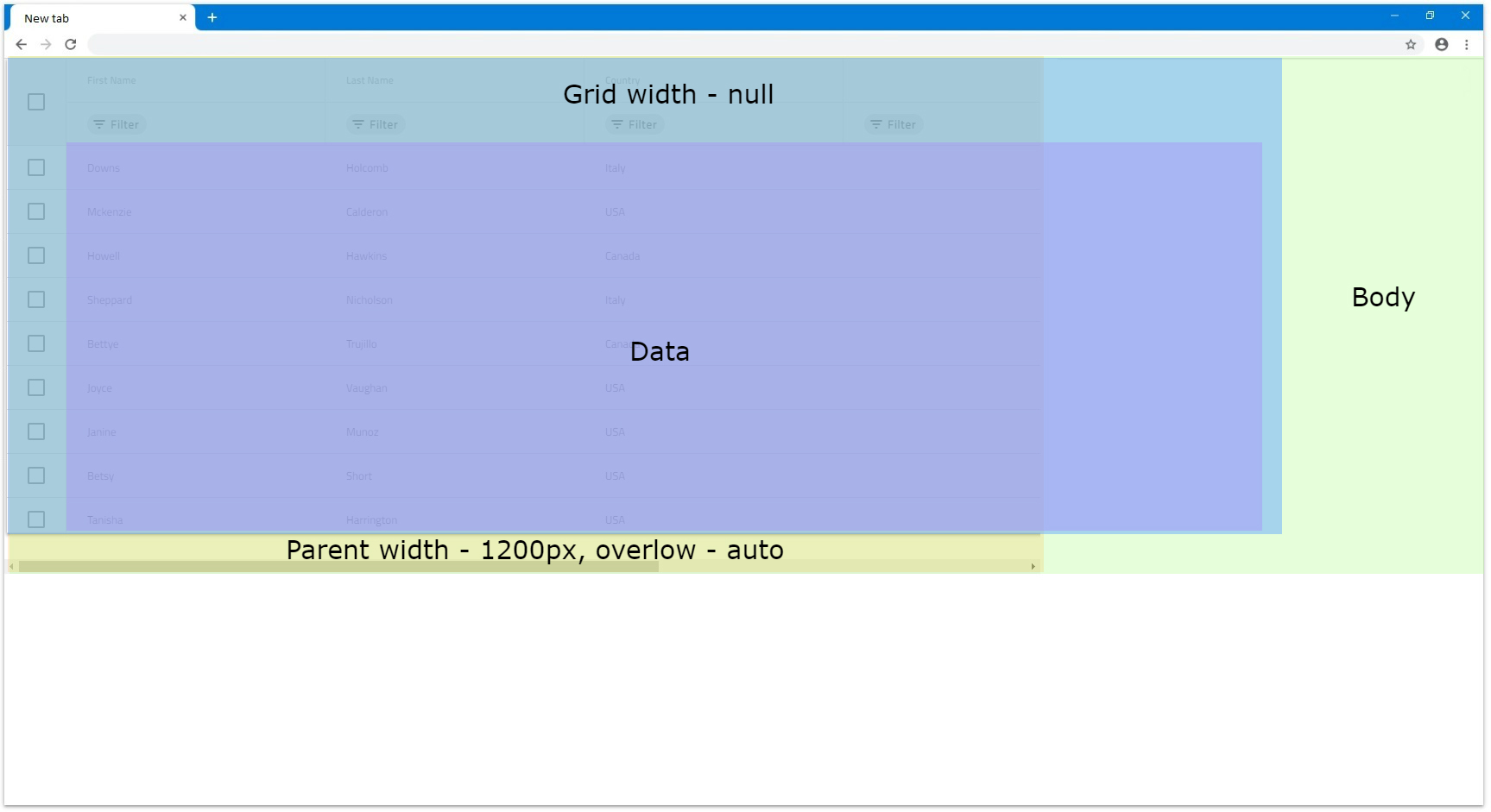
- If the grid has a parent element of any sort and it doesn't have any overflow set, it will still render all columns visible. Otherwise if the parent element has overflow
autoorscroll, a scrollbar for that parent element will be rendered natively. The parent has bigger height for easier visualization in the following example.
[!Note] Due to this behavior, if the grid data contains too many columns, it might have significant impact on the browser performance, since all columns would be rendered without virtualization.
Pixels
When the IgbGrid has its Width input is set to pixels it will set the whole grid size to that value and it will be static. It will not react to any browser resizing or changes in the DOM, although this is not the case for the grid content:
- When width is set in pixels in order for the grid to render horizontal scrollbar, its content width needs to exceed the specified grid
Width. Let's, for example, have the combined width of the columns exceed1200px. In this case a horizontal scrollbar will be rendered.
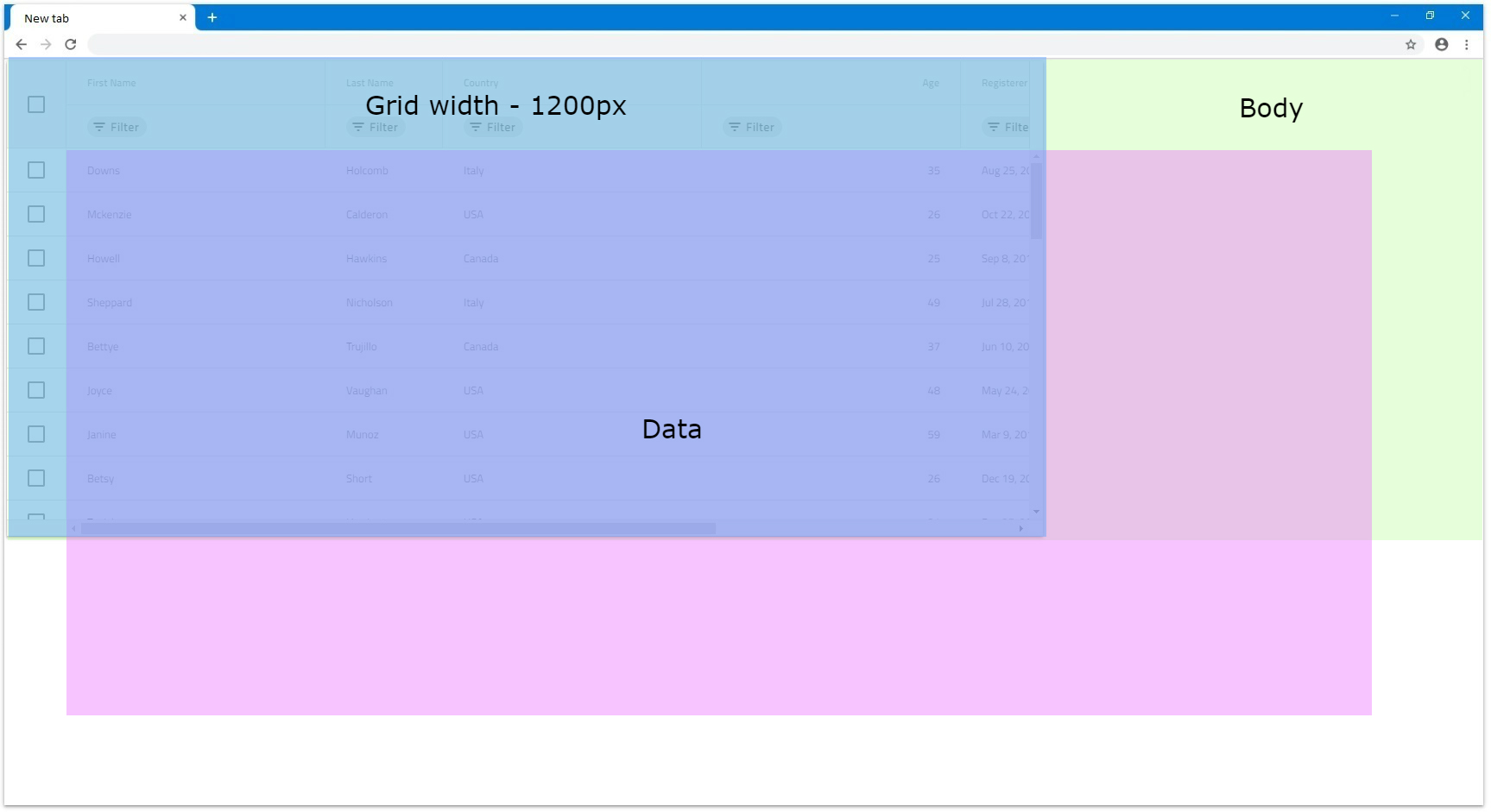
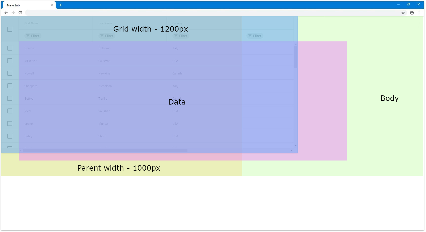
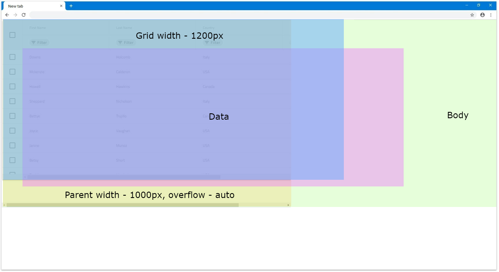
- For scenarios where the grid has a parent element, it depends on the parent styling if it will render scrollbar or not. Everything else related to the grid itself is still retained. If the parent element width is smaller than the grid's width and has overflow style set to
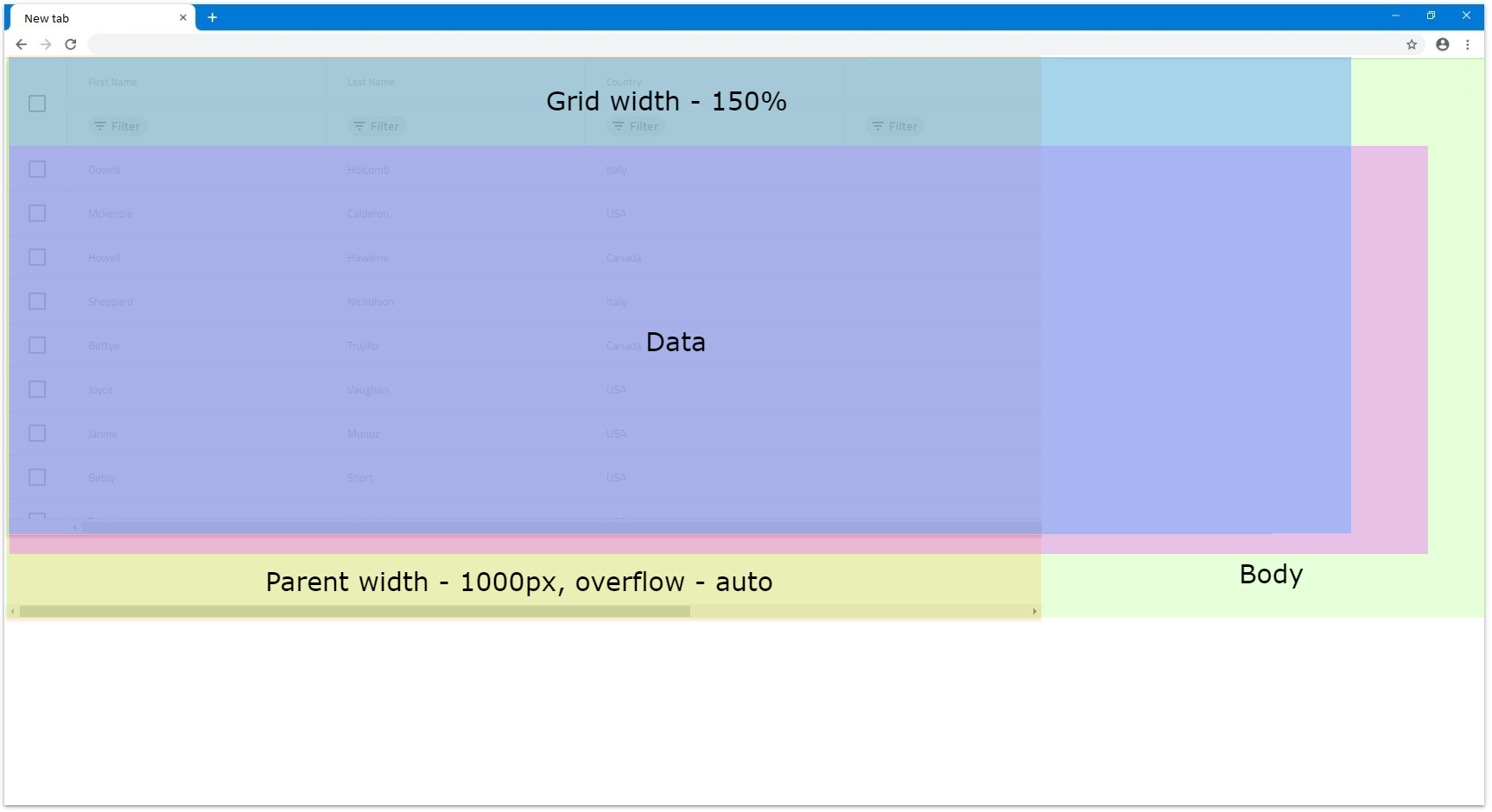
autoorscroll, it will render scrollbar natively. For example, if the parent haswidthset to1000pxand theIgbGridwidthis still1200px, it will look similar to the following illustrations:
Percentages
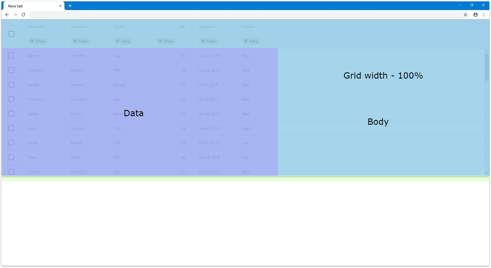
When the Width of the IgbGrid is set to percentages it will size the grid according to the parent element's width. If the parent element does not have width specified the IgbGrid will size relative to the browser window.
- For example, if we set the grid
Widthinput to100%and there is no parent element it will fill 100% of the available width of the browser window. If it is resized the grid will resize as well accordingly.
- If we set grid's width to
100%and there is a parent element that has specific width of1200px, this will mean that the grid will size relative to that element and his final width will be1200px.
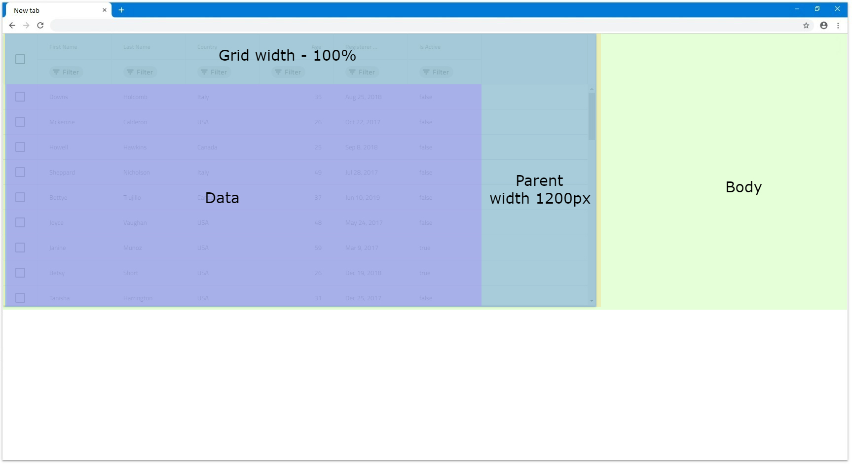
- If we have a parent element with
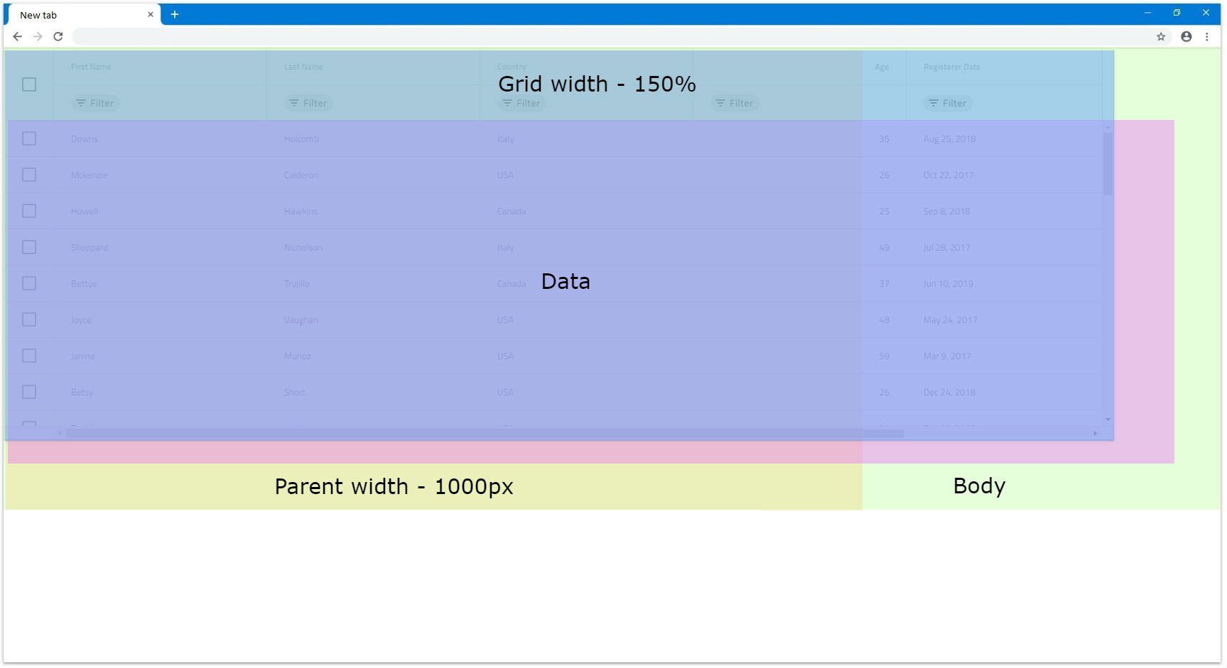
Widthof1000pxand have the grid'sWidthset to150%, the calculated grid width will be1500px. In this case the grid will still render fully visible but if we setoverflow: autoof the parent, that parent will render scrollbar on its own.
Blazor Grid Height
By default if no height is defined for the IgbGrid, it will be set to 100%. You can check how the grid reacts depending on the DOM structure in the Percentages section.
[!Note] Setting manually the
Heightstyle of theIgbGriditself will result in an unexpected behavior.
Null
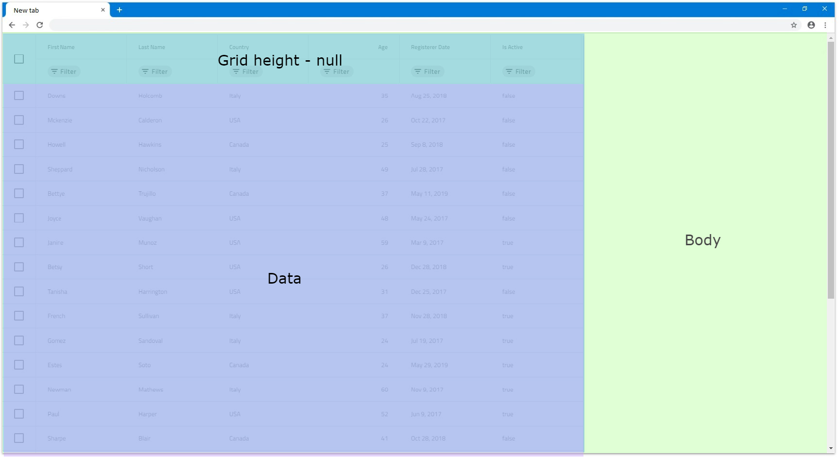
The IgbGrid Height input can accept null value, which when set, displays all rows with no scrollbar no matter how many they are. In this case, there is no vertical virtualization since the grid renders all rows anyway.
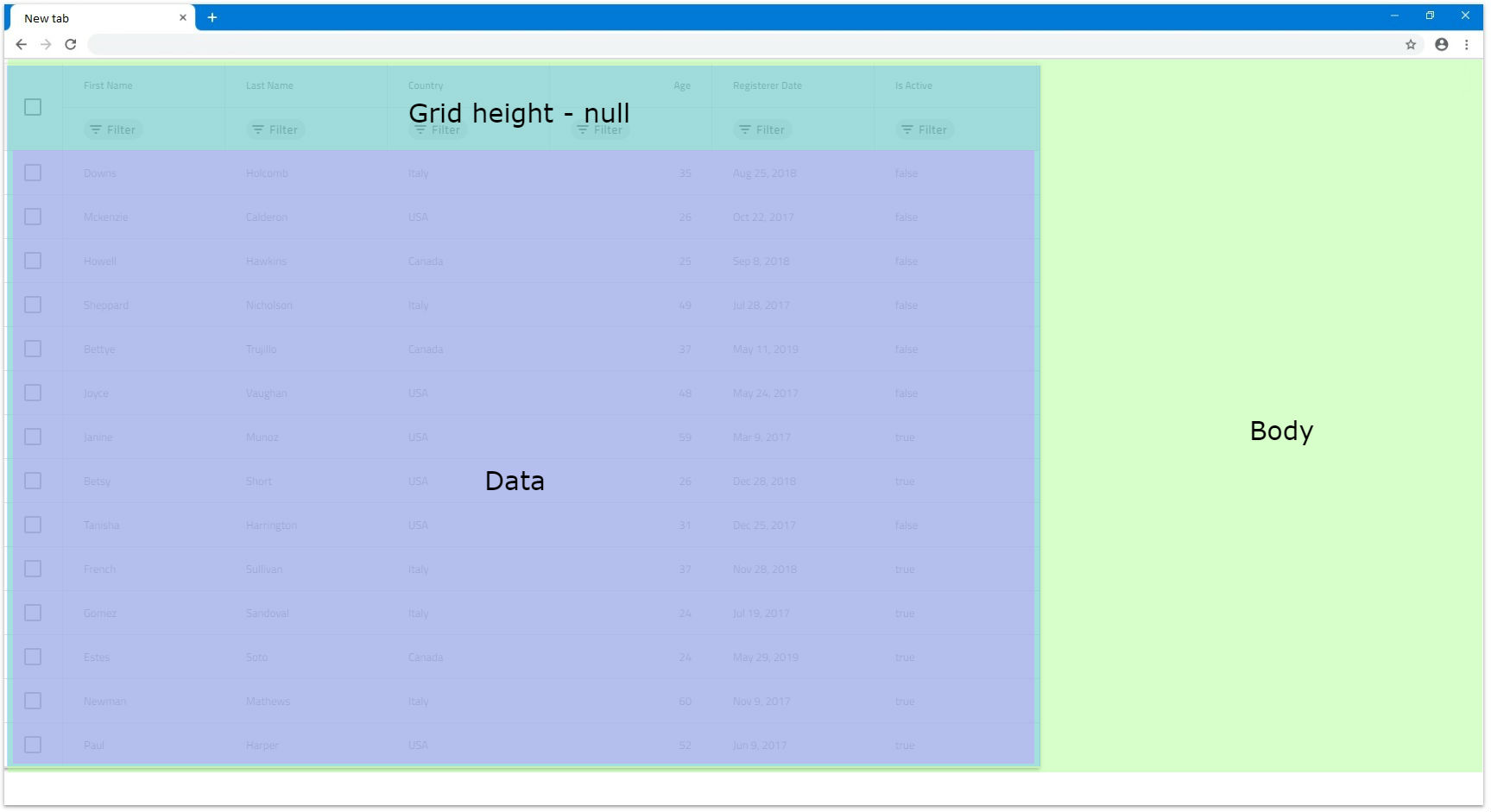
- If we have data with 14 rows in this case the grid will render all 14 of them and size the grid so all are visible without any empty space inside the grid.
- If we have 24 rows instead, the grid will still render all rows but since they are too many, they exceed the browser boundaries. That's why the browser itself will render vertical scrollbar by default so the user can scroll down to the rest of the rows.
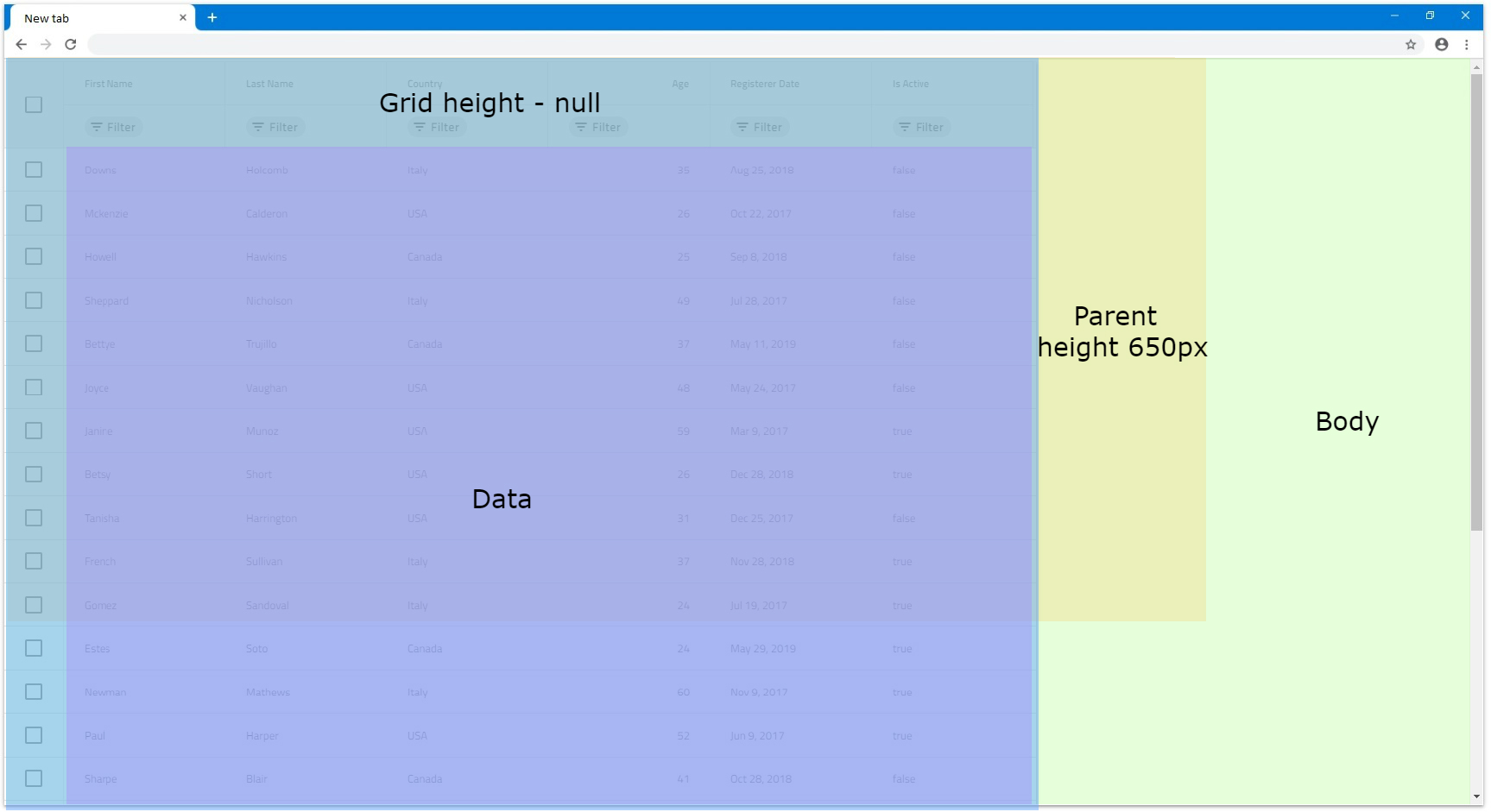
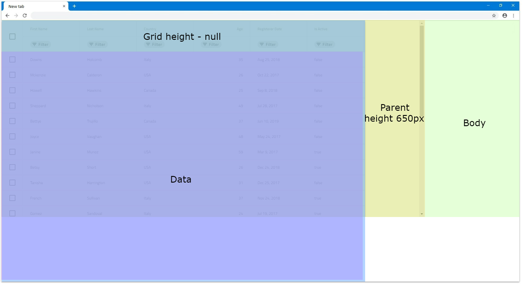
- If there is a parent element with defined
Height, the grid will still render all rows and not be affected. Let's say the parent hasHeightof650px. If it hasoverflowset toautoorscroll, it will render a vertical scrollbar but the grid will still be unaffected:
[!Note] Due to this behavior, if the grid data contains too many rows, it might have significant impact on the browser performance, since all rows would be rendered without virtualization.
Pixels
Setting the IgbGrid Height in pixels is more straightforward since the grid will size to that specific size in all occasions similarly to how Width is set in pixels.
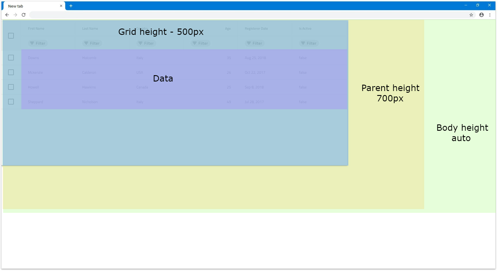
- If we set, for example, the height
500pxwith 4 rows for our data the grid will sit to that size and since 4 rows are not enough to fill the visible area it is expected to have some empty area.
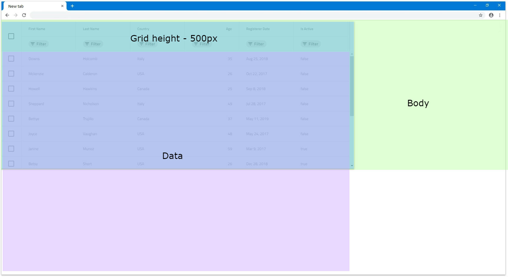
- If the number of rows exceeds the visible area of the grid when
Heightis set to pixels a vertical scrollbar will be rendered. For example, a grid with500pxheight set and 14 rows will be rendered the following way:
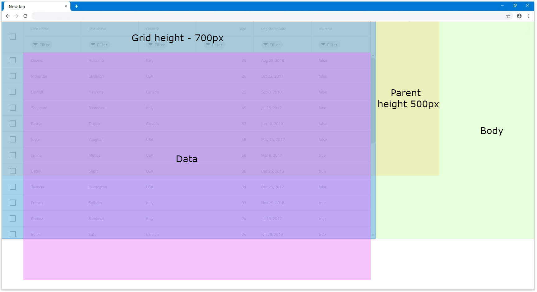
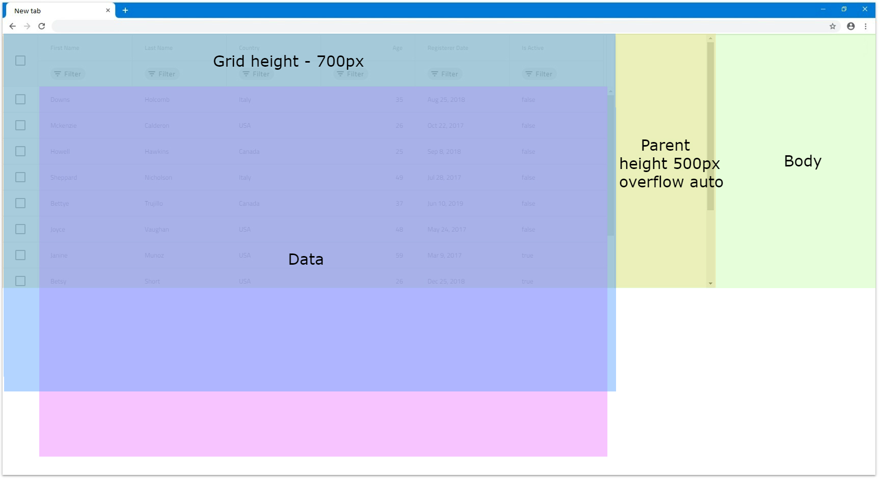
- If there is a parent element with
Heightdefined, unless it hasoverflowset toautoorscroll, the grid will still be fully visible. Otherwise it will render a scrollbar.
Percentages
When the Height input is set to percentages, the IgbGrid will size based on the parent element height. If the parent element has its Height set in pixels or percentages, the grid will size relative to the size of the parent.
When the parent element does not have defined height, the browser does not assign height to it initially and sizes it based on its children and their size. That is why there is no way for the grid to know what base height to use in order to apply percentage sizing based on it. For this reason, it will render a maximum of 10 rows and if they are more rows, a vertical scrollbar will be rendered. Otherwise, the grid will fit to number of rendered rows. We will look in this scenario in more detail in the next examples.
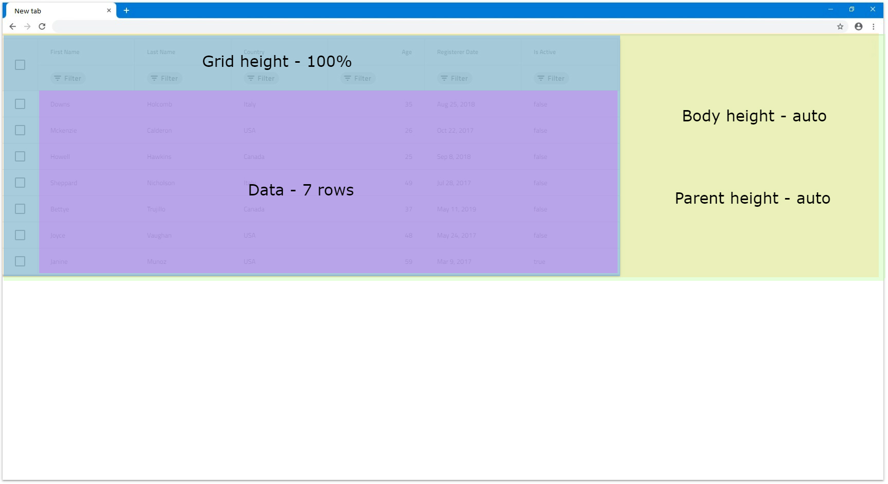
Let's have Width set to 1200px and the parent element not having any size applied to it:
- If there are less than 10 rows the grid will try to fit all rows in the visible area without having an empty space between the last row and the bottom of the visible area. For example, let's have the grid data to consist of 7 rows. The grid will render all 7 rows without vertical scrollbar and without empty space inside the grid.
- If there are more than 10 rows a vertical scrollbar will be rendered for the rest of the rows and only 10 rows can be visible at any time. In the next example only the row number is increased to 14.
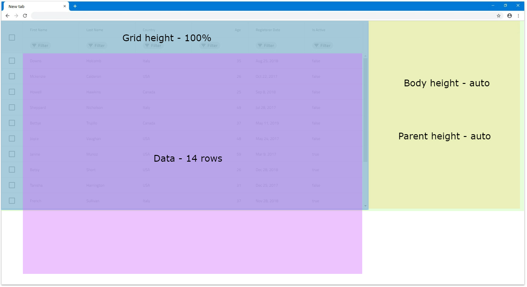
- If we set the parent element height to
800pxand theIgbGridto100%height this means that the grid will be sized to 100 percentages of800px.
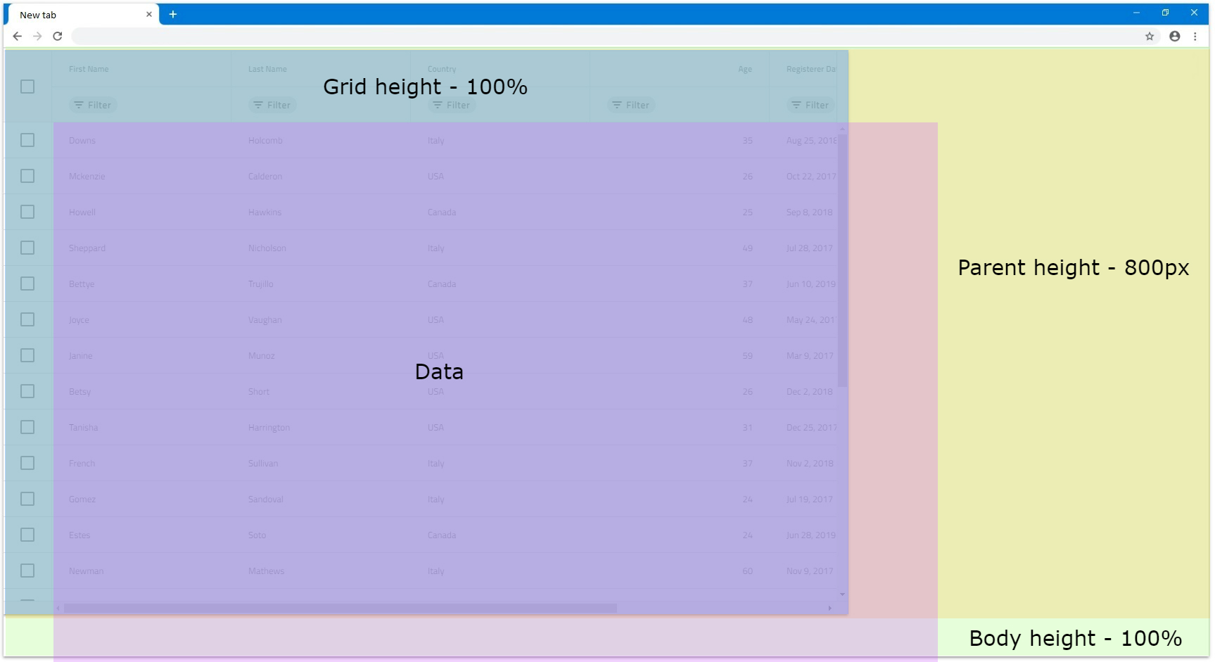
- If the
IgbGridHeightis set to a number bigger than100%and the parent element has height, for the parent to render scrollbar it again needs to haveoverflowset toautoorscroll. Otherwise the grid will be fully visibly and size relative to the parent size.
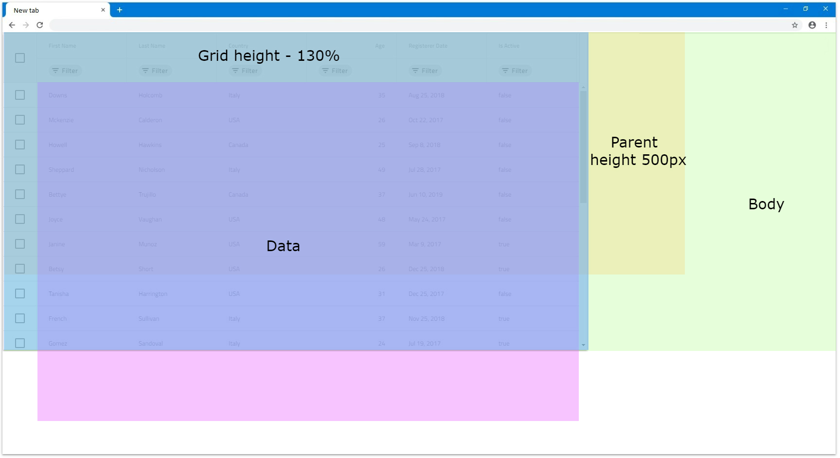
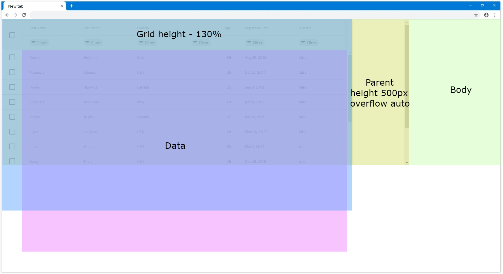
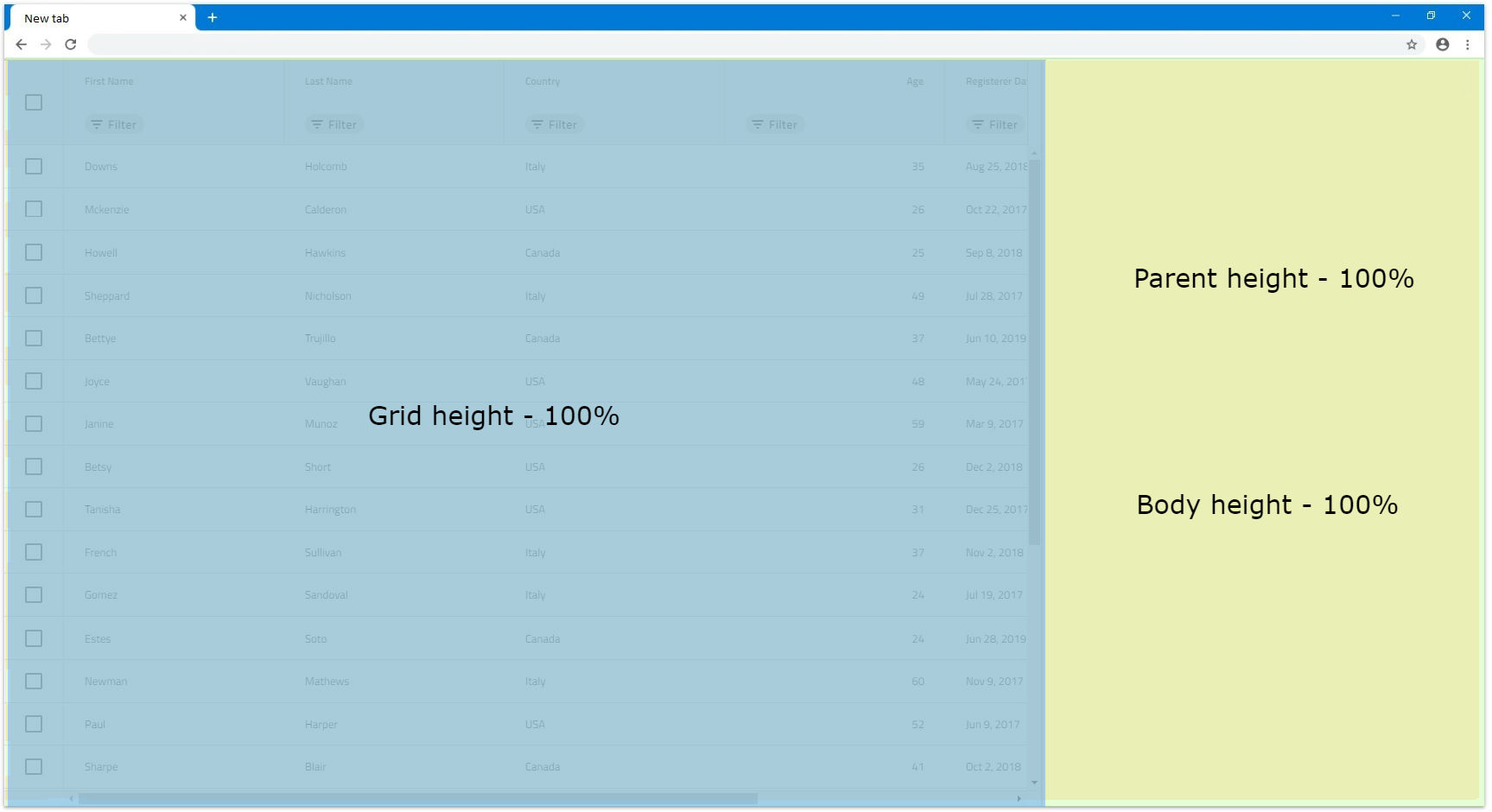
- If we want the grid to be sized to
100%from the browser window we would need to set bothbodyand parent grid element heights to100%. In this case, the parent element can be sized and the grid will size accordingly if the browser is resized.
Blazor Grid Column Sizing
Depending on the grid size itself, the columns inside it can also be sized differently that could result in scenarios where the grid renders horizontal scrollbar or not. Columns can have width set in pixels, percentages or autosized when nothing is set. We will take a deeper look regarding these scenarios in this section.
Default
By default when a column doesn't have a specified width it will try to autosize, so that it fills if any empty space is available in the grid view area. Autosized columns have minimum width of 136px, so if the area available is less than 136px for that column, it will default to that size.
When the grid is resized in these scenarios, the column width is also updated to reflect the changes, so it fills any new empty space available.
- If a column does not have specified
Widthand theIgbGridhasWidthset tonull, it will be sized to the minimum of136px. This means that for a grid withWidthnulland 6 columns that don't have width, each column will be sized to136px.

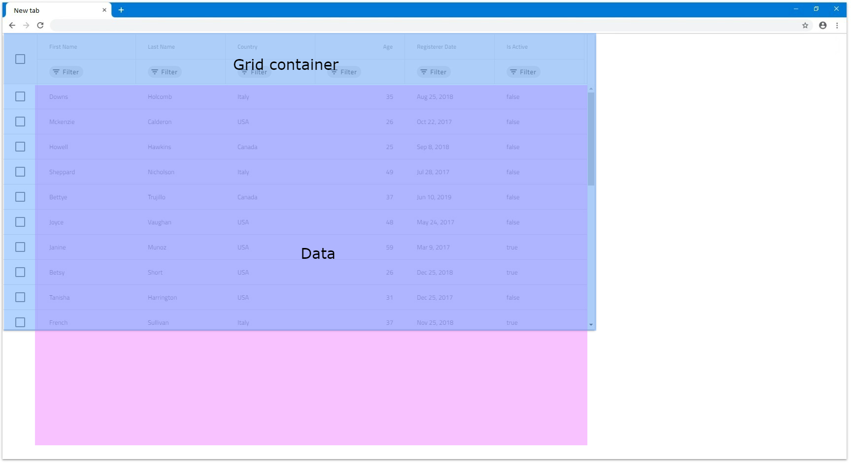
- When there are multiple autosized columns they will divide the available space between each other equally. This means that if we have 6 columns and there is empty area of
1200px, each will size to200px.
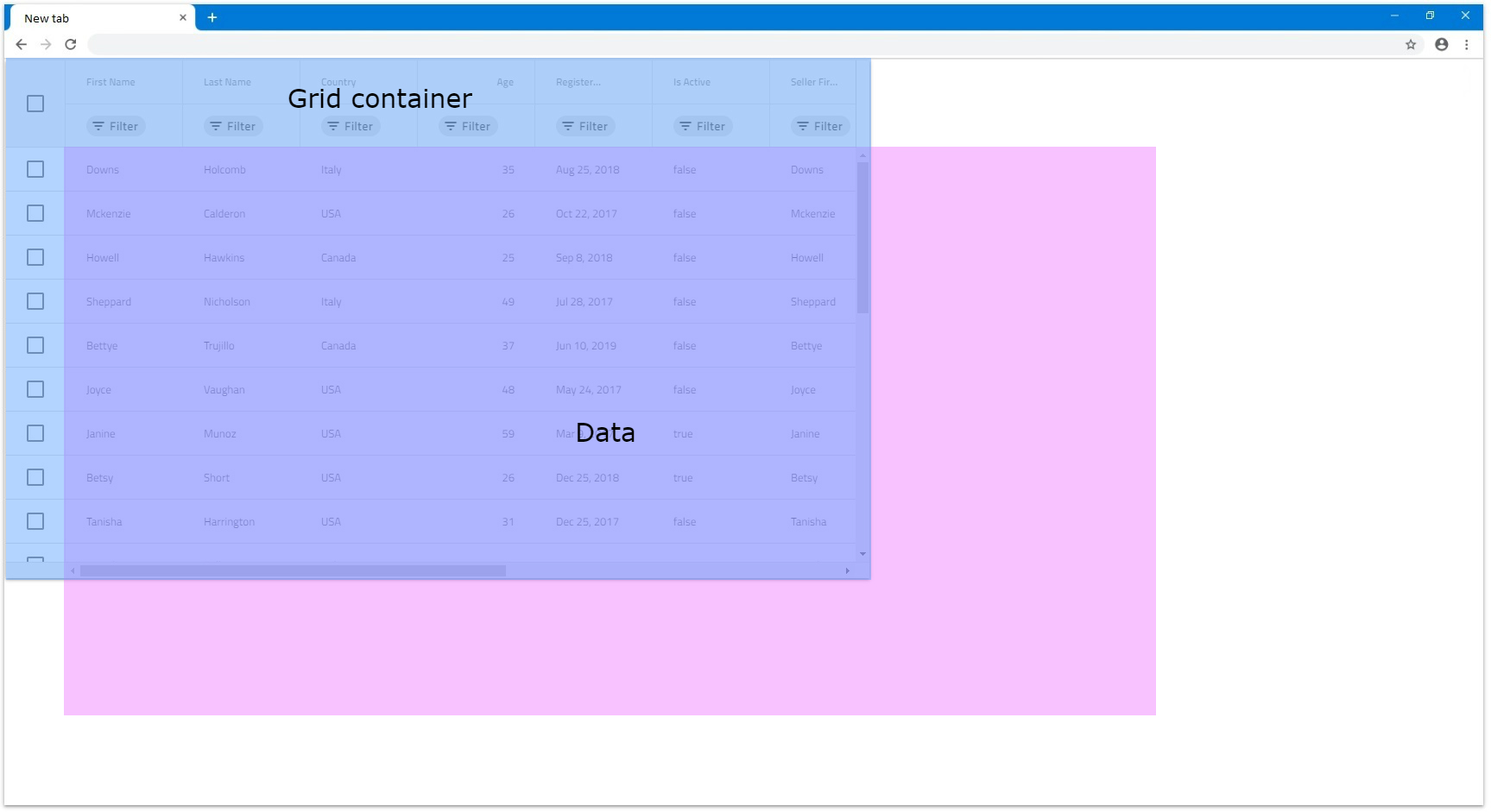
- If there is available empty space, so that each autosized column will be less than
136px, all autosized columns will default to136pxand the grid will render horizontal scrollbar. In the next example let's have 12 autosized columns and the gridWidthset to1000px.
- If a column does not have
Widthspecified, but all other columns have eitherWidthin pixels or percentages, that column will try to also fill the available space. For example, if we don't have width set to the first column and all other 5 haveWidthof100px, the first will fill the rest.
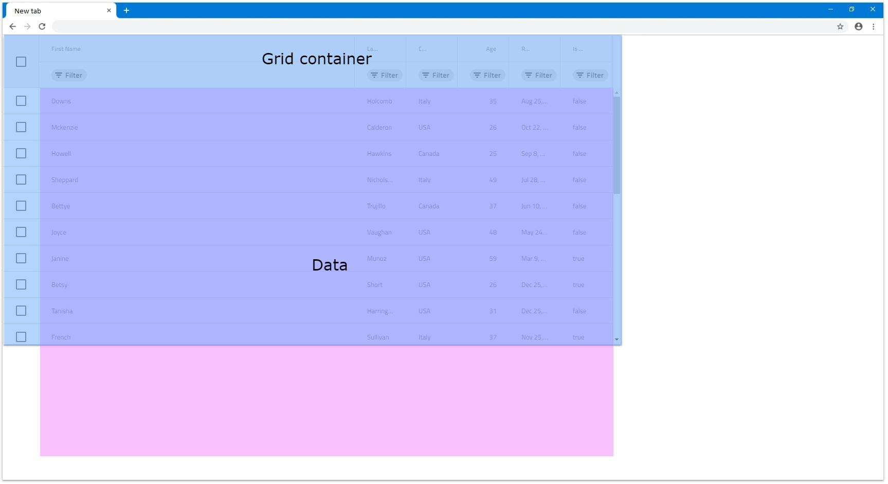
- Same applies if multiple columns does not have
Widthspecified, all will divide the available space between each other equally. In the next illustration the first column hasWidthset to100px.
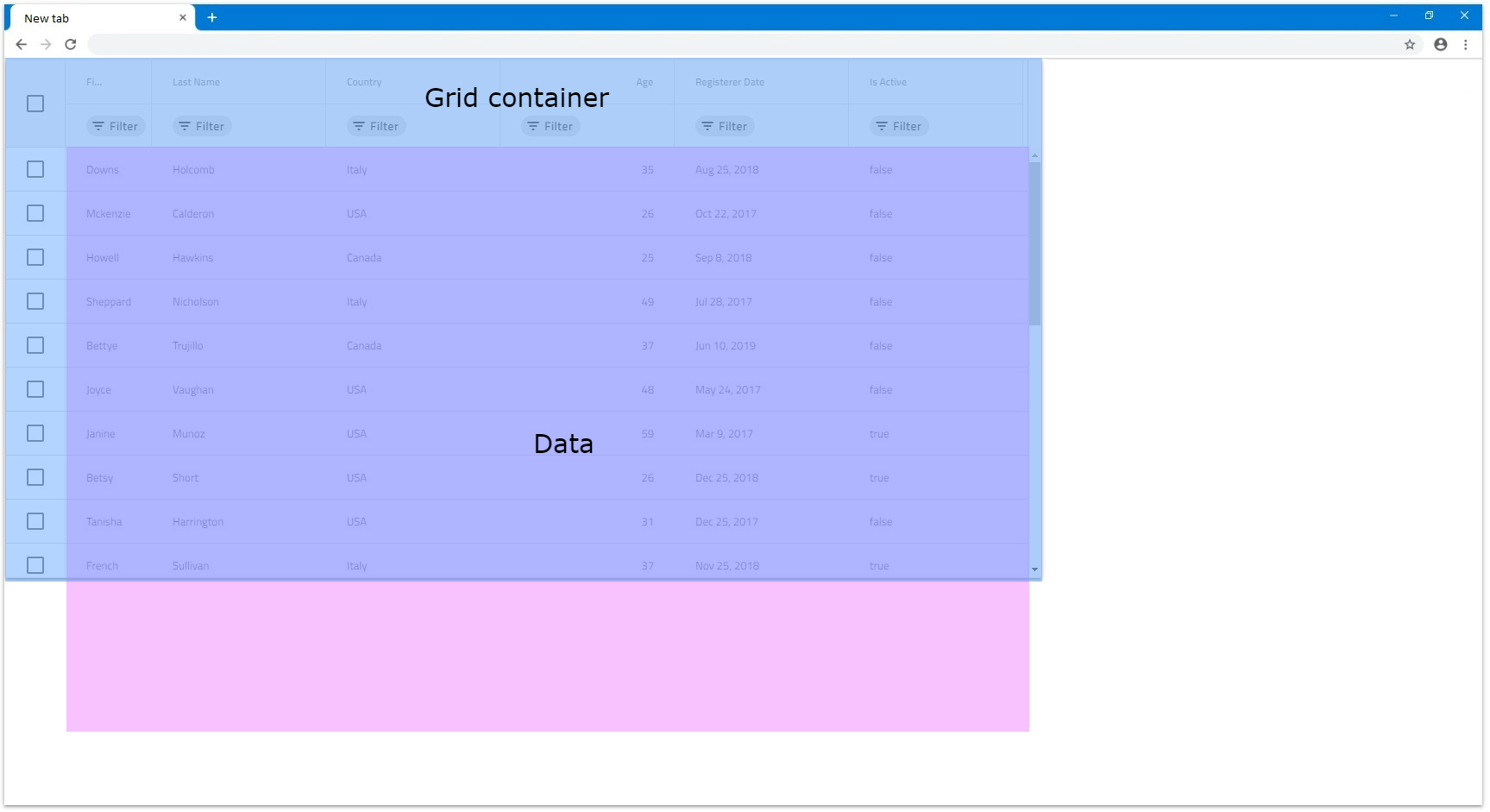
[!Note] Feature columns like Row Selector checkbox column and etc. fill additional space that is taken into account when autosizing columns.
Pixels
When columns have set specific Width in pixels, they stick to that size, unless they are resized manually. Since the combined Width of the columns is static, it can be less than the IgbGrid Width or exceed it.
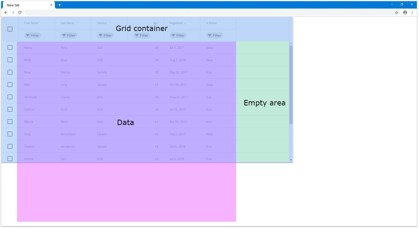
- If the combined
widthof all columns is less than theIgbGridWidth, there would be an empty are inside the grid that the columns wouldn't be able to fill. This is the expected behavior of theIgbGrid. In the next example the columns have150pxwidth.
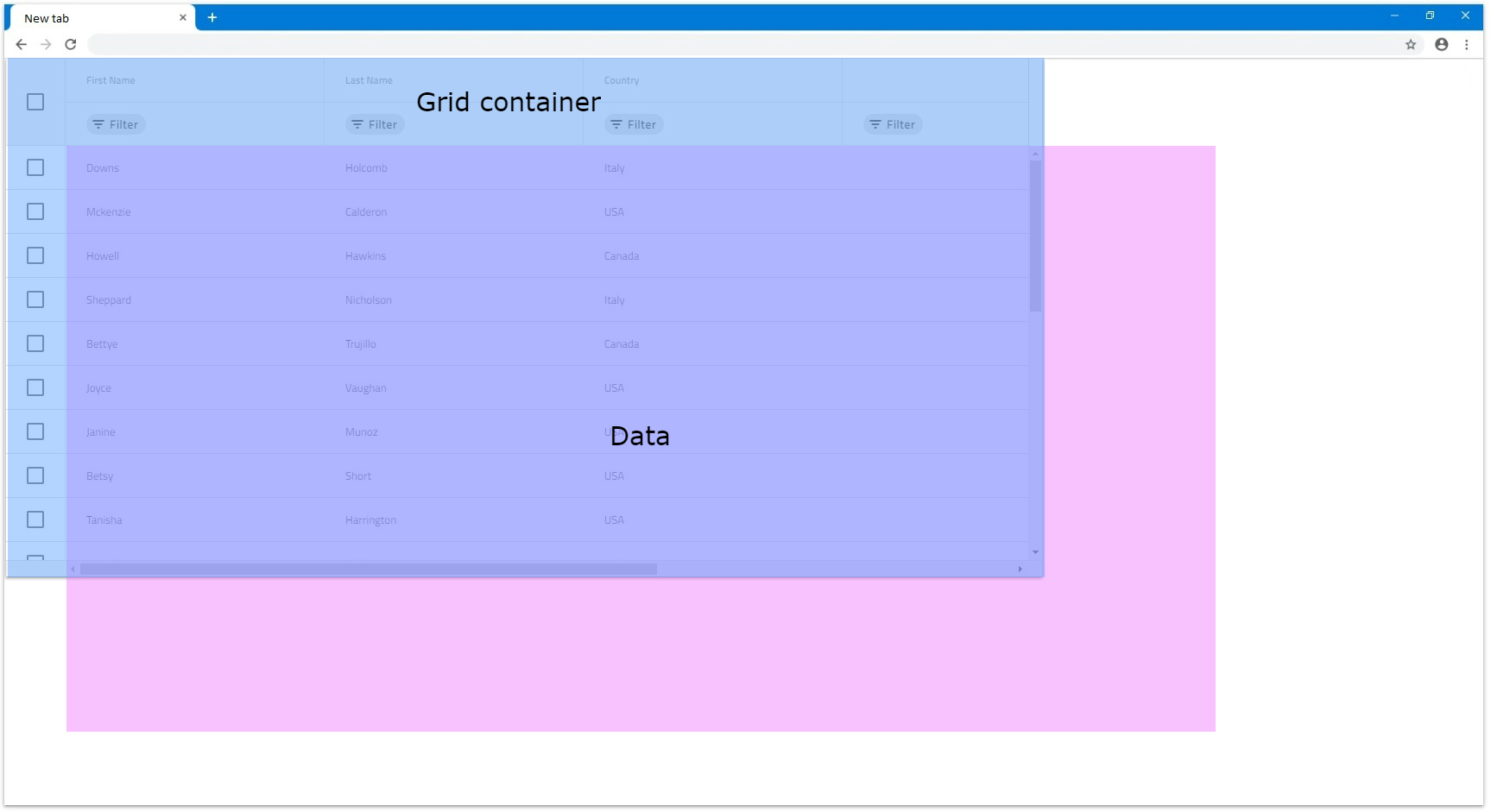
- If the combined
Widthof all columns is bigger than the actualIgbGridWidth, a horizontal scrollbar will be rendered. In the next example each of the 6 columns have width of300pxand grid has width of1200px, which means that the columns combined have excess of600pxthat goes out of bounds.
Percentages
When columns have set Width in percentages, their size is calculated relatively to the grid size. It is similar to how width in pixels works, but provides also responsiveness to the columns which means that when the grid is resized, the columns also will resize accordingly.
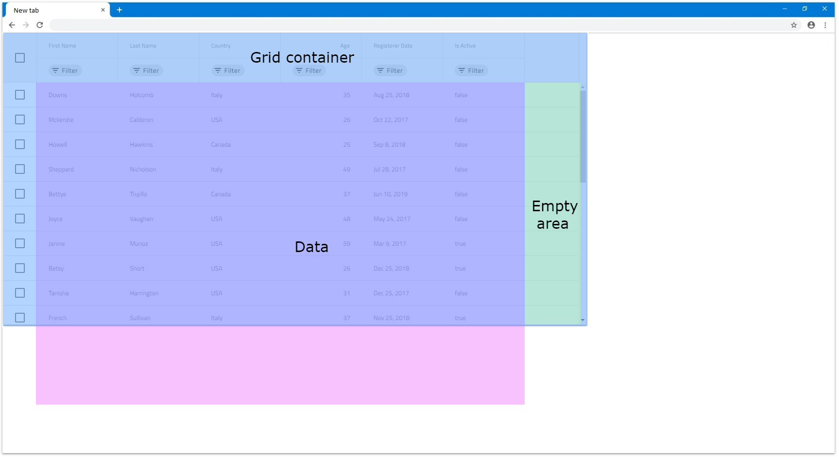
- If the combined width of all columns is less than
100%, similarly to when in pixels, there could be an empty area of the grid that the columns do not cover.
- If the combined width is exactly
100%, the columns will fill all available space of the grid.
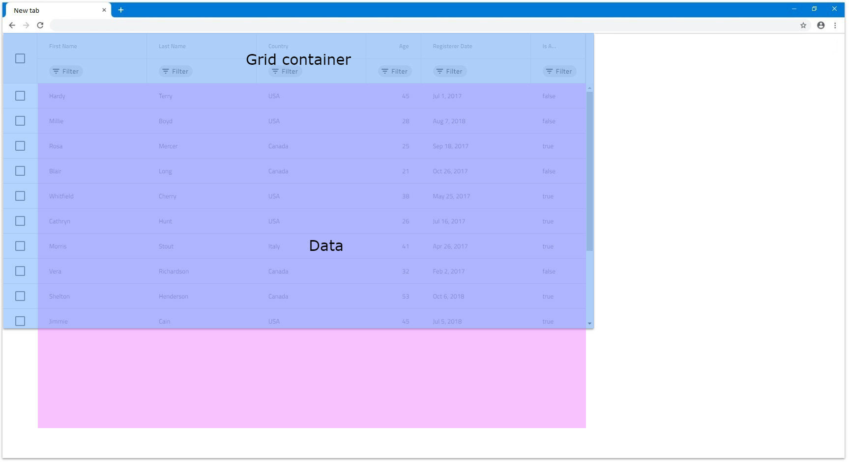
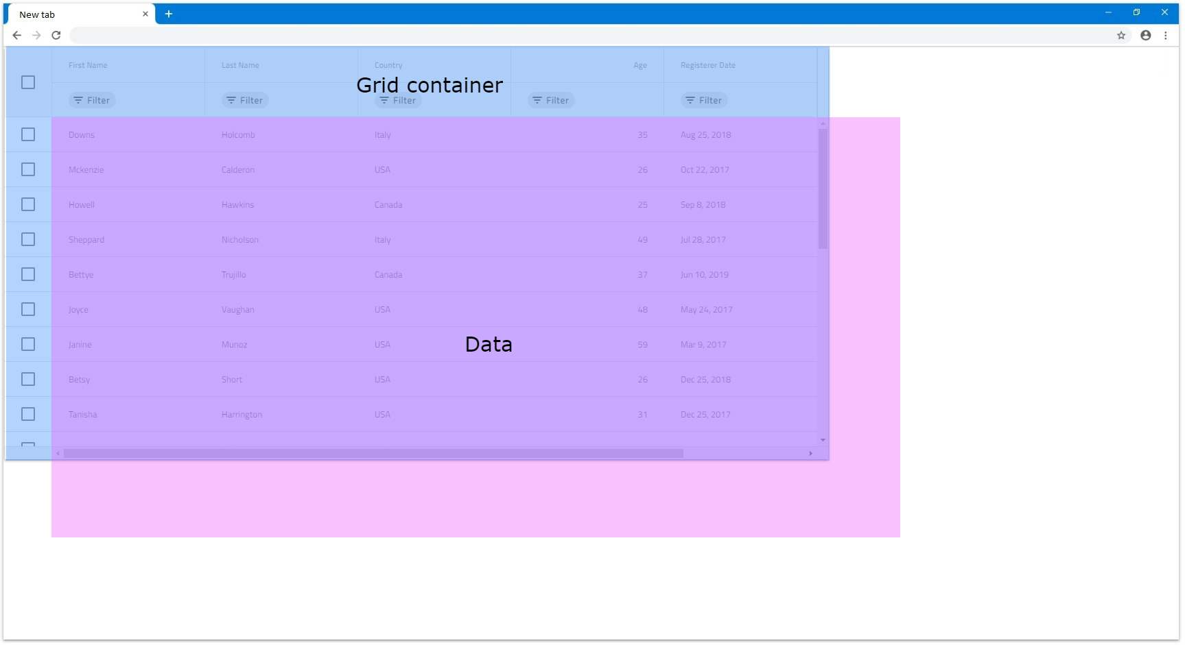
- If the combined width exceeds
100%in order for the user to be able to see the columns out of view, a horizontal scrollbar is rendered.
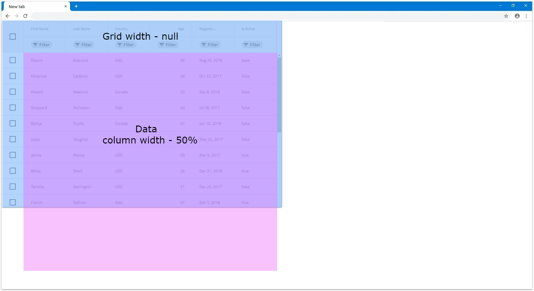
- If columns are set in percentages and the grid
Widthis set tonull, it would applyWidthof136pxto each column. That is because the columns cannot be sized relatively to the grid, since it doesn't haveWidthitself and relies on its content to be sized when itsWidthisnull. In the following example all 6 columns haveWidthset to50%:
API References
Additional Resources
Our community is active and always welcoming to new ideas.