Getting Started With Ignite UI for Web Components
Ignite UI for Web Components is a complete set of UI widgets, components, and Figma UI kits for Web Components by Infragistics. It enables developers to build modern, high-performance HTML5 and JavaScript apps for desktop browsers, mobile experiences, and progressive web apps (PWAs).
Ignite UI for Web Components comprises several packages available under either an MIT or a commercial license, depending on the components and services they contain. For a detailed list of components and their license, please refer to the License FAQ and Installation and Open Source vs Premium topics.
Install Ignite UI CLI
To create an application from scratch and configure it to use the Ignite UI Web Components you can use the Ignite UI CLI. The first step is to install the respective package globally as follows:
npm install -g igniteui-cli
If you want to get a guided experience through the available options, you can initialize the step-by-step mode that will help you create and set up your new application. To start the guide, simply run the ig command:
ig
Then choose Web Components as framework, select Base project template, add a specific component/view or select Complete & Run.
Additionally, you can read more about the Ignite UI CLI in this topic.
Install Polyfills
Run this command to install the web component polyfills:
npm install @webcomponents/custom-elements
Then import the web component polyfills into index.js:
import '@webcomponents/custom-elements/custom-elements.min';
import '@webcomponents/custom-elements/src/native-shim.js';
Install Ignite UI for Web Components
In order to use the Ignite UI Web Components in your application you should install the igniteui-webcomponents package:
npm install igniteui-webcomponents
Next you will need to import the components that you want to use in your index.ts file. You could import one or more components using the defineComponents function like this:
import { defineComponents, IgcAvatarComponent, IgcBadgeComponent } from 'igniteui-webcomponents';

defineComponents(IgcAvatarComponent, IgcBadgeComponent);
You could also import all of the components using the defineAllComponents function:
import { defineAllComponents } from 'igniteui-webcomponents';

defineAllComponents();
[!Note] Importing all of the components will increase the bundle size of your application. That's why we recommend you to import only the components that you are actually using.
The last step is to import the necessary CSS for our components so that they are styled properly:
import 'igniteui-webcomponents/themes/light/bootstrap.css';
After the components are imported you can use them in your html:
<igc-avatar initials="AZ"></igc-avatar>
<igc-badge></igc-badge>
Install Charts and Map Packages
Step 1 - Create the Web Component Project
1 - Open a command line and create a directory named wc-html
mkdir wc-html
2 - Change the command line path to the newly created directory
cd wc-html
3 - Initialize npm in the directory
npm init -y
4 - Install the webpack bundler and the webpack cli as a developer dependency
npm install webpack webpack-cli --save-dev
[!Note] Webpack is a module bundler. Its main purpose is to bundle JavaScript files for usage in a browser, yet it is also capable of transforming, bundling, or packaging just about any resource or asset.
5 - Open the project in VS Code
code .
6 - Create a new file named index.html with this code:
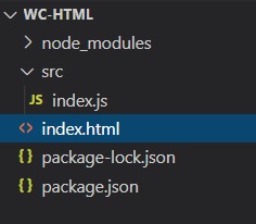
7 - Create a new folder named src, and within that folder create a new file named index.js. Your project structure should look like this:
8 - Update the package.json file to include a build script using webpack
  "scripts": {
    "build": "webpack ./src/index.js -o ./dist/ --output-filename index.bundle.js"
  },
[!Note] This script will use webpack to bundle the index.js file into another file called index.bundle.js and place it into a folder named dist.
If a JavaScript heap out of memory issue occurs while building you can increase the heap size by using this build command instead:
"scripts": {
    "build": "node --max_old_space_size=8192 node_modules/webpack/bin/webpack src/index.js -o dist/index.bundle.js"
},
Step 2 - Install Polyfills
1 - Open a terminal in VS Code (View -> Terminal menu or press CTRL + ` keys)
2 - Type this command to install the web component polyfills:
npm install @webcomponents/custom-elements
3 - Import the web component polyfills into index.js
import '@webcomponents/custom-elements/custom-elements.min';
import '@webcomponents/custom-elements/src/native-shim.js';
Step 3 - Install Ignite UI for Web Components and lit-html
1 - Install the Ignite UI for Web Component using npm. In this example, we will install the Map web component:
npm install --save igniteui-webcomponents-core
npm install --save igniteui-webcomponents-charts
npm install --save igniteui-webcomponents-maps
npm install lit-html
2 - Import the Geographic Map modules and ModuleManager in index.js file:
import { IgcGeographicMapModule } from 'igniteui-webcomponents-maps';
import { IgcDataChartInteractivityModule } from 'igniteui-webcomponents-charts';
// module manager for registering the modules
import { ModuleManager } from 'igniteui-webcomponents-core';
3 - Register the Geographic Map modules using the ModuleManager
ModuleManager.register(
    IgcGeographicMapModule,
    IgcDataChartInteractivityModule
);
4 - Add the Geographic Map web component to the body of index.html file
<body>
    <igc-geographic-map id="map" height="500px" width="100%">
    </igc-geographic-map>
</body>
Step 4 - Build and Run the Web Component Project
1 - Open a terminal in VS Code and execute the build script
npm run build
[!Note] This command will run the build script we created earlier. The build script will generate a file named index.bundle.js in a folder named dist
2 - Add the index.bundle.js script to the end of body element in index.html file.
<body>
    <igc-geographic-map id="map" height="500px" width="100%">
    </igc-geographic-map>

    <script src="dist/index.bundle.js"></script>
</body>
3 - To run the project, launch a local development server. In this example, we are using Live Server. Right-click within the editor of index.html and select Open with Live Server
[!Note] Live Server is an extension to Visual Studio Code that allows you to launch a local development server with live reload feature for static & dynamic pages. This extension can be installed via the Visual Studio Code Extensions tab, or by downloading it from the Visual Studio Marketplace.
4 - Navigate to the index.html using a web browser on your local server. The final result should show interactive map of the world:
Ignite UI for Web Components Packages Overview
Ignite UI for Web Components is a complete set of UI widgets, components, and UI kits for design tools and supporting services for Web Components. Designed to enable developers to build the most modern, high-performance HTML5 and JavaScript apps for modern desktop browsers, mobile experiences, and progressive web apps (PWAs) targeting the browsers web components APIs.
Charts & Graphs
Ignite UI for Web Components contains a library of Charts & Graphs that lets you visualize any type of data through its 65+ types of chart series and combinations to create stunning and interactive charts and dashboards. Built for speed and beauty, designed to work on every modern browser and with complete touch and interactivity, you can quickly build responsive visuals on any device.
Gauges
Ignite UI for Web Components provides Radial Gauge, Linear Gauge, and Bullet Graph components used to illustrate data in an easy and intuitive way. The Radial Gauge has a variety of customization options in order to create a predefined shape and scale. The Linear Gauge provides a simple view of a value compared against a scale and one or more ranges. It supports one scale, one set of tick marks and one set of labels. The Bullet Graph component lets you create data visualizations, replacing meters and gauges that are used on dashboards with simple bar charts.
Maps
The Ignite UI for Web Components Geographic Map component brings the ability to visualize geographic data in your application. It can render data sets consisting of many geographic locations in shapes of markers, lines, polygons, or even interactive bitmaps. It allows you to overlay multiple map layers with geographic data, mark specific geographic locations and display information using custom markers and colors.
Grids & Inputs
Ignite UI for Web Components provides several Grid components that allow you to bind and display data with little configuration in the form of Grid Lite - a light-weight grid component under MIT license, Data Grid - a feature-rich grid component under commercial license, List, Tree, and even Spreadsheet.
Buttons, Inputs, Layouts, and Menus
Ignite UI for Web Components provides various types of Buttons, Inputs, Menus, and Layouts that give you the ability to build modern web applications using encapsulation and the concept of reusable components in a dependency-free approach. See the Storybook here. These components are based on the Indigo Design System, are fully supported by App Builder and are backed by ready-to-use UI kits for Figma.