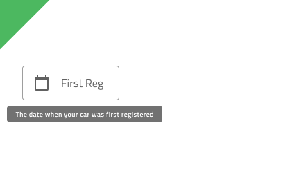
Tooltip
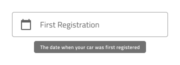
Use the Tooltip Component to show additional information that describes another component or its purpose in the user interface in a transient way. It becomes visible upon user interaction and may disappear after certain time or upon user interaction. The Tooltip is visually identical to the Ignite UI for Angular Tooltip Component
Tooltip Demo
Styling
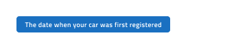
The Tooltip comes with styling flexibility through the options available for the background color and message text style. However, it is recommended to use the predefined colors to assure optimal contrast with the background and legibility of the tooltip message.
Usage
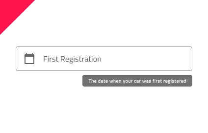
When displaying Tooltip for a given element it is important how the tooltip is positioned. In most cases, both elements should be centrally aligned in relation to each other. The only exception is when such an alignment would cause part of the Tooltip to be cut off, then the positioning should be such that the whole Tooltip fits in the visible area.
| Do | Don't |
|---|---|
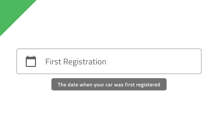 |
 |
 |
 |
Additional Resources
Our community is active and always welcoming to new ideas.
 GitHub