Angular Query Builder Component Overview
Angular Query Builder is part of our Angular Components and it provides a rich UI that allows developers to build complex data filtering queries for a specified data set. With this component they can build a tree of expressions and set AND/OR conditions between them with editors and condition lists determined by each field's data type. The expression tree can then be easily transformed to a query in the format the backend supports.
The IgxQueryBuilderComponent component provides a way to build complex queries through the UI. By specifying AND/OR operators, conditions and values the user creates an expression tree which describes the query.
Angular Query Builder Example
We’ve created this Angular Query Builder example to show you the default functionalities of the Angular Query Builder component. Click the plus button to add conditions, “and” group as well as “or” group. Grouping or ungrouping expressions as well as re-ordering could be achieved via the Drag&Drop functionality.
Getting Started with Ignite UI for Angular Query Builder
To get started with the Ignite UI for Angular Query Builder component, first you need to install Ignite UI for Angular. In an existing Angular application, type the following command:
ng add igniteui-angular
For a complete introduction to the Ignite UI for Angular, read the getting started topic.
The next step is to import the IgxQueryBuilderModule in the app.module.ts file.
// app.module.ts

import { IgxQueryBuilderModule } from 'igniteui-angular/query-builder';
// import { IgxQueryBuilderModule } from '@infragistics/igniteui-angular'; for licensed package

@NgModule({
    ...
    imports: [..., IgxQueryBuilderModule],
    ...
})
export class AppModule {}
Alternatively, as of 16.0.0 you can import the IgxQueryBuilderComponent as a standalone dependency, or use the IGX_QUERY_BUILDER_DIRECTIVES token to import the component and all of its supporting components and directives.
// home.component.ts

import { IGX_QUERY_BUILDER_DIRECTIVES } from 'igniteui-angular/query-builder';
import { FilteringExpressionsTree, FieldType } from 'igniteui-angular/core';
// import { IGX_QUERY_BUILDER_DIRECTIVES, FilteringExpressionsTree, FieldType } from '@infragistics/igniteui-angular'; for licensed package

@Component({
    selector: 'app-home',
    template: `
    <igx-query-builder #queryBuilder
        [entities]="entities"
        [(expressionTree)]="expressionTree"
        (expressionTreeChange)="onExpressionTreeChange()">
    </igx-query-builder>
    `,
    styleUrls: ['home.component.scss'],
    standalone: true,
    imports: [IGX_QUERY_BUILDER_DIRECTIVES]
    /* or imports: [IgxQueryBuilderComponent] */
})
export class HomeComponent {
    public expressionTree: FilteringExpressionsTree;
    public entities: Array<any>;

    public onExpressionTreeChange() {
        ...
    }
}
Now that you have the Ignite UI for Angular Query Builder module or directives imported, you can start using the igx-query-builder component.
Using the Angular Query Builder
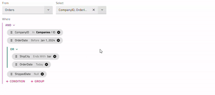
If no expression tree is initially set, you start by choosing an entity and which of its fields the query should return. After that, conditions or sub-groups can be added.
In order to add a condition you select a field, an operand based on the field data type and a value if the operand is not unary. The operands In and Not In will allow you to create an inner query with conditions for a different entity instead of simply providing a value. Once the condition is committed, a chip with the condition information appears. By clicking or hovering the chip, you have the options to modify it or add another condition or group right after it.
Clicking on the (AND or OR) button placed above each group, will open a menu with options to change the group type or ungroup the conditions inside.
Since every condition is related to a specific field from a particular entity changing the entity will lead to resetting all preset conditions and groups. When selecting a new entity a confirmation dialog will be shown, unless the showEntityChangeDialog input property is set to false.
You can start using the component by setting the entities property to an array describing the entity name and an array of its fields, where each field is defined by its name and data type. Once a field is selected it will automatically assign the corresponding operands based on the data type.
The Query Builder has the expressionTree input property. You could use it to set an initial state of the control and access the user-specified filtering logic.
ngAfterViewInit(): void {
    const innerTree = new FilteringExpressionsTree(FilteringLogic.And, undefined, 'Companies', ['ID']);
    innerTree.filteringOperands.push({
        fieldName: 'Employees',
        condition: IgxNumberFilteringOperand.instance().condition('greaterThan'),
        conditionName: 'greaterThan',
        searchVal: 100
    });
    innerTree.filteringOperands.push({
        fieldName: 'Contact',
        condition: IgxBooleanFilteringOperand.instance().condition('true'),
        conditionName: 'true'
    });

    const tree = new FilteringExpressionsTree(FilteringLogic.And, undefined, 'Orders', ['*']);
    tree.filteringOperands.push({
        fieldName: 'CompanyID',
        condition: IgxStringFilteringOperand.instance().condition('inQuery'),
        conditionName: 'inQuery',
        searchTree: innerTree
    });
    tree.filteringOperands.push({
        fieldName: 'OrderDate',
        condition: IgxDateFilteringOperand.instance().condition('before'),
        conditionName: 'before',
        searchVal: new Date('2024-01-01T00:00:00.000Z')
    });
    tree.filteringOperands.push({
        fieldName: 'ShippedDate',
        condition: IgxDateFilteringOperand.instance().condition('null'),
        conditionName: 'null'
    });

    this.queryBuilder.expressionTree = tree;
}
The expressionTree is a two-way bindable property which means a corresponding expressionTreeChange output is implemented that emits when the end-user changes the UI by creating, editing or removing conditions. It can also be subscribed separately to receive notifications and react to such changes.
<igx-query-builder #queryBuilder
    [entities]="entities"
    [(expressionTree)]="expressionTree"
    (expressionTreeChange)="onExpressionTreeChange()">
</igx-query-builder>
Expressions Dragging
Condition chips can be easily repositioned using mouse Drag & Drop or Keyboard reordering approaches. With those, users can adjust their query logic dynamically.
- Dragging a chip does not modify its condition/contents, only its position.
- Chip can also be dragged along groups and subgroups. For example, grouping/ungrouping expressions is achieved via the Expressions Dragging functionality. In order to group already existing conditions, first you need to add a new group through the 'add' group button. Then via dragging, the required expressions can be moved to that group. In order to ungroup, you could drag all conditions outside their current group and once the last condition is moved out, the group will be deleted.
Note
Chips from one query tree cannot be dragged in another, e.g. from parent to inner and vice versa.
Keyboard interaction
Key Combinations
- Tab / Shift + Tab - navigates to the next/previous chip, drag indicator, remove button, 'add' expression button.
- Arrow Down/Arrow Up - when chip's drag indicator is focused, the chip can be moved up/down.
- Space / Enter - focused expression enters edit mode. If chip is been moved, this confirms it's new position.
- Esc - chip's reordering is canceled and it returns to it's original position.
Note
Keyboard reordering provides the same functionality as mouse Drag & Drop. Once a chip is moved, user has to confirm the new position or cancel the reorder.
Templating
The Ignite UI for Angular Query Builder Component allows defining templates for the component's header and the search value using the following predefined reference names:
Header Template
By default the IgxQueryBuilderComponent header would not be displayed. In order to define such, the IgxQueryBuilderHeaderComponent should be added inside of the igx-query-builder.
Then, for setting the header title could be used the title input and passing content inside of the igx-query-builder-header allows templating the query builder header.
The code snippet below illustrates how to do this:
<igx-query-builder #queryBuilder [entities]="this.entities">
        <igx-query-builder-header [title]="'Query Builder Template Sample'">
        </igx-query-builder-header>
</igx-query-builder>
Search value
The search value of a condition can be templated using the igxQueryBuilderSearchValue directive, applied to an <ng-template> inside of the igx-query-builder's body:
<igx-query-builder #queryBuilder
    [entities]="entities"
    [expressionTree]="expressionTree">
    <ng-template #searchValueTemplate
                igxQueryBuilderSearchValue
                let-searchValue
                let-selectedField = "selectedField"
                let-selectedCondition = "selectedCondition"
                let-defaultSearchValueTemplate = "defaultSearchValueTemplate">
        @if (
            selectedField?.field === 'Region' &&
            (selectedCondition === 'equals' || selectedCondition === 'doesNotEqual')
            ){
            <igx-select [placeholder]="'Select region'" [(ngModel)]="searchValue.value">
                <igx-select-item *ngFor="let reg of regionOptions" [value]="reg">
                    {{ reg.text }}
                </igx-select-item>
            </igx-select>
        }
        @else if (
            selectedField?.field === 'OrderStatus' &&
            (selectedCondition === 'equals' || selectedCondition === 'doesNotEqual')
            ){
            <igx-radio-group>
                <igx-radio class="radio-sample"
                           *ngFor="let stat of statusOptions"
                           value="{{stat.value}}"
                           [(ngModel)]="searchValue.value">
                    {{stat.text}}
                </igx-radio>
            </igx-radio-group>
        }
            @else {
            <ng-container #defaultTemplate *ngTemplateOutlet="defaultSearchValueTemplate"></ng-container>
        }
    </ng-template>
</igx-query-builder>
Formatter
In order to change the appearance of the search value in the chip displayed when a condition is not in edit mode, you can set a formatter function to the fields array. The search value and selected condition could be accessed through the value and rowData arguments as follows:
this.ordersFields = [
    { field: "CompanyID", dataType: "string" },
    { field: "OrderID", dataType: "number" },
    { field: "EmployeeId", dataType: "number" },
    { field: "OrderDate", dataType: "date" },
    { field: "RequiredDate", dataType: "date" },
    { field: "ShippedDate", dataType: "date" },
    { field: "ShipVia", dataType: "number" },
    { field: "Freight", dataType: "number" },
    { field: "ShipName", dataType: "string" },
    { field: "ShipCity", dataType: "string" },
    { field: "ShipPostalCode", dataType: "string" },
    { field: "ShipCountry", dataType: "string" },
    { field: "Region", dataType: "string", formatter: (value: any, rowData: any) => rowData === 'equals' || rowData === 'doesNotEqual' ? `${value.value}` : value }},
    { field: "OrderStatus", dataType: "number" }
];
Demo
We’ve created this Angular Query Builder example to show you the templating and formatter functionalities for the header and the search value of the Angular Query Builder component.
Styling
Query Builder Theme Property Map
When you modify a primary property, all related dependent properties are automatically updated to reflect the change:
| Primary Property | Dependent Property | Description |
|---|---|---|
$background |
$label-foreground | The color for query builder labels "from" & "select" |
| $header-background | The background color of the query builder header | |
| $header-foreground | The foreground color of the query builder header | |
| $subquery-header-background | The background color of the subquery header | |
| $subquery-border-color | The border color of the query block | |
| $separator-color | The separator color of the query block | |
| $header-border (Bootstrap only) | The border color of the query builder header |
To get started with styling the Query Builder, we need to import the index file, where all the theme functions and component mixins live:
@use "igniteui-angular/theming" as *;

// IMPORTANT: Prior to Ignite UI for Angular version 13 use:
// @import '~igniteui-angular/lib/core/styles/themes/index';
The Query Builder takes its background color from the its theme, using the background parameter. In order to change the background we need to create a custom theme:
$custom-query-builder: query-builder-theme(
  $schema: $dark-material-schema,
  $background: #292826,
  ...
);
Since we have other components inside the Query Builder, such as buttons, chips, dropdowns and inputs, we need to create a separate theme for each one:
$custom-button: flat-button-theme(
  $schema: $dark-material-schema,
  $foreground: #ffcd0f,
);

$custom-input-group: input-group-theme(
  $schema: $dark-material-schema,
  $focused-secondary-color: #ffcd0f
);

$custom-chip: chip-theme(
  $schema: $dark-material-schema,
  $background: #ffcd0f,
);

$custom-icon-button: outlined-icon-button-theme(
  $schema: $dark-material-schema,
  $foreground: #ffcd0f,
);
In this example we only changed some of the parameters for the listed components, but the button-theme, chip-theme, drop-down-theme, input-group-theme themes provide way more parameters to control their respective styling.
Note
Instead of hardcoding the color values like we just did, we can achieve greater flexibility in terms of colors by using the palette and color functions. Please refer to Palettes topic for detailed guidance on how to use them.
The last step is to include the new component themes using the tokens mixin.
:host {
    @include tokens($custom-query-builder);
    @include tokens($custom-input-group);
    @include tokens($custom-chip);
    @include tokens($custom-icon-button);

    .igx-filter-tree__buttons {
      @include tokens($custom-button);
    }
}
Note
If the component is using an Emulated ViewEncapsulation, it is necessary to penetrate this encapsulation using ::ng-deep to style the components inside the query builder component (button, chip, drop-down ...etc).
Demo
Note
The sample will not be affected by the selected global theme from Change Theme.
Styling with Tailwind
You can style the query builder using our custom Tailwind utility classes. Make sure to set up Tailwind first.
Along with the tailwind import in your global stylesheet, you can apply the desired theme utilities as follows:
@import "tailwindcss";
...
@use 'igniteui-theming/tailwind/utilities/material.css';
The utility file includes both light and dark theme variants.
- Use
light-*classes for the light theme. - Use
dark-*classes for the dark theme. - Append the component name after the prefix, e.g.,
light-query-builder,dark-query-builder.
Once applied, these classes enable dynamic theme calculations. From there, you can override the generated CSS variables using arbitrary properties. After the colon, provide any valid CSS color format (HEX, CSS variable, RGB, etc.).
You can find the full list of properties in the query-builder-theme. The syntax is as follows:
<igx-query-builder
  class="!light-query-builder ![--background:#90B69F]">
  ...
</igx-query-builder>
Note
The exclamation mark(!) is required to ensure the utility class takes precedence. Tailwind applies styles in layers, and without marking these styles as important, they will get overridden by the component’s default theme.
At the end your query builder should look like this:
You can also streamline your Angular app development using WYSIWYG App Builder™ with real UI components.
API References
- IgxQueryBuilderComponent API
- IgxQueryBuilderHeaderComponent
- IgxQueryBuilderSearchValueTemplateDirective
- IgxQueryBuilderComponent Styles
Additional Resources
Our community is active and always welcoming to new ideas. GitHub