
The Fastest Web Components Grid
Ignite UI for Web Components provides a complete library of Web Components-native, Material-based UI components, including the world’s fastest virtualized Web Components data grid.
Web Components Grid Example
In this Web Components grid example, you can see how users can customize their data view by leveraging the various features built into the grid, like data search and filtering, columns sorting, resizing, pinning and hiding, row selection, export to excel and csv, horizontal and vertical scrolling. We have provided examples for cell templating that includes components like linear progress bar indicator and sparkline. View more features in this topic.
What is a Web Components Grid?
The Web Components data grid is a component used to display tabular data in a series of rows and columns. Data grids, also known as tables, are well known in the desktop world with popular software such as Microsoft Excel. While grids have been available on desktop platforms for a long time, they have recently become part of web app UIs, such as Web Components UI. Modern grids can be complex and may include a range of functionalities, including data binding, editing, Excel-like filtering, custom sorting, grouping, row reordering, row and column freezing, row aggregation, and exporting to Excel, CSV, and pdf formats.
Why Use a Web Components Grid?
Web Components data grids are essential in use cases where lots of data must be stored and sorted through quickly. This can include industries such as financial or insurance that use high-volume, high-velocity data frequently. Often the success of these companies is dependent on the functionality and performance of these data grids. When stock decisions need to be made in microseconds, for example, it’s imperative that the data grid performs with no lag time or flicker.
Key Features
The Ignite UI for Web Components Data Grid is not just for high-volume and real-time data. It is a feature-rich Web Components grid that gives you capabilities that you would never be able to accomplish with so little code on your own.
Here are a few of the data grid’s key features:
-
Virtualized Rows and Columns so you can load millions of records
-
Inline Editing with Cell, and Row Update options
-
Inline Editing with Cell
-
Excel-style Filtering and full Excel Keyboard Navigation capability
-
Interactive Outlook-style Grouping
-
Column Summaries based on any data in a grid cell or column
-
Size to adjust the height and sizing of the rows
Data Virtualization and Performance
Seamlessly scroll through unlimited rows and columns in your Web Components grid, with the data grid’s column and row level virtualization. With support for local or remote data sources, you get the best performance no matter where your data lives. Your users will experience Excel-like scrolling, with enterprise speed — no lag, screen flicker, or visual delay — giving you the best user experience (UX) without compromising performance.
Quick and Easy to Customize, Build and Implement
The Ignite UI Web Components Data Grid can handle unlimited rows and columns of data, while providing access to custom templates and real-time data updates. Featuring an intuitive API for easy theming and branding, you can quickly bind to data with minimal code.
Web Components Grid Paging, Sorting, Filtering, & Searching
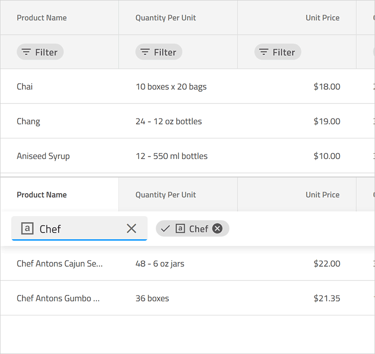
Allow users to navigate your data set with our default [pager](grid/paging.md) or create your own template to give your own paging experience. With complete support for single and multi-column sorting, full-text [search](grid/search.md) on the grid, and several [advanced filtering](grid/advanced-filtering.md) options, including data-type based [Microsoft Excel-style Filtering](grid/excel-style-filtering.md).
Inline Web Components Grid Editing
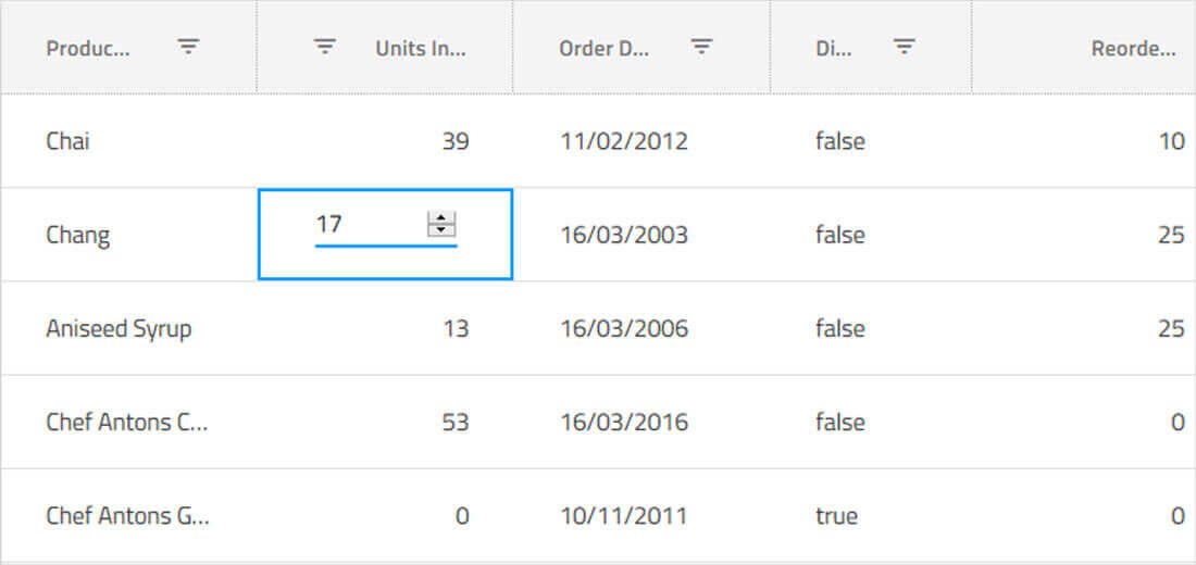
We provide you default [cell templates for editable columns](data-grid.md#cell-editing-template) which are based on the data type of the column. You can define your own custom templates for editable columns and override default behavior for committing and discarding changes in the cell value.
Keyboard Navigation & Row/Cell Selection
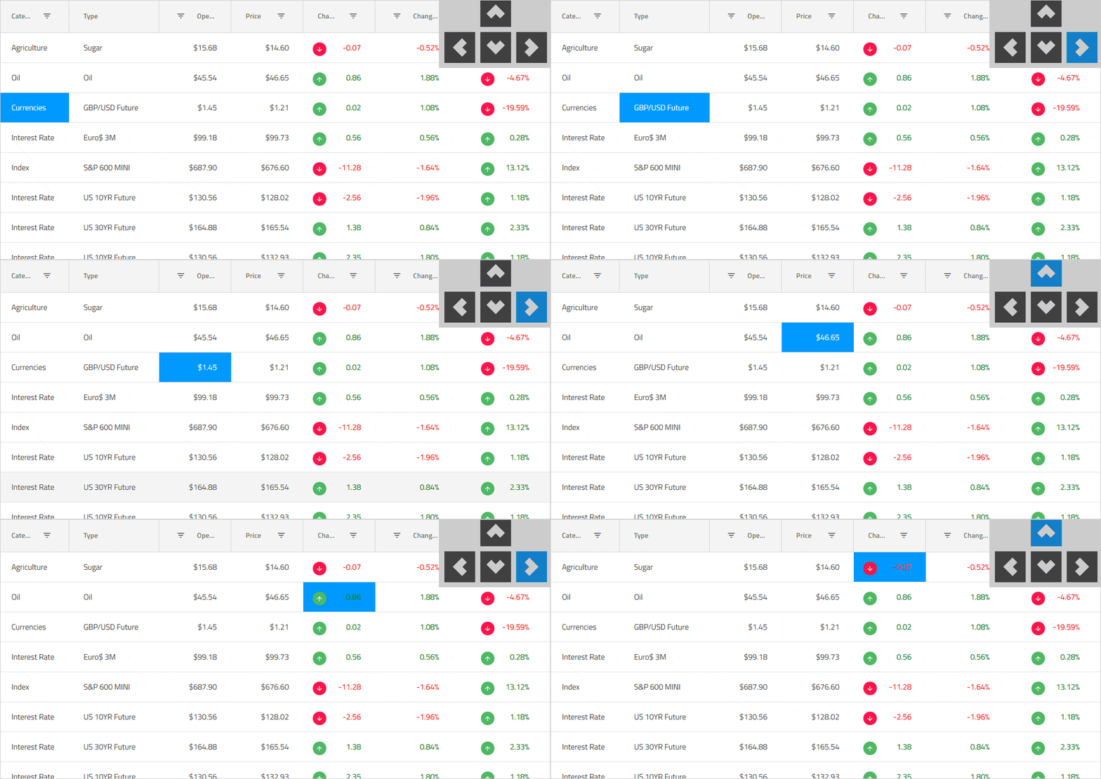
Ensure accessibility compliance and improve usability, enabling Excel-like [keyboard navigation](grid/keyboard-navigation.md) in the Web Components data grid, using the up, down, right, left, tab, and Enter keys. You can toggle single or multiple row selection in the Web Components grid using the mouse or keyboard to select or de-select full rows, or use the built-in select all / de-select all checkbox in the grid toolbar to work with row selection. Learn about our most recent enhancements to this feature.
Web Components Grid Accessibility & ARIA Support

Each of our Web Components components in Ignite UI for Web Components has been implemented according to the latest accessibility guidelines and specifications. Our Web Components components have been tested using OS or Browser provided accessibility technology – screen readers. Our team ensures not only that the guidelines are implemented, but also that the actual content delivered to visually impaired or blind people is actually consumable and user-friendly for them. The Ignite UI for Web Components data grid is fully accessible with a11y Keyboard accessibility, ARIA, and accessible color palette. Learn more.
Column Grouping, Pinning, Summaries
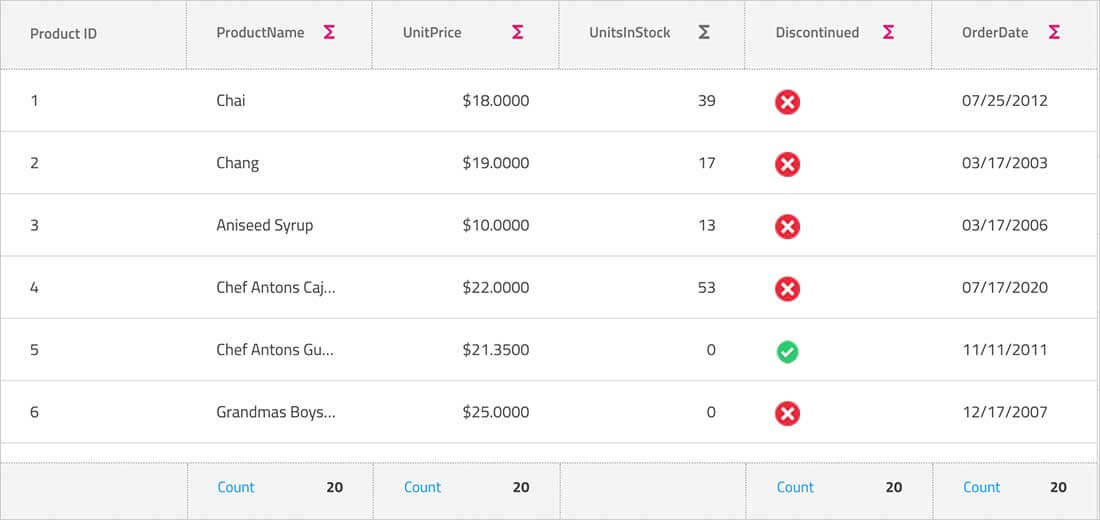
Group columns or pre-set column groups via mouse interaction, touch or our API, with support for built-in column [summaries](grid/summaries.md) or custom summary templates. Enable users to interactively [hide](grid/column-hiding.md) or [move columns](grid/column-moving.md), with full support for interactive [column pinning](grid/column-pinning.md), during move, drag, and reorder operations.
Multi-Column Headers
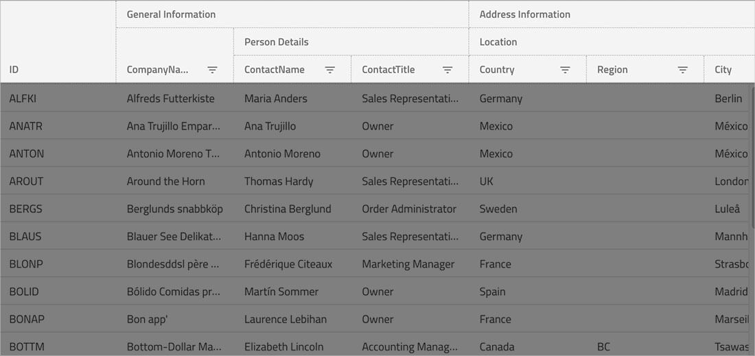
Enable [multi-column headers](grid/multi-column-headers.md), allowing you to group columns under a common header. Every column group could be a representation of combinations between other groups or columns, with full support for column pinning, interactive column moving within groups, sorting, and hiding groups.
Web Components Grid Features
Download the Fastest Web Components Grid Today!
download now30 days free trial. No credit card required.
Ignite UI for Web Components Supported Browsers
- Chrome
- Edge / Edge Chromium
- Firefox
- Safari
- Internet Explorer 11 with polyfills
Ignite UI for Web Components Support Options
- Start at the Web Components Support home page
- Read the Web Components Documentation and experiment with Web Components Samples
- Read the Web Components Blogs to stay up to date
- Submit a Support Case
- Learn from the Web Components Reference Applications
Ignite UI for Web Components Trial License and Commercial
Ignite UI for Web Components is a commercially licensed product available via a subscription model. You can try the Ignite UI for Web Components product for free when you register for a 30-day trial. When you are done with your Trial Period, you can purchase a license from our web site or by calling sales in your region.
Frequently Asked Questions
-
Virtualized Rows and Columns so you can load millions of records
-
Inline Editing with Cell, Row
-
Excel-style Filtering and full Excel Keyboard Navigation capability
-
Interactive Outlook-style Grouping
-
Column Summaries based on any data in a grid cell or column
-
Size to adjust the height and sizing of the rows
To get started with the Web Components Data Grid, follow the steps in the getting started guide. We also maintain a library of sample applications, which are designed to not only inspire but are best practices guides for Web Components development.