Collapsible Column Groups in Angular Data Grid
Multi-column headers allow you to have multiple levels of nested columns and column groups. They also provide the ability to mark each column group as collapsible. Collapsible multi-column headers make it possible to collapse/expand, i.e. to show and hide the nested headers under the current one, which will give you a shortened/summarized information for example.
Angular Grid Collapsible Column Groups Overview Example
Setup
To get started with the IgxGrid and the Collapsible multi-column headers , first you need to install Ignite UI for Angular by typing the following command:
ng add igniteui-angular
For a complete introduction to the Ignite UI for Angular, read the getting started topic.
The next step is to import the IgxGridModule in the app.module.ts file. Also, we strongly suggest that you take a brief look at multi-column groups topic, to see more detailed information on how to setup the column groups in your grid.
Usage
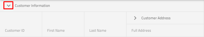
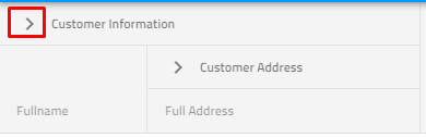
Collapsible Column Groups is a part of the multi-column headers feature which provides a way to collapse/expand a column group to a smaller set of data. When a column group is collapsed, a subset of the columns will be shown to the end-user and the other child columns of the group will hide. Each collapsed/expanded column can be bound to the grid data source, or it may be unbound, thus calculated.
In order to define a column group as collapsible, you need to set the property to [collapsible]="true" and also keep in mind that you need to define the property visibleWhenCollapsed to at least two child columns: at least one column must be visible when the group is collapsed ([visibleWhenCollapsed]="true") and at least one column must be hidden when the group is expanded ([visibleWhenCollapsed]="false"), otherwise the collapsible functionality will be disabled. If visibleWhenCollapsed is not specified for some of the child columns, then this column will be always visible no matter whether the parent state is expanded or collapsed.
So let's see the markup below:
<igx-column-group header="Customer Information" [collapsible]="true"> <!-- Initially the column groups will be expanded--->
    <!--The column below will be visible when its parent is collapsed-->
    <igx-column field="CustomerName" header="Fullname" [dataType]="'string'" [visibleWhenCollapsed]="true"></igx-column>
    <!--The three columns below will be visible when its parent is expanded-->
    <igx-column field="CustomerID" header="Customer ID" [dataType]="'string'" [visibleWhenCollapsed]="false"></igx-column>
    <igx-column field="FirstName" header="First Name" [dataType]="'string'" [visibleWhenCollapsed]="false">
    </igx-column>
    <igx-column field="LastName" header="Last Name" [dataType]="'string'" [visibleWhenCollapsed]="false">
    </igx-column>
    <igx-column-group header="Customer Address"> <!--This column visibility will not be changed based on parent expand/collapsed state-->
        <igx-column field="Country" header="Country" [dataType]="'string'" [sortable]="true">
        </igx-column>
        <igx-column field="City" header="City" [dataType]="'string'" [sortable]="true">
        </igx-column>
    </igx-column-group>
</igx-column-group>
And now let's sum up: every child column has three states:
- Can be always visible, no matter the expanded state of its parent;
- Can be visible, when its parent is collapsed;
- Can be hidden, when its parent is collapsed;
The initial state of the column group which is specified as collapsible is [expanded]="true". But you can easily change this behavior by setting the property [expanded]="false".
Expand/Collapse indicator template
Default expand indicator for the igxGrid is the following:
Default collapse indicator for the igxGrid is the following:
Also, if you need to change the default expand/collapse indicator, we provide two easy ways to do so - via an input property or through a directive.
Using an input property
You can define custom expand/collapse template and provide it to each of the collapsible column groups using collapsibleIndicatorTemplate input property. Check the markup below:
<ng-template #indTemplate let-column="column">
    <igx-icon [attr.draggable]="false" >{{column.expanded ? 'remove' : 'add'}} </igx-icon>
</ng-template>
<igx-column-group header="Customer Information" [collapsible]="true" [collapsibleIndicatorTemplate]="indTemplate">
    <igx-column field="CustomerName" header="Fullname" [dataType]="'string'" [visibleWhenCollapsed]="true"></igx-column>
    <igx-column field="CustomerID" header="Customer ID" [dataType]="'string'" [visibleWhenCollapsed]="false"></igx-column>
    <igx-column-group header="Customer Address" [collapsible]="true" [collapsibleIndicatorTemplate]="indTemplate">
        <igx-column field="Country" header="Country" [dataType]="'string'" [sortable]="true" [visibleWhenCollapsed]="true"></igx-column>
        <igx-column field="City" header="City" [dataType]="'string'" [sortable]="true" [visibleWhenCollapsed]="false"></igx-column>
    </igx-column-group>
</igx-column-group>
Using igxCollapsibleIndicator directive
Another way to achieve this behavior is to use the igxCollapsibleIndicator directive as shown in the example below:
<igx-column-group header="Customer Information" [collapsible]="true">
    <ng-template igxCollapsibleIndicator let-column="column">
        <igx-icon [attr.draggable]="false">{{column.expanded ? 'remove' : 'add'}} </<igx-icon>
    </ng-template>
    <igx-column field="CustomerName" header="Fullname" [dataType]="'string'" [visibleWhenCollapsed]="true"></igx-column>
    <igx-column field="CustomerID" header="Customer ID" [dataType]="'string'" [visibleWhenCollapsed]="false"></igx-column>
    <igx-column-group header="Customer Address" [collapsible]="true">
        <igx-column field="Country" header="Country" [dataType]="'string'" [sortable]="true" [visibleWhenCollapsed]="true"></igx-column>
        <igx-column field="City" header="City" [dataType]="'string'" [sortable]="true" [visibleWhenCollapsed]="false"></igx-column>
    </igx-column-group>
</igx-column-group>
Note
Please keep in mind that initially collapse group option takes precedence over column hidden - If you declared your column to be hidden using the property hidden and you have a group defined where the same column should be shown, the column will be shown.
API References
Additional Resources
- Grid overview
- Virtualization and Performance
- Paging
- Filtering
- Sorting
- Summaries
- Column Moving
- Column Pinning
- Selection
 GitHub