Bootstrap Theming
The Ignite UI for Angular theming engine provides an opportunity to be used in conjunction with other component libraries such as the popular NG Bootstrap based on Bootstrap’s markup and CSS.
Overview
The Ignite UI for Angular is a complete set of Material-based UI Widgets, Components & Figma UI kits and supporting directives for Angular that enables developers to build modern high-performance apps. Our theming engine is easy to use and allows theming granularity on different levels from a single component, multiple components, or the entire suite. Therefore, some users want to take advantage of it not only with Ignite UI components but also with other libraries. In this article, we will look through the usage of Ignite UI together with Ng Bootstrap components.
Demo
Basic Usage
Add NG Bootstrap
If you are using Angular CLI and have an existing Angular project, you can install NG Bootstrap with the command below:
ng add @ng-bootstrap/ng-bootstrap
Once installed, you have to import the NG Bootstrap main module into your app.module.ts file:
import {NgbModule} from '@ng-bootstrap/ng-bootstrap';

@NgModule({
    imports: [
        ...,
        NgbModule,
        ...
    ]
)}
At this point your applications is ready to use the NG Bootstrap components. You can find more information about using the Bootstrap library at their official documentation.
Add Ignite UI for Angular
To install the Ignite UI for Angular package along with all of its dependencies, font imports, and styles references, run the following command in your project:
ng add igniteui-angular
Then, you can use the Ignite UI components by importing their respective modules in your app.module.ts file:
// manually addition of the Igx Avatar component
import { IgxAvatarModule } from 'igniteui-angular/avatar';
// import { IgxAvatarModule } from '@infragistics/igniteui-angular'; for licensed package

@NgModule({
    imports: [
        ...,
        IgxAvatarModule,
        ...
    ]
)}
Follow our Getting Started topic for a complete introduction about using Ignite UI for Angular in existing projects. Further information on how to import and use each of our components along with guided examples can be found in the component's documentation.
Components
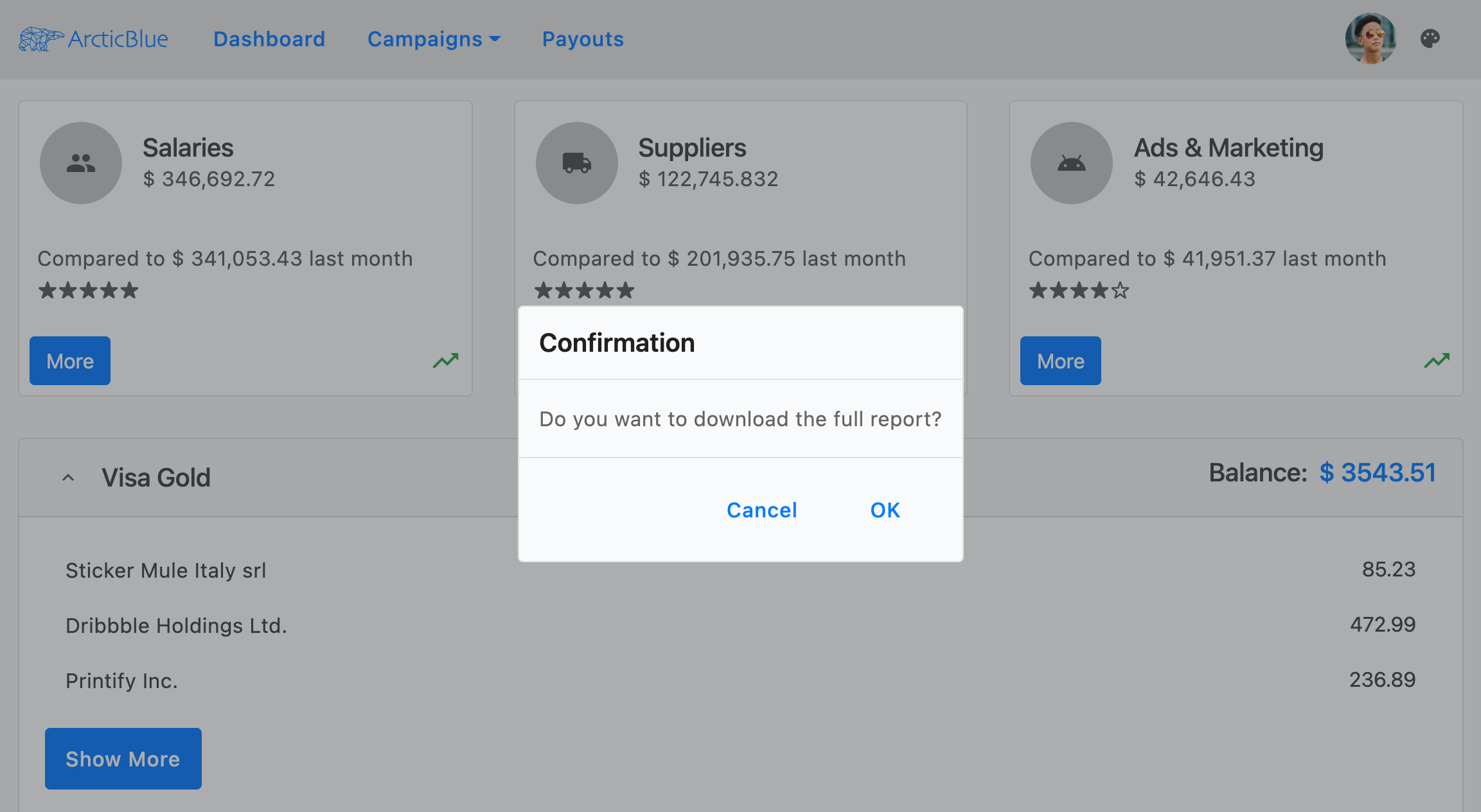
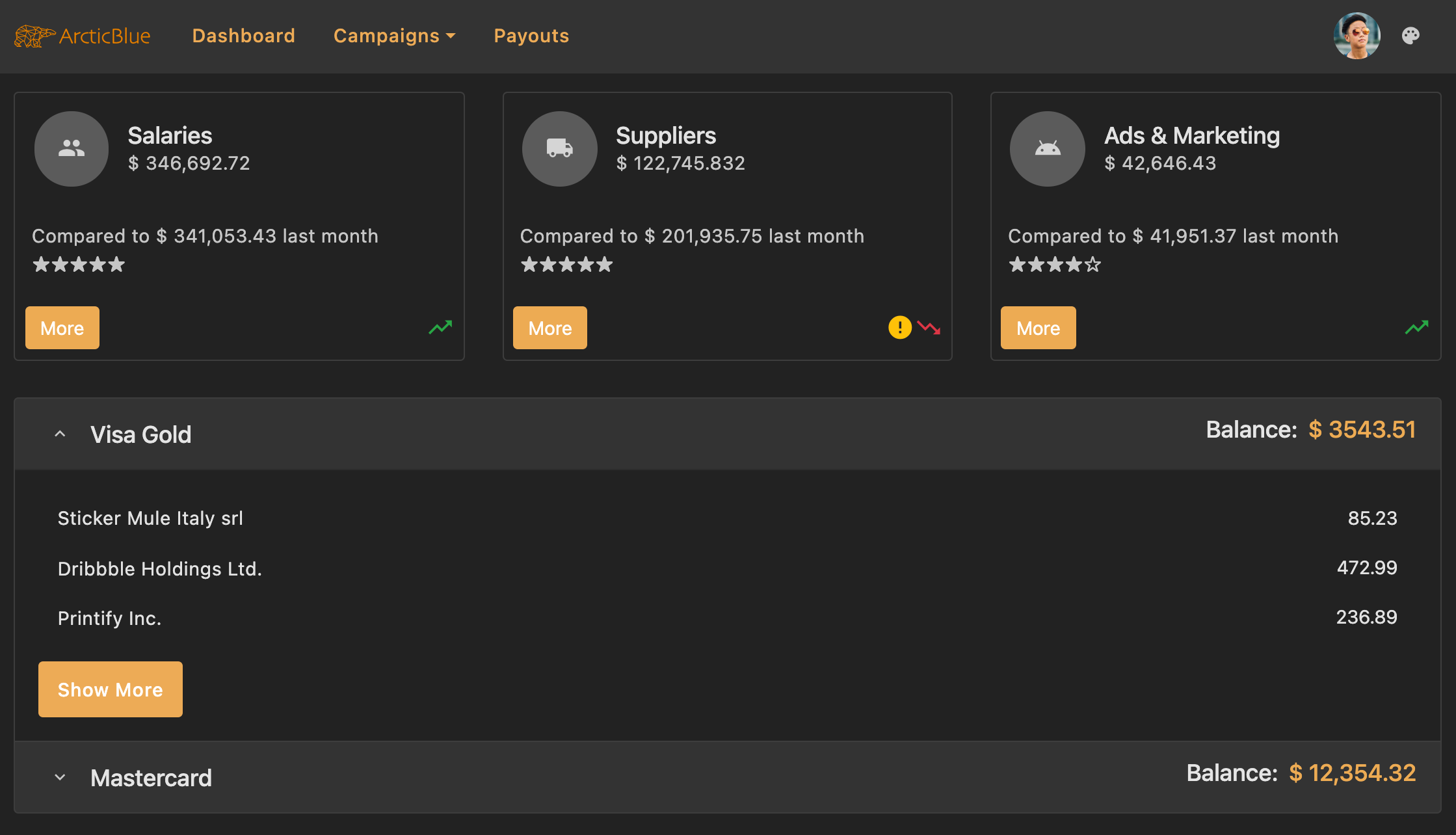
Let's see how our demo sample is done. It is a mixture of Ignite UI and NG Bootstrap components, styled to fit nicely in one application. The navigation in our example is created using the bootstrap navbar together with igx-buttons and igx-avatar. The dropdown under the Campaigns button is also taken from the bootstrap library. Below the nav, we are using the igx-card component to display some statistics. Within the cards, we have placed multiple items - igx-avatars and igx-icons as well as bootstrap buttons and ngb-ratings.

Clicking on the More buttons, you will see the igx-dialog:

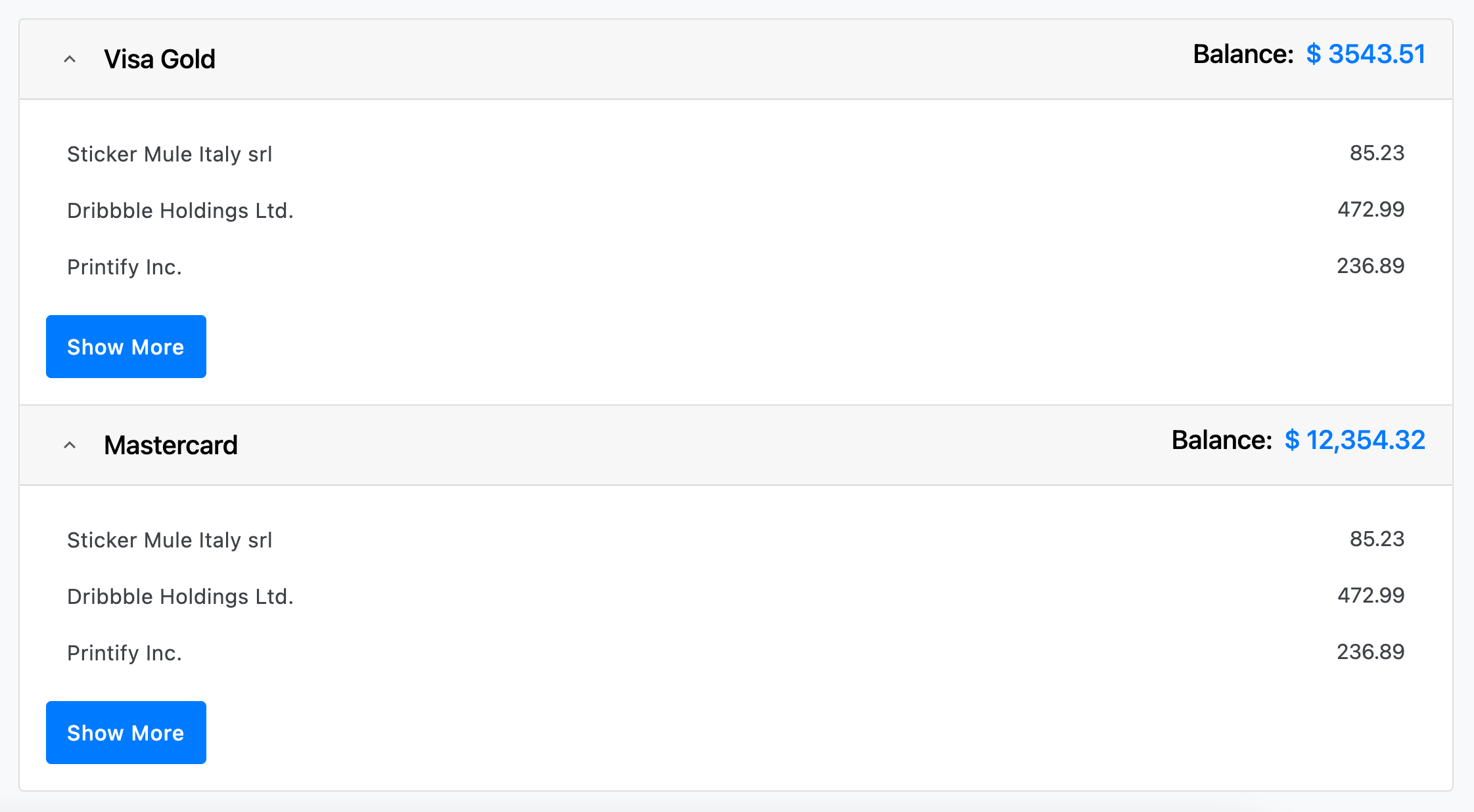
Next, we have added an ngb-accordion showing information about credit cards. Inside its content, there is an igx-list and igx-button.

Finally, we inserted an Ignite UI for Angular icon button in the top right corner, that changes the theme of the whole app:

Styling
To get started with styling components using the Ignite UI theming engine, create an scss file named of your choice that would be the base file for your global theme. We will call this file _variables.scss. Next, we need to import the index file, where all the theme functions and component mixins live:
// _variables.scss
@use "igniteui-angular/theming" as *;

// IMPORTANT: Prior to Ignite UI for Angular version 13 use:
// @import '~igniteui-angular/lib/core/styles/themes/index';
Palettes
The Bootstrap library makes use of a Sass map called $theme-colors to provide a palette composed of eight colors:
$theme-colors: (
    "primary":    $primary,
    "secondary":  $secondary,
    "success":    $success,
    "info":       $info,
    "warning":    $warning,
    "danger":     $danger,
    "light":      $light,
    "dark":       $dark
);
Ignite UI for Angular's palette function generates a color palette map including primary, secondary, gray, info, success, warn, and error colors and their color variants. Our predefined bootstrap palette in turn consists of seven colors:
$bootstrap-palette: palette(
    $primary: #0d6efd,
    $secondary: #6c757d,
    $info: #0dcaf0,
    $success: #198754,
    $warn: #ffc107,
    $error: #dc3545,
    $surface: #f8f9fa
);
As you can see most of the colors in the Bootstrap palette overlap with the colors defined in the Bootstrap palette of Ignite UI for Angular. Hence, we can simply map the Bootstrap theme colors to our light or dark bootstrap palette colors.
First, we are going to define Sass variables that extract values from the $light-bootstrap-palette:
// Colors from the Ignite UI light bootstrap color palette
$light-primary: color($light-bootstrap-palette, "primary");
$light-secondary: color($light-bootstrap-palette, "secondary");
$light-success: color($light-bootstrap-palette, "success");
$light-info: color($light-bootstrap-palette, "info");
$light-warning: color($light-bootstrap-palette, "warn");
$light-danger: color($light-bootstrap-palette, "error");
After that, we will create a new color palette which will be used for the dark mode of the sample:
// Defining custom color palette
$custom-dark-palette: palette(
    $primary: #ecaa53,
    $secondary: #011627,
    $gray: #fff,
    $surface: #222
);

// Creating Sass variables for primary and secondary colors
$dark-primary: color($custom-dark-palette, "primary");
$dark-secondary: color($custom-dark-palette, "secondary");
Note
Visit our palettes with Sass section to discover more about the palettes provided by Ignite UI for Angular and learn how to create a new one.
Themes
In order to switch between light and dark mode, we are adding a custom class to the host element which will be changed on button click. In our stylesheet file, we are going to include different color palettes scoped to each class.
Light mode
Ignite UI for Angular comes with predefined themes inspired by the Bootstrap 4 library. To use them, first, you have to include our core mixin and then our built-in theme mixin - bootstrap-light-theme. We will also make use of our predefined bootstrap palette - $light-bootstrap-palette.
The background color for our application needs to be set explicitly on the host element. In our sample, we want to use the surface color of the passed palette.
At this point we have to modify the Bootstrap $theme-colors map with the Sass variables we created earlier:
// Make sure you always include thecore mixin first
@include core();

:host {
    &.light {
        // The background color of the application in light mode
        background: color($light-bootstrap-palette, 'surface');

        ::ng-deep {
            // Applying the igx predefined light bootstrap palette and theme
            @include bootstrap-light-theme($light-bootstrap-palette);

            $theme-colors: (
                "primary": $light-primary,
                "secondary": $light-secondary,
                "success": $light-success,
                "info": $light-info,
                "warning": $light-warning,
                "danger": $light-danger
            );
        }
    }
}
The light and dark colors from the $theme-colors map, which don't have corresponding values in the Ignite UI palettes, can also be replaced with values at our discretion. For instance:
$custom-light: color($light-bootstrap-palette, "gray", 100);
$custom-dark: color($light-bootstrap-palette, "gray", 800);

:host {
    &.light {
        ::ng-deep {
            $theme-colors: (
                "light": $custom-light,
                "dark": $custom-dark,
            );
        }
    }
}
Dark mode
For our dark variant, we are going to use our newly created $custom-dark-palette. We have to include it in the dark class styles and also modify the $theme-colors map with the new values.
All components in Ignite UI for Angular use colors from the passed palette, therefore they fit nicely in the dark mode without any additional adjustments. However, we have to do some more styling changes for the ng-bootstrap components:
:host {
    &.dark {
        // The background color of the application in dark mode
        background: color($custom-dark-palette, 'surface');

        ::ng-deep {
            // Applying our custom dark palette
            @include bootstrap-dark-theme($custom-dark-palette);

            // Overriding bootstrap button colors with colors from the custom dark palette
            .igx-card-actions .btn-primary {
                background-color: $dark-primary;
                border-color: $dark-primary;

                &:hover {
                    background-color: color($custom-dark-palette, 'primary', 600);
                }
            }

            // Overriding ngb-accordion colors with colors from the custom dark palette
            .accordion {
                .card-header {
                    background-color: color($custom-dark-palette, 'gray', 200);
                    color: color($custom-dark-palette, 'gray', 900);
                }

                .card {
                    background-color: color($custom-dark-palette, 'surface');
                    border-color: color($custom-dark-palette, 'gray', 300);
                }
            }

            // Overriding bootstrap dropdown colors with colors from the custom dark palette
            .dropdown .dropdown-menu {
                background-color: color($custom-dark-palette, 'surface');
                border-color: color($custom-dark-palette, 'gray', 300);

                .dropdown-item {
                    color: color($custom-dark-palette, 'gray', 800);

                    &:hover {
                        background-color: color($custom-dark-palette, 'gray', 200);
                    }
                }
            }

            // Modifying the bootstrap color map
            $theme-colors: (
                "primary": $dark-primary,
                "secondary": $dark-secondary
            );
        }
    }
}
Lastly, we need to import the Bootstrap library - always import it at the end!
:host {
    ::ng-deep {
        // Importing Bootstrap .scss file
        // Make sure you always import it last
        @import "~bootstrap/scss/bootstrap";
    }
}
Once we are done with modifying the $theme-colors map, the bootstrap components will already use the colors from the igx $light-bootstrap-palette for the light mode, and $custom-dark-palette for the dark one.
Warning
Be sure to place the above code inside the ::ng-deep selector to penetrate the Emulated ViewEncapsulation.
Generate class
The bootstrap navbar uses CSS classes for its background color. In our sample, we want that color to change according to the selected theme, hence we are going to use the color-classes mixin. It will generate CSS class names for all colors for a given property and color palette, with optional prefix and suffix attached to the class name. For the demo, we will include the mixin twice - once for the light mode with the respective $light-bootstrap-palette as a first value and second time for the dark mode with the $custom-dark-palette:
:host {
    &.light {
        @include color-classes(
            $palette: $light-bootstrap-palette,
            $prop: 'background',
            $prefix: 'bg'
        );
    }

    &.dark {
        @include color-classes(
            $palette: $custom-dark-palette,
            $prop: 'background',
            $prefix: 'bg'
        );
    }
}
Then, add a CSS class to your navbar component following the pattern "bg - color from the palette - color variant". In our sample app, we are using bg-gray-200.
Typography
Ignite UI for Angular exposes four default type scales for each of its themes, which can be used inside the typography mixin to define the global typography styles of an application. In our example, we are going to apply the bootstrap predefined typeface and type-scale but you can create custom ones if you wish.
:host {
    @include typography($font-family: $bootstrap-typeface, $type-scale: $bootstrap-type-scale);
}
API References
- Light Bootstrap Palette
- Dark Bootstrap Palette
- Light Bootstrap Theme
- Dark Bootstrap Theme
- Palette Function
- Typography Mixin
Related topics:
- Palettes
- Component Themes
- Typography
- Avatar Component
- Button Component
- Dialog Component
- Icon Component
- List Component
Additional Resources
Our community is active and always welcoming to new ideas.