Grid
Use the Grid Component to let the user browse and interact with a vast amount of complex data that is visually represented in tabular layout and provide means for filtering, sorting, paging, and much more. The Grid is visually identical to the Ignite UI for Angular Grid Component
Grid Demo

Using the Grid in Figma
The Grid is essentially a repeater of columns and rows, showing data in a tabular layout. Therefore, the easiest way to use it is by dragging one of the predefined grids to your frame - there are three presets available for the three sizes supported. Please note, that in Figma the Grid Component has a structure, based on columns, which means you can instantly delete or hide an entire column, but not an entire row. Once you insert the grid, you can then start editing the header and body cells or resize the overall width of the grid. However, in case you'd like to make any further adjustments to the grid structure, such as removing columns or rows, or changing the columns' width, you have to right-click on the grid and use the Detach instance option from the contextual menu.
On the layers panel you'll see the following structure under the component's name, without the need to detach it beforehand:
| Layer | Use |
|---|---|
| 🚫 componentVersion | A special locked layer starting with a prohibited icon. This layer is required by the code generation and holds information about the component's version. You should avoid deleting or modifying it. |
| 🚫 metadata | A special locked layer starting with a prohibited icon. This layer is required by the code generation and you should avoid deleting or modifying it. |
| Column 1 | Contains all the cells in the column - Header and Body Cells |
| ... | Columns between 1 and 7 |
| Column 7 | Contains all the cells in the column - Header and Body Cells |
After detaching, you may increase the number of columns inside the grid by duplicating any of the existing columns. On the layers panel you'll see the following structure for each Column:
| Layer | Use |
|---|---|
| 🚫 metadata | A special locked layer starting with a prohibited icon. This layer is required by the code generation and you should avoid deleting or modifying it. |
| Header | Contains a specific header cell |
| Body Cell 1 | Contains a specific body cell |
| ... | Cells between 1 and 9 |
| Body Cell 9 | Contains a specific body cell |
In order to increase the number of body cells, you should first use the Detach instance option on the specific column and then duplicate any of the body cells that already exist inside the column. After you increase or decrease the number of columns or cells, you should manually adjust the size of the Grid component.
Cell Types
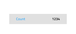
The Grid provides three types of cells, serving different data visualization purposes. The Header Cell is only one per column and appears at the top of the grid to display the textual description of the data in that particular column. The Body Cell is used to build the content table, displaying data records, and its type may vary. The Summary Cell is used to create a section at the bottom of the Grid, where Summaries columns are displayed for each dimension, such as count, minimum, and maximum value.

There is also one special sub-type of Header Cell, the Row Filter Header Cell that is used to create an additional Header row at the bottom of the Header in order to enable the Row Filtering functionality.

Cell Size
Header, Body, and Summary Cells support three variants for the according sizes of the Grid component: Large, Medium, and Small. In Figma, the cells' size and the content inside are properties that can be changed separately from the properties panel.
Note
We advise you not to change the size of the grid cells, once you've selected a Grid Component with a certain size.

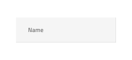
Items and Features (Header Cell)
The Grid Header Cell supports various layout combinations through the Items instance and different feature configurations via the Feature Left, Feature Right and Right Border.
State and Grid Feature (Body Cell)
The Grid Body Cell supports the following interactive states: Idle as a default state, Selected, Active and Focused. Only one cell in the whole grid can be active or focused at any given moment.

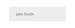
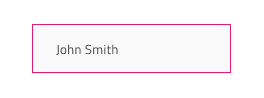
The Grid Body Cell has styling support for some of the Grid features defined in the headers. There are style variants for regular cells, editable cells, and cells that belong to a selected row. In Figma switching between the different body cell states is achieved through the Cell State, Row Selected and Row Editing properties in the properties panel.

Cell Type
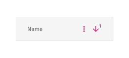
In Figma, the Grid Header Cell provides five presets for the types of data that the Grid needs to accommodate: Number for numeric values, the one combining Text,Date,Bool for the respective data types, Row Selection that is used for the first column when selection of multiple rows is desired, Group By - used to expand and collapse grouped data rows, and two options for Row Filter (Empty or Filtered) that is used where the user can activate specific filtering options, related to the content inside the body cells.


The Grid Body Cell provides presets for the same generic types of data like the Header Cell with an additional icon type to visualize simple graphics and spacer type, used to display an empty body cell.


Grid Horizontal Scrolling
In order to achieve horizontal scrolling in Figma, you need to add the Grid inside a frame with a size smaller than the actual grid width and activate the clipping option from the properties panel. Then you need to go to the Prototype tab at the top of the properties panel and set the scrolling to horizontal. Another option for achieving the same result is by detaching the Grid Component. Afterwards you'd need to reduce the frame size and then activate the clipping option from the properties panel. You can also add a mask - simply insert a rectangle with any fill and set its dimensions according to your needs, and position it below the grid in the Layers panel. Then select both the grid and the rectangle, right-click and select the Use as mask option from the contextual menu.

Styling
The Grid comes with styling flexibility achievable through styling the individual cell text, icons, and background colors in the various states available, as well as the hiding of horizontal and vertical borders.
Usage
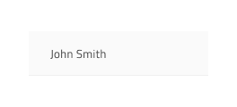
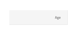
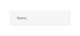
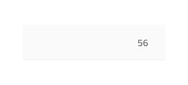
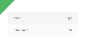
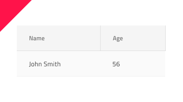
The most important thing about the Grid is the alignment of the data inside its Header and Body Cells. Text should always be aligned left, leaving variable empty space to the right, and numbers should always be aligned right, leaving variable empty space to the left.
| Do | Don't |
|---|---|
 |
 |
Additional Resources
Related topics:
- Grid Toolbar
- Grid Export
- Grid Grouping
- Grid Column Pinning
- Grid Column Hiding
- Grid Column Moving
- Grid Column Resizing
- Grid Sorting
- Grid Row Filter
- Grid Excel Style Filter
- Grid Row Selection
- Grid Editing
- Grid Sizes
- Grid Paging
- Grid Summaries
- Hierarchical Grid
- Tree Grid
- Grid Patterns
- Grid Skeleton
Our community is active and always welcoming to new ideas.
 GitHub