UWP Data Grid
The UWP Data Grid was built specifically to meet the challenges of displaying large amounts of data on mobile platforms. This control is lightweight, feature-rich, responsive, and can handle large amounts of data while providing superior versatility and performance.
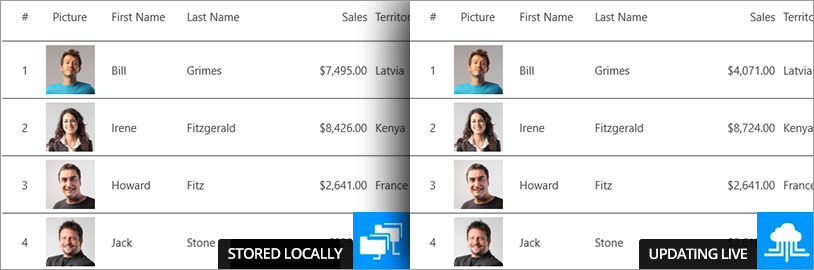
Data Source
The Grid's data can be Local (available on the device already), or data can be retrieved from a Remote store such as a web service.
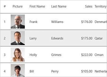
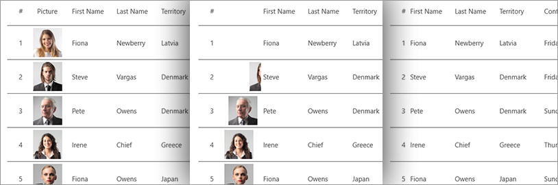
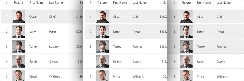
Built-in Columns
Easily create a Grid with auto-generated columns or select the column types among our built-in Columns including Numeric, Image, Text, DateTime, and Template. All cells and headers can be configured by setting text properties like text color, font size, background color, alignment, and width.
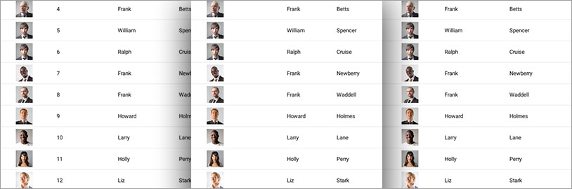
Responsive Layout
Our Grid dynamically changes the visible columns based on the available width by setting break points at different widths or based on the orientation of the device.
Animation
Control columns' Hiding, Showing, Moving, Adding, and Exchanging in a variety of animations, including left, right, top, bottom, fade in, crossfade, or slide over.
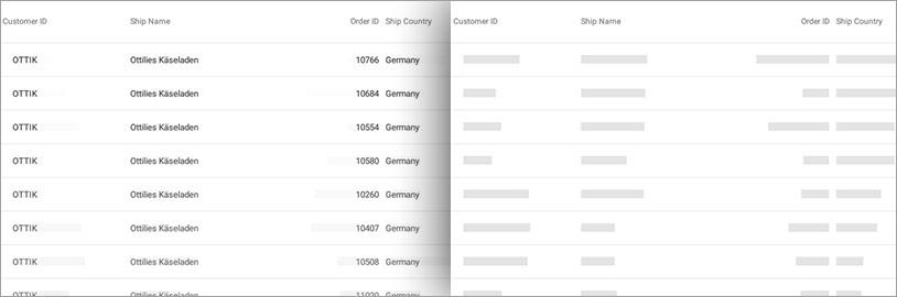
Live Scrolling
Data is retrieved from the web as you are scrolling down, thus ensuring high performance at all times by minimizing the amount of data that needs to be transmitted to the device.
Selection
Single and Multi-Row Selection is supported, allowing for highlighting a row or a master/detail view.
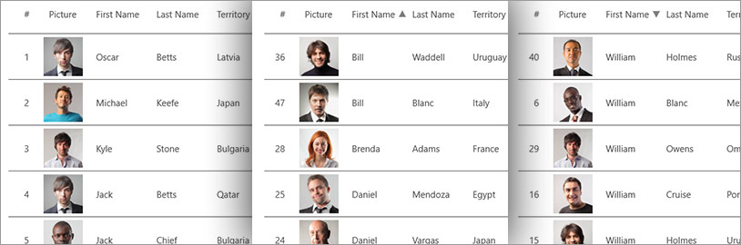
Sorting and Filtering
The UWP data grid allows you add sorting to columns in ascending or descending order. Sorting can be applied to multiple columns for advanced sorting operations. And it’s also got a powerful filtering engine that gives you complete control over how to filter your data.