
React Table: Full-Featured, High-Performance React Data Grid
The Ignite UI for React Data Table / Data Grid allows you to quickly bind and display your data with little coding or configuration. We designed the React Data Grid to meet the challenge of displaying large amounts of data with the interaction features your users expect.

React Data Grid Key Features
This example demonstrates key features of the data grid, including:
- Virtualized Rows and Columns so you can load millions of records in seconds
- Inline Editing with Cell, Row and Batch Update options
- Excel-style Filtering and full Excel Keyboard Navigation capability
- Interactive Outlook-style Grouping
- Column Summaries show aggregations based on grid column data
- Export to Excel, including Data Visualization
- Cell and Row Selection for Single and Multi-Select
- Full touch support for mobile app development
Real-Time Data with Live Streaming
Optimized for live, streaming data, and virtualized to handle unlimited rows or columns of data, the React Table is the only choice for the most demanding data requirements.
React Data Grid Features
The React Data Grid is fast, and can take care of any real-time, high-volume data needs, but it is really designed for delivering a highly productive, interactive experience to your users. In the next section, we will explore the key features of the React Data Grid and give you a better idea of how it can help you deliver the next amazing experience to your users.

Cell and Row Selection
The React Data Grid includes every option for mouse and touch-driven selection by cell and row level, including modes like SingleCell, SingleRow, MultipleCell, MultipleRow, RangeCell and more.

Grid Filtering
The React Data Grid includes column filtering based on the data type of the column being filtered. For example, if your column is a DateTime field you can use filters like Last Month, This Quarter, Next Week, etc.
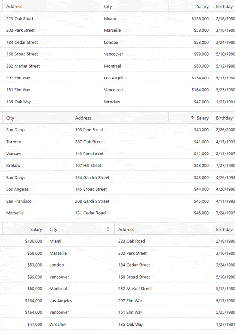
Column Moving
Rearranging column order is as easy as Click and Drag in the React Data Grid. We’ve also included a complete animation engine, giving you control over the UX of this interaction.

Column Pinning
With Right and Left column pinning in the React Data Grid, users can lock a single column or multiple columns in any order, so that the column maintains position, while scrolling horizontally.
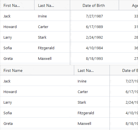
Column Resizing
The React Data Grid supports the ability to resize columns, giving your customers flexibility over how they display the Data Grid columns, with respect to the other columns in the table.

Column Sorting
The React Data Grid supports ascending and descending column sorting with a Single, Multi or Tri-State Column Sorting configuration. Sorting is triggered on header click or using the Column Options dropdown.
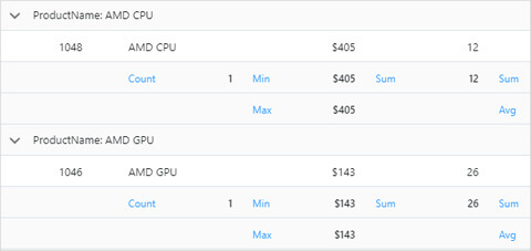
Column Summaries
The React Data Grid supports column summaries in the footer area of the Data Grid, or in the Group Headers. This is great for showing values like Count, Sum, Min, Max, Avg, etc.

Column Types
The React Data Grid supports a variety of column types, plus a Template Column type and a Sparkline Template type, giving you complete flexibility over the way your data is displayed in the Grid.
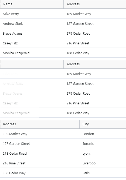
Column Animations
The React Data Grid supports Column Animation during events like Column Hiding or Column Moving. When Column Animation on the React Data Grid is set, the corresponding animation will fire for all of the cells in that column.

Column Options Dialog
The React Data Grid supports the ability to group, hide, move, pin, filter, and sort columns directly from a UI exposed on each column header. The Column Options are on by default for every column, via the Kebab menu on column hover.
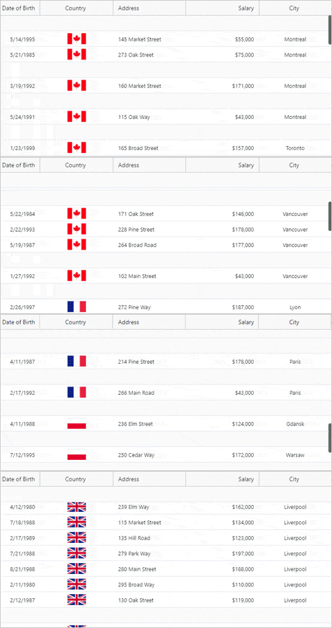
Outlook-Style Grouping Row / Column Grouping
The React Data Grid lets you group rows into a ‘sticky header’ Row Group. Like the Group By feature in Microsoft Outlook, your users have an easy way to visually group data based on their own criteria.
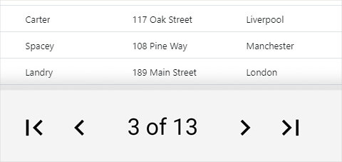
Grid Paging
The React Data Grid Paging component is designed to take in an array of data and output portions of that data as a page, with a simple navigation UI.

Row Pinning
The React Data Grid allows you to pin rows to the top of the Data Grid. When a row is pinned, it will be duplicated at the top of the Data Grid and remain fixed there with a light gray background and its actual (or original) row in the Data Grid will be rendered with low opacity, making it clear to the user this is a special row.
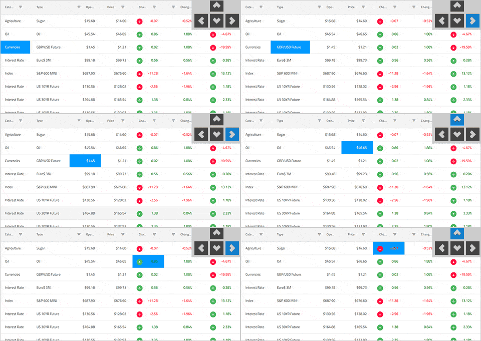
Keyboard Navigation
The React Data Grid supports extensive Excel-like keyboard navigation. Ensure accessibility compliance and improve usability, enabling Excel-like keyboard navigation in the React Data Grid, using the up, down, right, left, tab, and Enter keys. You can toggle single or multiple row selection using the mouse or keyboard to select or de-select full rows.
Ignite UI for React Supported Browsers
The React Data Grid is supported on all modern web browsers, including:
- Chrome
- Edge / Edge Chromium
- Firefox
- Safari
- Internet Explorer 11 with polyfills
Ignite UI for React Support Options
There are multiple options to get access to our award-winning support at Infragistics for the React product.
- Start at the React Support home page
- Read the React Documentation and experiment with React Samples
- Read the React Blogs to stay up to date
- Submit a React Support Case
- Learn from the React Reference Applications
Ignite UI for React Trial License and Commercial
Ignite UI for React is a commercially licensed product available via a subscription model. You can try the Ignite UI for React product for free when you register for a 30-day trial. When you are done with your Trial Period, you can purchase a license by calling sales in your region.
Frequently Asked Questions
Questions and Answers for Ignite UI for React Data Grid
Why should I choose the Infragistics Ignite UI React Data Grid?
- Virtualized Rows and Columns so you can load millions of records
- Easily Bind JSON, REST, OData and custom object data sources
- Inline Editing with Cell, Row and Batch Update options
- Excel-style Filtering and full Excel Keyboard Navigation capability
- Interactive Outlook-style Grouping
- Column Summaries based on any data in a grid cell or column
- Export to Excel, including Data Visualization
- Works on every modern browser
- 24x5 Global Technical Support, including Phone and Chat
What is the Pricing for the Infragistics Ignite UI React Data Grid?
Ignite UI for React is a commercially licensed product available via a subscription model. A single developer license starts at $749 USD for a one-year subscription, which includes one year of standard support and product updates. This subscription includes the React Grid, plus React Charts and dozens on other React UI Controls.
We also offer discounts for multi-year licenses. Please refer to our Pricing page for more information on pricing.
If you are developing applications on multiple platforms, consider our complete app development package, Infragistics Ultimate, which include desktop platforms like WPF and Windows Forms, plus all modern web toolsets for Angular, Web Components, ASP.NET MVC and ASP.NET Core.
Can I purchase the Infragistics Ignite UI React Data Grid control separately?
No, you cannot purchase the React Data Grid separately. It is part of a the Ignite Ignite UI for React product, which includes dozens of UI controls and components, plus over 60 charts, including React Financial Charting. If you are interested in other modern web platforms like Angular, ASP.NET MVC, Web Components or ASP.NET Blazor, check out our Ignite UI product bundle, which gives you every web platform for only $100 more on your subscription. That is hundreds of controls, components, and data visualizations for 1 very low price.
How do I Install React and the Infragistics Ignite UI React Data Grid control?
To get started with the React Data Grid, follow the steps in the getting started guide. If you need more inspiration, take a look at our reference applications, which are designed to not only inspire but are best practices guides for React development.

React Components & Directives
Choose the Plan that's Right for You!
The comprehensive, UI components library for React.
Multi-year discount
- Everything in Ignite UI and Professional
- UI prototyping, design systems, user testing, app building and code gen
- The only complete UI/UX toolkit for building high performance, modern web, desktop and mobile applications
MULTI-YEAR DISCOUNT
- Everything in Ignite UI
- Comprehensive UI component library for web, mobile and desktop developers
MULTI-YEAR DISCOUNT
Connect with Infragistics
Follow Us for the Latest News and Updates

