Xamarin Radial Gauge
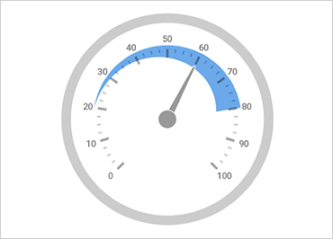
Use the Radial Gauge control to show off Key Performance Indicators (KPIs) with rich style and interactivity. These round and semi-round gauges are powerful, easy to use, and highly configurable—perfect for dashboards displaying clocks, industrial panels, automotive dashboards, and even aircraft cockpits.
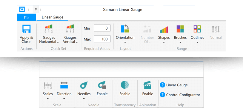
Use the new Ultimate UI for Xamarin Radial Gauge Configurator to quickly configure the control and bind data directly from XAML—no code required!
Animations
Give your users a modern, visually appealing way to view data with animated transitions. You can gradually animate the gauge as it redraws changes to the needle, needle position, scale range, color range, and more. You can also set multiple properties at the same time to morph between different gauge styles.
Needles
Customize needle attributes, including length, color, point, base, and cap. You can select from built-in needle shapes including rectangle, triangle, and trapezoid--all with or without a bulb. There’s even an option to allow your users to drag the needle.

Ranges
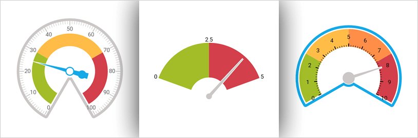
Add multiple ranges to indicate important thresholds or milestones and enhance readability.

Scales
Control the Start and End scale positions, major and minor tick marks, labels, color ranges, and sweep direction. You can create full 360-degree scales or half-circular gauges with 180-degree scales, 90-degree scales, 45-degree scales, or choose a custom value.

Backing
Configure the Radial Gauge to control visual attributes such as colors, fitted or circular edges, corner radius, and over-sweep.

Radial Gauge Configurator
The control configurators shave hours off development time by removing the complexity of learning the Gauge API. Visually configure your entire gauge in a WYSIWYG point-and-click experience. Allow your designers to style controls interactively and visually to get a pixel-perfect render of their design intent.
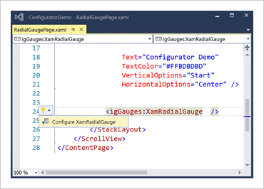
Launch the Gauge Configurator with a Single Click
Select you control on the XAML editor and use the suggested actions lightbulb to launch the Gauge Configurator.
Visually Configure Your Gauge
Use the Ribbon Gallery items to visually customize almost every aspect of you gauge – from the initial gauge style, to the Shape, Brushes, Outline, and Needle configuration. All without needed to know anything about the API of the gauge! Even better, the configurator will read any changes you make in XAML and update the properties with our full two-way XAML parser.
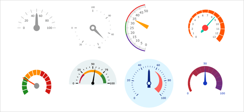
Quickset Style Selection
Quickly configure your control by selecting one of the professional, beautifully-designed, and pre-configured Quicksets.
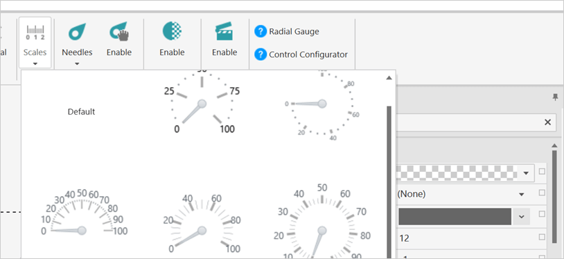
Custom Scales Selector
Choose from one of the rich pre-set scale customizations to change how your gauge scale looks in your app.
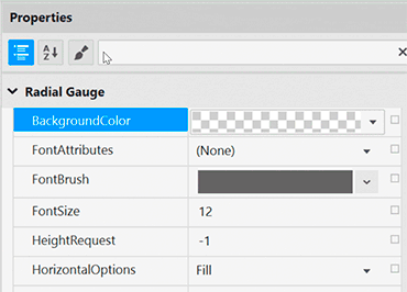
Property Editing with Ease
Conveniently find properties grouped by related features in the Property Editor. Features are also enabled or disabled by feature compatibility. This lets you customize any detail of the control, and it helps you learn by example, as you can see in real-time how your changes affect the control.
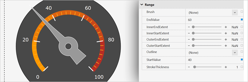
Range Customization Made Simple
Customize each Range property like Brush, Extent, Outline, Start Value, Thickness, and more.
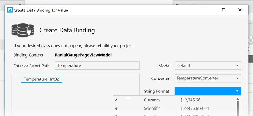
Data Binding is a Breeze
You can quickly add dynamic data to inflate Ranges in the Range Selector, or you can manually add data in the Range Editor. Use the Binding Editor to easily set a binding for a control, including binding mode or your custom converter. We’ve even provided a handy formatter so you don’t need to think about how you need to display your values.
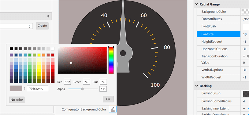
Ensure Correct Color Views
Conveniently change the background of the Gauge Configurator to your app background so you know what the gauge will look like at runtime. We’ve also included a dotted-line around the actual control bounds so you know where the control begins and ends.
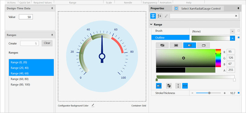
Configure Multiple Ranges at One Time
Select a single range to customize properties or select multiple ranges to quickly apply Brush, Outline, and Stroke Thickness as a group.
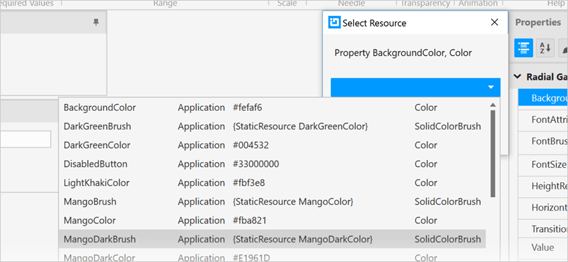
Easily Use Existing Style Resources
Bind to existing project or page level resources from the convenient Resource picker.