
Xamarin Data Grid
Use the lightweight, feature-rich Data Grid control when you need to display lots of data without sacrificing mobile device performance.
Use the new Ultimate UI for Xamarin Data Grid Configurator to quickly configure the control and bind data directly from XAML—no code required!
Check the Visual Studio Marketplace to ensure you have the latest update.
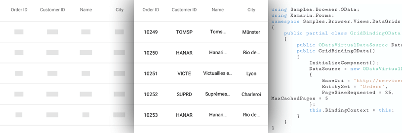
Data Source
Data can be local to the user’s device or in a remote store or web service.
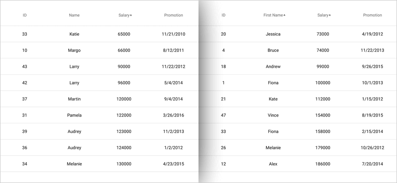
Sorting and Filtering
Sort your data grid columns in ascending or descending order. Apply sorting to multiple columns for more advanced operations. Whether your data is local or remote, use powerful filtering to exercise complete control over your data, with a wide range of filters such as function expressions, literal expressions, arithmetic operands and logical operands for building advanced filtering capabilities spanning multiple columns.
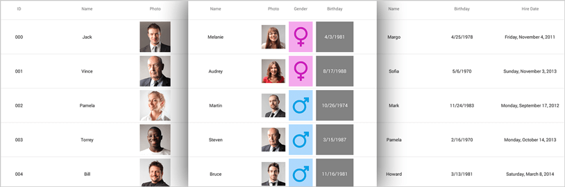
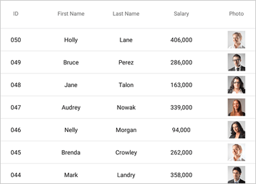
Built-in Columns
Auto-generate columns or select from built-in column types including Text, Numeric, Image, DateTime, and Template. All cells and headers can be configured by setting text properties like text color, font size, background color, formatting, and alignment.
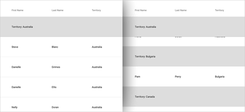
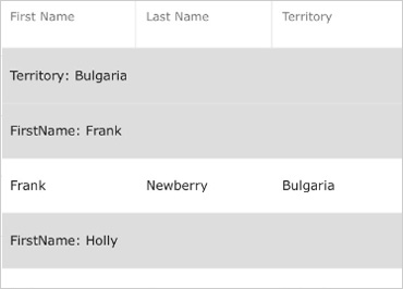
Column Grouping with Sticky Headers
Column Grouping in the Xamarin Data Grid enables you to organize data in a hierarchical structure based on matching property values. You can apply grouping to multiple columns, including invisible columns, and set the sort order for the group. Sticky headers are on by default; disable them by setting the IsGroupRowStick property to "false."
Responsive Layout
You can configure the Data Grid control to change visible columns based on available width by setting break points at different widths or based on device orientation.

Animation
Control Showing, Hiding, Adding, Moving, and Exchanging grid columns with a variety of animations including left, right, top, bottom, fade-in, crossfade, or slide-over.
Live Scrolling
The Data Grid control features on-the-fly data retrieval as you scroll, ensuring high performance at all times by minimizing the amount of data transmitted to the device and used at any given time.
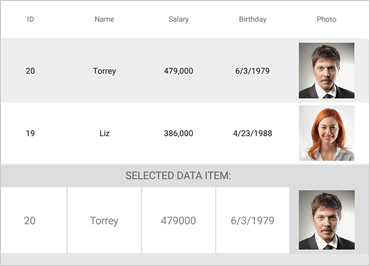
Selection
Configure either cell or row selection with this grid control. Multiple rows or multiple cell selection is also supported.
Column Pinning
Pin your columns via left, right, or none with this grid control. This is useful for organization purposes when you have many columns and prefer to keep a column in view at all times.
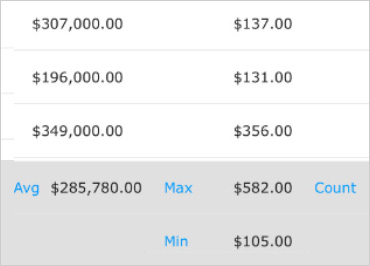
Column Summaries
Use this grid control to add summaries within the grid. This is useful when you have aggregate financial data and expenses. Summaries can be added per column and displayed within cells, top or bottom of the grid.
Split Group Headers
When grouping by multiple property-paths, you can customize the display of the row groupings. The new "Split" option will place the property-paths in separate, hierarchical headers based on the order of the groupings.
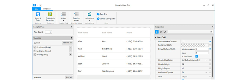
Data Grid Configurator
The control configurators shave hours off development time. No need to learn a complex API—just point and click to visually configure your entire WYSIWYG grid. Visually configure your entire grid in a WYSIWYG point-and-click experience. Allow your designers to style controls interactively and visually to get a pixel-perfect render of their design intent.
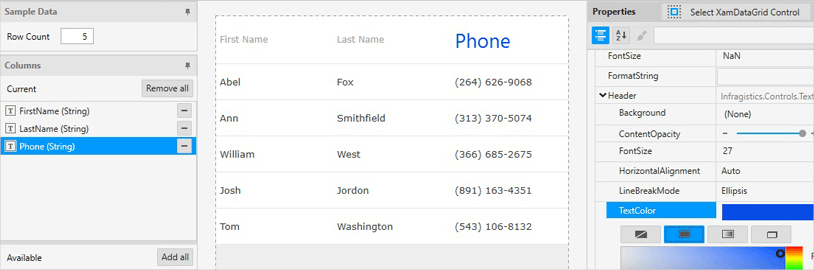
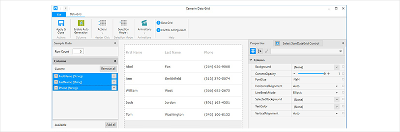
Visually Configure Your Data Grid
Use the Ribbon and Properties editor to visually customize almost every aspect of your data grid – from the column type, sort actions, selection mode, animations, column property settings, and more. All without needing to know anything about the API of the data grid! Even better, the configurator will read any changes you make in XAML and update the properties with our full two-way XAML parser.
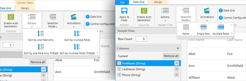
Sort and Select
Set the column sorting with single-field, multiple-field and tri-state combinations and single or multi-row selection modes quickly and visually with the Ribbon Gallery items.
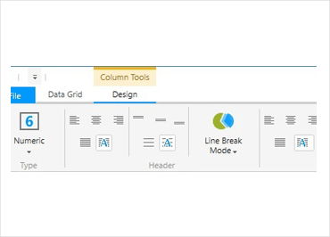
Customize Your Columns
Use the Ribbon Gallery to quickly customize the formatting of your data grid columns, including data type, header and row alignment, and sample data values.
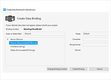
Bind Data Instantly
Use the Binding Editor to easily set a binding for a control, including binding mode, custom converter and string formatting. We’ve even provided a handy formatter so you don’t need to think about how you need to display your values.
Configure Multiple Columns at One Time
Select a single column to customize its specific properties, or select multiple columns to quickly apply Backgrounds, Colors, Font Size and Alignment as a group.
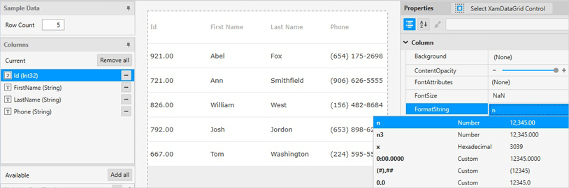
Format Column Strings
Use one of our pre-set string formats or use your own to easily change the displayed formatting of your column data.
Ensure Correct Colors
Conveniently modify color properties like Header Text Color, Text Color, Background Color and more with the visual color editors.