

QR Code Component New
The Ignite UI for Angular QR Code renders a scannable QR (Quick Response) code as an inline SVG, generated on the client from any string value, with customizable size, error correction, and center logo.
Live Demo
The Angular QR Code demo renders a code from a URL string and lets you switch its module shape, size, and center logo.
Anatomy
The Angular QR Code is a square SVG graphic made of three finder-pattern corners, the encoded data modules, a quiet-zone margin, and an optional center logo.

2. QR Matrix: the encoded matrix that stores the destination or data payload.
3. Quiet Zone: the empty space around the code that ensures scanners can read it reliably.
4. Center Logo (optional): an optional central container used to display a brand logo or custom icon.
5. Finder-pattern corners: square markers at the corners that help scanners detect and orient the code correctly.
<igc-qr-code>
└── svg[role="img"]
    ├── <title>                          // "QR code: <value>" or the aria-label value
    ├── ::part(background)               // background rect
    ├── <mask>                           // rendered when logo-src is set
    ├── <g>                              // masked when logo-src is set
    │   ├── ::part(dots)                 // data modules path
    │   ├── ::part(corner-square)        // outer finder-pattern squares (×3)
    │   └── ::part(corner-dot)           // inner finder-pattern dots (×3)
    └── <image>                          // center logo, rendered when logo-src is set
Getting Started
To use the Angular QR Code, complete the Ignite UI for Angular Getting Started topic for the basic project setup, then register the component.
The QR Code requires igniteui-webcomponents 7.3.0 or later. The toBlob() and toImage() export methods require 7.3.2 or later.
Ignite UI for Angular renders the QR Code as a web component, so install igniteui-webcomponents in your Angular project:
npm install igniteui-webcomponentsImport IgcQrCodeComponent and a theme, then register the component:
import { defineComponents, IgcQrCodeComponent } from 'igniteui-webcomponents';
import 'igniteui-webcomponents/themes/light/bootstrap.css';

defineComponents(IgcQrCodeComponent);
Add CUSTOM_ELEMENTS_SCHEMA to the Angular component that renders igc-qr-code:
import { CUSTOM_ELEMENTS_SCHEMA } from '@angular/core';

@Component({
    schemas: [CUSTOM_ELEMENTS_SCHEMA],
})
Render the QR Code with a value:
<igc-qr-code value="https://www.infragistics.com"></igc-qr-code>By default, this renders a 128×128 pixel QR code with a 4-module quiet-zone margin, M error correction, and square modules and corners.
Usage
Set value to any string to render a scannable QR code. The component picks the most compact encoding mode (numeric, alphanumeric, or byte) and the smallest QR version that fits the value. Clearing value removes the SVG.
Error Correction
Use errorLevel to choose the L, M (default), Q, or H error correction level. Higher levels recover more of a damaged or covered code but produce a denser code. Use version to pin a QR version from 1 to 40 when you need predictable module dimensions; leave it unset to use the smallest version that fits value.
<igc-qr-code
  value="https://www.infragistics.com"
  version="4"
  error-level="H">
</igc-qr-code>
Size
Use size to set the rendered width and height in pixels, and margin to set the quiet zone in QR modules. The quiet zone is drawn inside size, so a larger margin makes the modules smaller.
<igc-qr-code
  value="https://www.infragistics.com"
  size="256"
  margin="2">
</igc-qr-code>
Center Logo
Set logoSrc to render an image at the center of the code; the component masks the modules beneath it. logoSize sets the logo size as a ratio from 0 to 1 of the largest safe logo area, which is 9% of the code at the H level. logoMargin adds whitespace around the logo in pixels.
The logo never covers more than the current errorLevel allows. At the default M level, logoSize values above about 0.44 render at the same capped size, so set errorLevel to H for the largest logo.
logoSrc accepts regular URLs and data:image/* URIs. Sources with unsafe schemes (such as javascript: or vbscript:) and non-image data: URIs are rejected, and no logo is rendered.
<igc-qr-code
  value="https://www.infragistics.com"
  error-level="H"
  logo-src="/assets/logo.png"
  logo-size="0.5"
  logo-margin="4">
</igc-qr-code>
Shapes
Use dotStyle to shape the data modules and the inner finder-pattern dots, and squareStyle to shape the outer finder-pattern squares. Both accept square (default), circle, or rounded.
<igc-qr-code
  value="https://www.infragistics.com"
  dot-style="rounded"
  square-style="rounded">
</igc-qr-code>
Export
Call toImage() to export the QR code as a PNG, JPEG, WebP, or SVG file, or toBlob() to get it as an SVG Blob. Both methods resolve theme colors and inline the logo, so the export matches the rendered code.
const qrCode = document.querySelector('igc-qr-code') as IgcQrCodeComponent;

// Downloads a 512×512 PNG from a 256px QR code.
await qrCode.toImage({ format: 'png', scale: 2, fileName: 'my-qr-code', download: true });
Do/Don’t
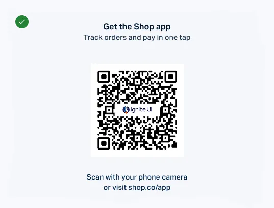
When to use: QR codes give users a fast bridge from print or static screens to a digital action, such as opening a page, downloading an app, or verifying a link.
When not to use: Avoid QR codes for information that must be readable without a scanner, or when a direct button, link, or short URL serves the destination better.
 |  |
| Do | Don’t |
Use QR codes for short, high-intent actions with a clear destination and enough surrounding whitespace. | Avoid using QR codes for critical content on their own, or in places where users cannot easily scan them. |
 |  |
| Do | Don’t |
Keep the foreground dark and the background light (ideally black on white) so phone cameras can scan it fast. | Avoid light-colored QR codes on dark backgrounds or low-contrast brand tints that fail scanner detection. |
Properties
The Angular QR Code exposes properties for the encoded value, code density, sizing, logo, and shape customization.
| Name | Type | Default | Description |
|---|---|---|---|
value |
string |
— | The string encoded in the QR code. |
version |
number |
— | The QR version (1–40). When not set, the smallest version that fits value is used. |
errorLevel |
'L' | 'M' | 'Q' | 'H' |
'M' |
The error correction level. Also caps the logo size. |
size |
number |
128 |
The rendered width and height in pixels. |
margin |
number |
4 |
The quiet-zone margin, in QR modules. |
logoSrc |
string |
— | The source URL of an optional center logo image. |
logoSize |
number |
0.4 |
The logo size as a ratio (0–1) of the largest safe logo area. |
logoMargin |
number |
— | The margin around the logo, in pixels. |
dotStyle |
'square' | 'circle' | 'rounded' |
'square' |
The shape of the data modules and the inner finder-pattern dots. |
squareStyle |
'square' | 'circle' | 'rounded' |
'square' |
The shape of the outer finder-pattern squares. |
Methods
| Name | Returns | Description |
|---|---|---|
toBlob() |
Promise<Blob> |
Serializes the QR code to an image/svg+xml blob with theme colors resolved and the logo inlined. Rejects when value is not set. |
toImage(options?) |
Promise<File> |
Exports the QR code as an image file. options accepts format ('png' default, 'jpeg', 'webp', or 'svg'), scale (default 1), fileName (default 'qr-code'), and download (default false). Rejects when value is not set or the options are invalid. |
Styling
The Angular QR Code appearance is controlled through CSS variables, CSS parts and the theming system.
Styling Variables
| Variable | What it changes |
|---|---|
--ig-qr-code-background |
The background color of the QR code. Defaults to white. |
--ig-qr-code-dark-color |
The color of the data modules, and the corner square/dot colors unless overridden. Defaults to black. |
--ig-qr-code-corner-square-color |
The color of the outer finder-pattern corner squares. Falls back to --ig-qr-code-dark-color. |
--ig-qr-code-corner-dot-color |
The color of the inner finder-pattern corner dots. Falls back to --ig-qr-code-dark-color. |
Style Parts
| Part | What it styles |
|---|---|
background |
The background rectangle of the QR code. |
dots |
The data modules (dots) of the QR code. |
corner-square |
The outer finder-pattern corner squares. |
corner-dot |
The inner finder-pattern corner dots. |
Sass Theming
Create a theme with qr-code-theme() and pass it to the tokens mixin.
@use "igniteui-theming/sass/themes" as *;

$custom-qr-code-theme: qr-code-theme(
  $background: #ffffff,
  $dark-color: #1a1a2e,
  $corner-square-color: #c0392b,
  $corner-dot-color: #1a1a2e
);

:root {
  @include tokens($custom-qr-code-theme);
}
CSS Variables
Set the component CSS variables directly when you need local styling without a Sass build step.
igc-qr-code {
  --ig-qr-code-background: var(--ig-gray-50);
  --ig-qr-code-dark-color: var(--ig-primary-800);
  --ig-qr-code-corner-square-color: var(--ig-secondary-800);
}

igc-qr-code::part(corner-dot) {
  fill: var(--ig-success-500);
}
Styling with Tailwind
Combine Tailwind utility classes with the QR Code CSS variables. Set up Tailwind with the Ignite UI theme first:
@import "tailwindcss/theme.css";
@import "tailwindcss/utilities.css";
Apply the light-qr-code utility to give the QR Code its theme variables, then override individual variables with arbitrary-property classes. The ! prefix marks the utility as important so it takes precedence over the component’s default styles.
<igc-qr-code
  value="https://www.infragistics.com"
  class="!light-qr-code [--ig-qr-code-dark-color:#1a1a1a] [--ig-qr-code-background:#f7df1e]">
</igc-qr-code>
Accessibility
The Angular QR Code is a static graphic that screen readers announce through the <title> of its SVG.
Keyboard Interaction
The QR Code is not focusable and does not respond to keyboard input.
Screen Readers / ARIA
The rendered <svg> has role="img" and a <title> that screen readers announce. The title defaults to QR code: <value>; set aria-label to announce a more meaningful phrase instead.
<igc-qr-code
  value="https://www.infragistics.com/products"
  aria-label="Scan to visit our product page">
</igc-qr-code>
Accessibility Compliance
Infragistics documents Ignite UI for Angular accessibility support for Section 508 and WCAG 2.1 guideline areas in the Accessibility Compliance topic.
| Criterion | How the component complies |
|---|---|
| 1.1.1 Non-text Content | The SVG <title> provides a text alternative, taken from aria-label or derived from value. |
| 1.4.11 Non-text Contrast | The default black modules on a white background exceed the 3:1 contrast ratio for graphical objects. |
| 4.1.2 Name, Role, Value | The SVG exposes role="img" with the <title> as its accessible name. |
Your responsibilities:
- Pair the QR Code with a short visible call to action so sighted users know what will happen after scanning.
- Provide an
aria-labelwhen the encodedvalueis opaque (e.g. a token or short identifier) so the announced text is meaningful. - Keep sufficient contrast between the module color and the background when overriding CSS variables so scanners can read the code reliably.
Troubleshooting
The Angular QR Code troubleshooting guidance follows a problem → cause → fix format for common integration and rendering issues.
Why is my QR code not scanning?
Contrast between the modules and the background is too low, the code is too small on screen, or the quiet-zone margin is too small. Restore the default black on white colors, increase size, and use a margin of at least 4 modules for reliable scanning.
Why is my logo smaller than the logoSize I set?
The logo is capped to the safe area of the current errorLevel. Set errorLevel to H to allow the largest logo.
Why is my logo not showing up?
logoSrc uses a rejected source (an unsafe scheme or a non-image data: URI), or the image failed to load. Use a valid image URL or a data:image/* URI; assigning a valid source afterwards renders the logo.
Why did my QR code not switch to a dark theme automatically?
QR Code colors do not invert with the global light/dark theme, because light-on-dark codes are not reliably scannable. To change them for the dark variant of your UI, set --ig-qr-code-background and --ig-qr-code-dark-color explicitly.
Known Limitations
The Angular QR Code has the following limitations.
-
The QR Code has no slots or events.
-
QR Code visual structure follows a fixed, standardized layout and is not mirrored in Right-to-Left contexts.
-
Exports omit a logo loaded from a cross-origin URL that does not send CORS headers.
API References
Dependencies
The Angular QR Code requires a theme stylesheet, which you add in Getting Started. It has no other runtime dependencies.
Additional Resources
Use these resources for support and related Ignite UI documentation.
Related Components
The QR Code is a standalone display primitive. When you need related visual content, consider the following components:
- Icon — For static symbolic imagery that does not need to be scannable.
- Avatar — For identity imagery representing people or entities.
FAQ
The value property accepts any string. Common uses include URLs, plain text, payment references, one-time setup tokens, Wi-Fi credentials, and vCard payloads. The component automatically selects the most compact encoding mode (numeric, alphanumeric, or byte) that fits the input.
No. The QR Code component generates the SVG entirely on the client from the string value, with no dependency on external QR-generation libraries. The only network request is for a center logo image loaded from a URL.
The logoSize ratio (default 0.4) is a fraction of the largest safe logo area, which is 9% of the code at the H error level. The QR Code caps the logo to the safe area of the current errorLevel, so the code stays scannable. Set errorLevel to H to allow the largest logo.
The QR Code ships in the igniteui-webcomponents package, version 7.3.0 or later.
Angular applications install it directly because igniteui-angular does not include the QR Code.