

Tabs
The Ignite UI for Angular Tabs component organizes related content at the same level of hierarchy into tabs and shows the content of the selected tab.
The selector of the Angular Tabs component is igx-tabs. Each igx-tab-item in it holds a tab header and the content that the Tabs component shows when the tab is selected.
Live Demo
Anatomy
The Angular Tabs component consists of a container with tab items, optional scroll buttons, and a content area for the selected tab.

2. Header Button (optional): navigation arrows appear for tabs that aren’t visible in the tab container
3. Label: text that names the tab and indicates what content it opens
4. Active Tab Item: a single selectable tab element that is active
5. Left Icon (optional): icon shown before the label to add context to the tab
6. Top Icon (optional): icon shown above the label to add context to the tab
7. Right Icon (optional): icon shown after the label to add context to the tab
8. Content Area: the panel where content for the selected tab is displayed
The igx-tabs element renders the header strip from the igx-tab-header of each tab item and the content area from the igx-tab-content of each tab item:
igx-tabs.igx-tabs
├─ div.igx-tabs-header
│  ├─ button.igx-tabs-header-button                 // start scroll button, hidden when the headers fit
│  ├─ div.igx-tabs-header__content
│  │  └─ div.igx-tabs-header__wrapper[role="tablist"]
│  │     ├─ div.igx-tabs-header-scroll
│  │     │  └─ igx-tab-header[role="tab"]          // one for each igx-tab-item
│  │     │     ├─ [igxPrefix]
│  │     │     ├─ div.igx-tab-header__inner        // [igxTabHeaderIcon] above [igxTabHeaderLabel]
│  │     │     └─ [igxSuffix]
│  │     └─ div.igx-tabs-header__active-indicator
│  └─ button.igx-tabs-header-button                 // end scroll button, hidden when the headers fit
└─ div.igx-tabs-content
   └─ igx-tab-content[role="tabpanel"]             // one for each igx-tab-item; renders its content only when selected
Getting Started
To use the Angular Tabs, follow the Ignite UI for Angular Getting Started topic for the basic project setup, then add the component for your target platform.
If your project doesn’t use Ignite UI for Angular yet, run ng add igniteui-angular. Then import the IGX_TABS_DIRECTIVES token and add it to the imports of your component. The token holds the Tabs, the tab item, header, and content components, the header label and icon directives, and the prefix and suffix directives:
import { Component } from '@angular/core';
import { IGX_TABS_DIRECTIVES } from 'igniteui-angular/tabs';
// import { IGX_TABS_DIRECTIVES } from '@infragistics/igniteui-angular/tabs'; for licensed package

@Component({
    selector: 'app-home',
    template: `
        <igx-tabs>
            <igx-tab-item>
                <igx-tab-header>
                    <span igxTabHeaderLabel>Overview</span>
                </igx-tab-header>
                <igx-tab-content>The overview content.</igx-tab-content>
            </igx-tab-item>
            <igx-tab-item>
                <igx-tab-header>
                    <span igxTabHeaderLabel>Details</span>
                </igx-tab-header>
                <igx-tab-content>The details content.</igx-tab-content>
            </igx-tab-item>
        </igx-tabs>
    `,
    imports: [IGX_TABS_DIRECTIVES]
})
export class HomeComponent {}
When no tab item is selected and the tab items have content, the Angular Tabs component selects the first tab item on init.
Usage
Use the Angular Tabs to organize different views of the same information or switch between similar or related data sets.
Type
The Tabs are available in two types - Short, showing only text by default, with the option to have prefix and suffix icons, and Tall, which also has an additional third icon on top of the text.
For a short tab, place a <span> with the igxTabHeaderLabel directive in the igx-tab-header. For a tall tab, also add an igx-icon with the igxTabHeaderIcon directive, and the Tabs component shows the icon above the text. Add IgxIconComponent to the imports of your component next to IGX_TABS_DIRECTIVES:
<igx-tabs>
  <igx-tab-item>
    <igx-tab-header>
      <igx-icon igxTabHeaderIcon>shopping_basket</igx-icon>
      <span igxTabHeaderLabel>Cart</span>
    </igx-tab-header>
    <igx-tab-content>The cart content.</igx-tab-content>
  </igx-tab-item>
  <igx-tab-item>
    <igx-tab-header>
      <igx-icon igxTabHeaderIcon>local_shipping</igx-icon>
      <span igxTabHeaderLabel>Shipping</span>
    </igx-tab-header>
    <igx-tab-content>The shipping content.</igx-tab-content>
  </igx-tab-item>
</igx-tabs>
To show content before and after the label, such as an icon or a badge, add it to the igx-tab-header with the igxPrefix and igxSuffix directives. The badge below also needs IgxBadgeComponent in the imports:
<igx-tab-header>
  <igx-icon igxPrefix>inbox</igx-icon>
  <span igxTabHeaderLabel>Inbox</span>
  <igx-badge igxSuffix [value]="12"></igx-badge>
</igx-tab-header>Responsiveness
The Tabs can be Content Fit to fill up the available horizontal space by adapting their width, or Fixed with scrolling buttons to navigate a large number of tab items. This allows fitting more content than what is normally possible with the other mode in the same total space.
The tabAlignment property sets how the Angular Tabs component arranges the tab headers:
start(default): each tab header is as wide as its content, and the headers start at the start edge of the Tabs.center: each tab header is as wide as its content, and the headers are centered.end: each tab header is as wide as its content, and the headers end at the end edge of the Tabs.justify: the tab headers stretch to fill the width of the Tabs. Use it for the Content Fit mode.
<igx-tabs tabAlignment="justify">
  <igx-tab-item>
    <igx-tab-header><span igxTabHeaderLabel>Podcasts</span></igx-tab-header>
    <igx-tab-content>The podcasts content.</igx-tab-content>
  </igx-tab-item>
  <igx-tab-item>
    <igx-tab-header><span igxTabHeaderLabel>Playlists</span></igx-tab-header>
    <igx-tab-content>The playlists content.</igx-tab-content>
  </igx-tab-item>
</igx-tabs>
When the tab headers don’t fit, the Angular Tabs component shows a scroll button at each end of the header strip, which is the Fixed mode. A scroll button scrolls the strip to the next tab header that is out of view in its direction, and it’s disabled when the strip is scrolled to that end. When the user selects a tab, the Tabs component scrolls its header into view.
Amount
For most scenarios, the Tabs need to contain between two and five items. If your use case requires more than five tabs, you should consider the Fixed mode explained above.
You can add and remove tab items at run time, for example with @for. When you remove the selected tab item, the Angular Tabs component selects the tab item that takes its index, or the last tab item when the removed one was last.
States
Tab Items support Active, Inactive, Active & Hover, Inactive & Hover and Disabled states. In Tabs there is always one Active tab and an arbitrary number of Inactive and Disabled ones.
Set selected on a tab to make it the active tab, and disabled to turn it off. Users can’t select a disabled tab, and the keyboard navigation skips it.
<igx-tabs>
  <igx-tab-item>
    <igx-tab-header><span igxTabHeaderLabel>Overview</span></igx-tab-header>
    <igx-tab-content>The overview content.</igx-tab-content>
  </igx-tab-item>
  <igx-tab-item selected>
    <igx-tab-header><span igxTabHeaderLabel>Activity</span></igx-tab-header>
    <igx-tab-content>The activity content.</igx-tab-content>
  </igx-tab-item>
  <igx-tab-item disabled>
    <igx-tab-header><span igxTabHeaderLabel>Billing</span></igx-tab-header>
    <igx-tab-content>The billing content.</igx-tab-content>
  </igx-tab-item>
</igx-tabs>Header Position
Set headerPosition on the Angular Tabs component to start or end for vertical tabs: a column of tab headers before or after the content in the text direction. The default, top, keeps them in a row above the content. The headerPosition input requires igniteui-angular 22.3.0 or later.
<igx-tabs headerPosition="start" style="height: 11rem">
  <igx-tab-item>
    <igx-tab-header><span igxTabHeaderLabel>Profile</span></igx-tab-header>
    <igx-tab-content>Update your name, photo, and contact details.</igx-tab-content>
  </igx-tab-item>
  <igx-tab-item>
    <igx-tab-header><span igxTabHeaderLabel>Security</span></igx-tab-header>
    <igx-tab-content>Change your password and sign-in options.</igx-tab-content>
  </igx-tab-item>
  <igx-tab-item>
    <igx-tab-header><span igxTabHeaderLabel>Notifications</span></igx-tab-header>
    <igx-tab-content>Choose which updates you receive by email.</igx-tab-content>
  </igx-tab-item>
</igx-tabs>
With strictTemplates, a bound value typed as string doesn’t compile. Type it as IgxTabsHeaderPosition:
import { IgxTabsHeaderPosition } from 'igniteui-angular/tabs';

public position: IgxTabsHeaderPosition = IgxTabsHeaderPosition.end;<igx-tabs [headerPosition]="position">...</igx-tabs>Without a height, the Angular Tabs component grows with its column of tab headers or the selected tab’s content, whichever is taller. To limit it, set a height or a max-height on the component. The content of a taller tab then scrolls inside the component. In a column, each tab header takes the width of the column, and tabAlignment applies along the height. The mouse wheel and touch don’t scroll the tab headers of a column, but the scroll buttons and the keyboard do.
To show routed views beside a column of tab headers, place the Angular Tabs component and an element that holds the router-outlet in a container with display: flex, and give that element flex: 1 and min-width: 0.
Selection
Bind selectedIndex to read and set the index of the selected tab. The Angular Tabs component emits selectedIndexChanging before the selection changes, and you can cancel the change in its handler:
<igx-tabs [(selectedIndex)]="selectedIndex" (selectedIndexChanging)="onSelectedIndexChanging($event)">
  <igx-tab-item>
    <igx-tab-header><span igxTabHeaderLabel>Profile</span></igx-tab-header>
    <igx-tab-content>The profile form.</igx-tab-content>
  </igx-tab-item>
  <igx-tab-item>
    <igx-tab-header><span igxTabHeaderLabel>Billing</span></igx-tab-header>
    <igx-tab-content>The billing form.</igx-tab-content>
  </igx-tab-item>
</igx-tabs>
import { ITabsSelectedIndexChangingEventArgs } from 'igniteui-angular/tabs';
public selectedIndex = 0;
public hasUnsavedChanges = false;
public onSelectedIndexChanging(event: ITabsSelectedIndexChangingEventArgs) {
if (this.hasUnsavedChanges) {
event.cancel = true;
}
}After the selection changes, the Angular Tabs component emits selectedItemChange with the previous and the new tab item. These events also fire when you set selectedIndex in code.
Activation
By default, the Angular Tabs component selects a tab as soon as the arrow keys, Home, or End move the focus to its header. Set activation to manual to move only the focus with these keys, and to select the focused tab with Enter or Space. Use the manual activation when showing the content of a tab is slow, for example when it loads data.
<igx-tabs activation="manual">
  ...
</igx-tabs>
Do/Don’t
The Tabs are appropriate for organizing information, and one should avoid using them as a way to design workflows and actions that come in a logical sequence, e.g. checkout process or configuration wizard. When using the short Tabs, never combine a text tab with an icon tab in the same bar. Choose one of the two content modes and use it consistently for all the items in the bar.

Use tabs to organize related information.

Avoid tabs for the steps of a sequential workflow, such as a checkout process.

Use the same content mode, text or icons, for all tabs in a bar.
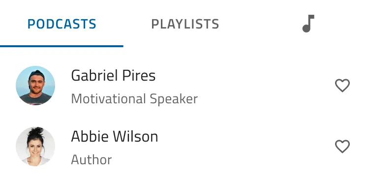
Avoid combining text tabs and icon tabs in the same bar.
Properties
The Angular Tabs component exposes the following properties. See the API reference for the complete type definitions.
| Name | Type | Default | Description |
|---|---|---|---|
selectedIndex |
number |
-1 |
The index of the selected tab item. When no tab item is selected and the tab items have content, the Tabs component selects the first tab item. Supports two-way binding. |
tabAlignment |
'start' | 'end' | 'center' | 'justify' |
'start' |
How the tab headers are arranged in the header strip. |
headerPosition |
'top' | 'start' | 'end' |
'top' |
Where the tab headers are placed: a row above the content, or a column before or after it. |
activation |
'auto' | 'manual' |
'auto' |
Whether moving the focus to a tab header with the keyboard also selects the tab. |
disableAnimation |
boolean |
false |
Whether the content animation on selection change is turned off. |
selectedItem |
IgxTabItemDirective |
— | Read-only. The selected tab item. |
items |
QueryList<IgxTabItemDirective> |
— | Read-only. The tab items of the Tabs. |
TabItem.selected |
boolean |
false |
Whether the tab item is selected. Supports two-way binding. |
TabItem.disabled |
boolean |
false |
Whether the tab item is disabled. |
Events
The Angular Tabs component emits the following events.
| Name | Description |
|---|---|
selectedIndexChanging |
Emitted with ITabsSelectedIndexChangingEventArgs before the selected index changes. Set cancel to keep the current tab, or change newIndex to select another tab. |
selectedIndexChange |
Emitted with the new index, a number, after the selected index changes. Enables the [(selectedIndex)] two-way binding. |
selectedItemChange |
Emitted with ITabsSelectedItemChangeEventArgs, which holds the previous and the new tab item, after the selected tab item changes. |
TabItem.selectedChange |
Emitted with a boolean when the tab item is selected or deselected. Enables the [(selected)] two-way binding. |
Styling
The Angular Tabs component takes its colors from the theme. Change them with the following CSS variables:
| Variable | What it changes |
|---|---|
--ig-tabs-item-background |
The background of the tab headers. |
--ig-tabs-item-text-color |
The text color of the tab headers. |
--ig-tabs-item-icon-color |
The icon color of the tab headers. |
--ig-tabs-item-hover-background |
The background of a hovered or focused tab header. |
--ig-tabs-item-hover-color |
The text color of a hovered or focused tab header. |
--ig-tabs-item-active-background |
The background of the selected tab header. |
--ig-tabs-item-active-color |
The text color of the selected tab header. |
--ig-tabs-item-active-icon-color |
The icon color of the selected tab header. |
--ig-tabs-item-disabled-color |
The text color of a disabled tab header. |
--ig-tabs-item-disabled-icon-color |
The icon color of a disabled tab header. |
--ig-tabs-indicator-color |
The color of the indicator of the selected tab header. |
--ig-tabs-button-background |
The background of the scroll buttons. |
--ig-tabs-button-color |
The icon color of the scroll buttons. |
--ig-tabs-button-hover-background |
The background of a hovered scroll button. |
--ig-tabs-button-disabled-color |
The icon color of a disabled scroll button. |
--ig-tabs-header-background |
The background of the header strip behind the tab headers. |
Sass Theming
When you modify a primary property, all related dependent properties are automatically updated to reflect the change. The primary parameters of the tabs-theme function are $item-background, from which the theme derives the colors of all tab states, and $item-active-color, from which it derives the indicator color. Create a theme with the function and include it with the tokens() mixin, which emits the matching --ig-tabs-* variables in the scope where you include it.
@use "igniteui-angular/theming" as *;

$custom-tabs-theme: tabs-theme(
  $item-background: #292826,
  $item-active-color: #f4d45c
);

:host {
  @include tokens($custom-tabs-theme);
}
CSS Variables
Set the CSS variables on a Tabs component or on a container when you need local styling without a Sass build step:
.profile-tabs {
  --ig-tabs-item-active-color: #e41c77;
  --ig-tabs-indicator-color: #e41c77;
}
Styling with Tailwind
You can style the Angular Tabs using our custom Tailwind utility classes. Make sure to set up Tailwind first.
Import the Ignite UI utilities in your global stylesheet:
@import "tailwindcss";
@import "igniteui-theming/tailwind/utilities/material.css";
Use the light-tabs or dark-tabs class for the corresponding theme, and override the generated CSS variables with arbitrary properties:
<igx-tabs class="!light-tabs ![--item-background:#011627] ![--item-active-color:#FF8040]">
  ...
</igx-tabs>
The exclamation mark (!) gives the Tailwind utility precedence over the default theme styles of the Tabs.
Accessibility
The Angular Tabs component uses the roles of the WAI-ARIA tabs pattern: users reach the tab headers with the Tab key, move between them with the arrow keys, and select a tab to show its content.
Keyboard Interaction
Only the selected tab header of the Angular Tabs component is in the tab order, so the header strip is a single tab stop. When no tab item is selected, no tab header is in the tab order. The content of the selected tab is the next tab stop. The following keys work while a tab header has the focus:
| Key | Action |
|---|---|
| Tab / Shift + Tab | Moves the focus out of the header strip, to the content of the selected tab or to the previous focusable element. The Tabs component doesn’t handle these keys. |
| Arrow Right | Moves the focus to the next enabled tab header, and from the last one to the first. In a right-to-left layout, moves it to the previous one. With the auto activation, also selects the tab. In a column of tab headers, the Tabs component doesn’t handle this key. |
| Arrow Left | Moves the focus to the previous enabled tab header, and from the first one to the last. In a right-to-left layout, moves it to the next one. With the auto activation, also selects the tab. In a column of tab headers, the Tabs component doesn’t handle this key. |
| Arrow Down | In a column of tab headers, moves the focus to the next enabled tab header, and from the last one to the first. With the auto activation, also selects the tab. |
| Arrow Up | In a column of tab headers, moves the focus to the previous enabled tab header, and from the first one to the last. With the auto activation, also selects the tab. |
| Home | Moves the focus to the first enabled tab header. With the auto activation, also selects the tab. |
| End | Moves the focus to the last enabled tab header. With the auto activation, also selects the tab. |
| Enter / Space | With the manual activation, selects the focused tab by clicking its header. |
With a pointer, a click on a tab header selects the tab when the tab item has content. A disabled tab header ignores clicks. The scroll buttons aren’t in the tab order.
Screen Readers / ARIA
The Angular Tabs component renders the following roles and attributes:
| Element | Role | Attributes |
|---|---|---|
The div.igx-tabs-header__wrapper element in the header |
tablist |
aria-orientation="horizontal", or aria-orientation="vertical" in a column of tab headers |
igx-tab-header |
tab |
aria-selected, aria-disabled, and, when the tab item has content, an id and aria-controls that points to the content |
igx-tab-content |
tabpanel |
aria-labelledby that points to the header of the tab item |
The Angular Tabs component also behaves as follows for assistive technology:
- A tab takes its accessible name from the content of its
igx-tab-header. - The Tabs component renders the content of the selected tab item only, so the content of the other tab items isn’t in the DOM.
- Tab items without
igx-tab-content, such as the tabs that drive the router, get noidandaria-controls. - The Tabs component doesn’t use a live region. A changed selection reaches assistive technology through the
aria-selectedstate and the focus.
Accessibility Compliance
Infragistics documents Ignite UI for Angular accessibility support for Section 508 and WCAG 2.1 guideline areas in the Accessibility Compliance topic.
| Criterion | How the component complies |
|---|---|
| 1.3.1 Info and Relationships | The tablist, tab, and tabpanel roles expose the structure, and each tab panel is labeled by its tab header through aria-labelledby. |
| 1.4.1 Use of Color | In the Material, Fluent, and Indigo themes, the selected tab header shows an indicator line under it, or beside it in a column of tab headers, so the selection doesn’t depend on color alone. |
| 2.1.1 Keyboard | The arrow keys, Home, and End move between the tab headers, and Enter and Space select the focused tab with the manual activation. |
| 2.1.2 No Keyboard Trap | The Tabs component doesn’t handle the Tab key, so Tab and Shift + Tab move the focus out of the header strip. |
| 2.4.3 Focus Order | The header strip is a single tab stop, followed by the content of the selected tab. |
| 2.4.7 Focus Visible | The focused tab header takes the hover colors of the theme, so it stands out from the other tab headers. |
| 4.1.2 Name, Role, Value | Each tab header exposes the tab role, a name from its content, and its selected and disabled states through aria-selected and aria-disabled. |
Your responsibilities:
- Give every tab a text label that names its content. A tab takes its accessible name from its header content, so a header with an icon only needs a text alternative. See Type.
- When you override the theme colors, keep a contrast ratio of at least 3:1 between the selected indicator and the background, as 1.4.11 Non-text Contrast requires, and keep the focused tab header distinct from the other headers.
- Don’t use the Tabs for the steps of a sequential process. Use a Stepper, which communicates the order of the steps.
- Keep a tab item selected, so that keyboard users can reach the header strip, and set the
manualactivation for tabs that drive the router.
API References
Dependencies
The Angular Tabs component requires a theme to apply its colors and sizes. See the framework-specific setup in Getting Started.
The scroll buttons of the Angular Tabs use the Icon Button and the Icon, and the theme() mixin includes their styles together with the Tabs styles.
Additional Resources
The following resources provide more Angular Tabs guidance and project support:
Related Components
The Angular Tabs component shows one section of related content at a time. Use these components when the content needs a different structure:
- Stepper - Use Stepper when users complete a sequence of steps, such as a checkout process.
- Accordion - Use Accordion when users need to expand several sections of a vertical list at the same time.
- Bottom Navigation - Use Bottom Navigation to switch between the top-level views of a mobile app from the bottom of the screen.
FAQ
These questions cover common Angular Tabs setup, accessibility, and usage scenarios.
Set the selectedIndex property of the Angular Tabs, or set the selected input of a tab item to true. The Angular Tabs component emits selectedIndexChanging and selectedItemChange for these changes too.
Yes. Handle the selectedIndexChanging event of the Angular Tabs and set cancel to true to keep the current tab, for example while a form in it has unsaved changes. To make a tab unavailable at all times, set disabled on the tab item.
No. The Angular Tabs component adds the content of the selected tab item to the DOM and removes the content of the other tab items from it. Code that queries the DOM, such as document.querySelector, finds only the content of the selected tab item.
No. The Angular Tabs component organizes related information that users can open in any order, and it doesn’t communicate an order of steps. Use the Angular Stepper for a sequential process, such as a checkout or a configuration wizard.
Set the headerPosition property of the Angular Tabs to start or end to show the tab headers in a column before or after the content. Give the Angular Tabs a height to keep its size fixed.