
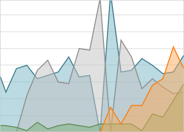
Windows Forms Data Chart
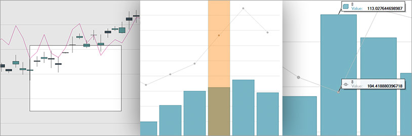
Take full advantage of touch, animate data over time, create composite charts, and use multiple series with our updated Windows Forms Data Chart control. Apply heavy duty data visualization and a wide range of series, including Line, Stacked 100-Line Series, Area, Stacked 100-Area, Bar, Stacked Bar Series, Bubble Series, Column, Stacked Column, Stacked 100-Column, Point, Spline, Spline Area, Step Line, Range Column, Waterfall, Scatter Line, Polar, Radial, Candlestick, and more.
Download Windows Forms SamplesReal-time Charting with Millions of Data Points
The speed and performance of our updated Data Chart are significantly enhanced. The improved chart can display millions of data points and update itself every few milliseconds to handle your real-time feeds.
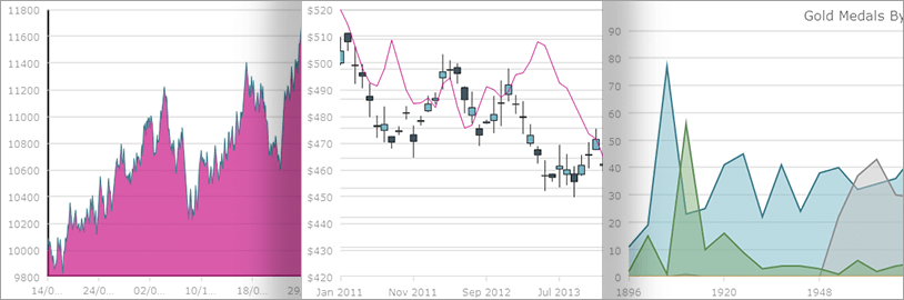
A Variety of Financial Indicators and Trend Lines
The DataChart comes complete with 34 Financial Indicators such as Average True Ranger Indicator, Force Index Indicator, and Positive Volume Indicator. Choose from more than a dozen trend lines and one of two financial overlays: Bollinger Bands Overlay or Price Channel Overlay.
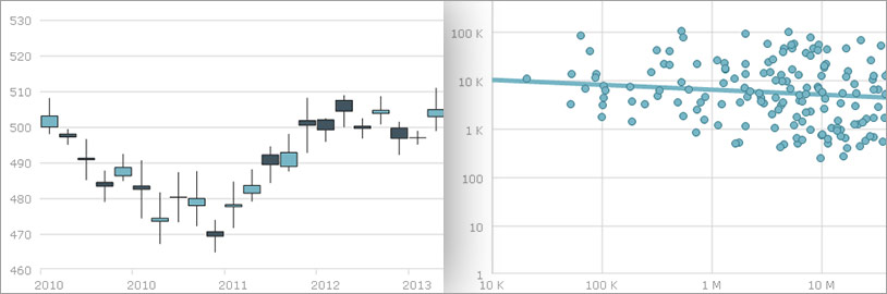
Axes and Legend Support
Users can scale the axis linearly, logarithmically, and across axis values with support for: multiple axes and date/time axis; zooming for both single and multi-axis; and zoom interaction with mouse wheel & window drag. The DataChart can create multiple legends and supports: chart title, subtitle, axis titles, text rotation, gridlines and radial chart y-axis.
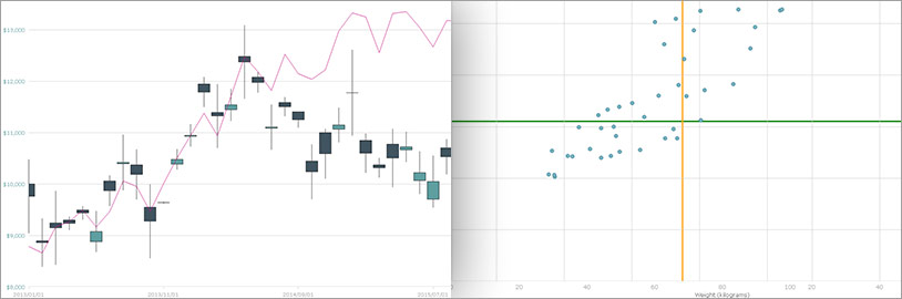
Multiple Interactions
Access a fully-interactive experience with gesture and touch support, including pinch-and-zoom, pan, and press-and-hold. Add mouse or hover interaction for background highlights; bar, slice, or area highlights; tooltip labels; and gradient brushes to style your chart.
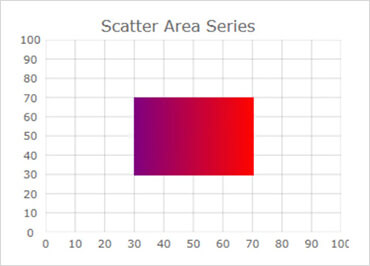
Scatter Area Series
The Scatter Area Series draws a colored surface, in a Cartesian context, based on a triangulation of X and Y data with a numeric value assigned to each point. This series is useful for rendering data that varies over a defined area, such as heat maps, magnetic field strength or Wi-Fi strength in an office.
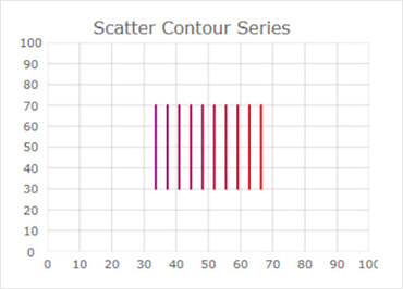
Scatter Contour Series
The Scatter Contour Series draws colored contour lines based on a triangulation of X and Y data with a numeric value assigned to each point. This series is useful for rendering contour maps or changes in magnetic field strength, or for rendering an overlay on top of a charted area.
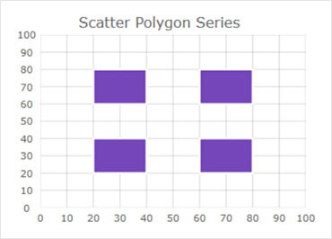
Scatter Polygon Series
The Scatter Polygon Series displays data using polygons. This type of series can render any shape that you desire. All you need to do is bind a List of List of Point objects or just load a shape file with polygons using the ShapefileConverter.
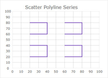
Scatter Polyline Series
The Scatter Polyline Series displays data using polylines. This type of scatter series is often used to render disconnected lines, such as a network graph or multiple connections between scatter data points. This series has the same data requirements as Scatter Polygon Series and can render data from shape files.