
WPF Doughnut Chart
Display your data with multiple series using this rich Doughnut Chart. Similar to a Pie Chart, the Doughnut Chart shows categorical statistics expressed in percentages. With its hollow center, it's best for displaying multiple series using concentric rings where each ring represents a data series. Bind easily to data, configure the inner radius, display exploded slices, customize themes, and more with this well-rounded control.
DOWNLOAD WPF Samples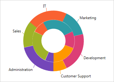
Multiple Ring Series & Data-Binding
The Doughnut Chart supports one or more rings surrounding a hollow center. The center, which does not typically represent data, may either be a blank circle or may contain a label. Each ring represents a separate data series that you can data-bind to a data source via the ItemsSource property.
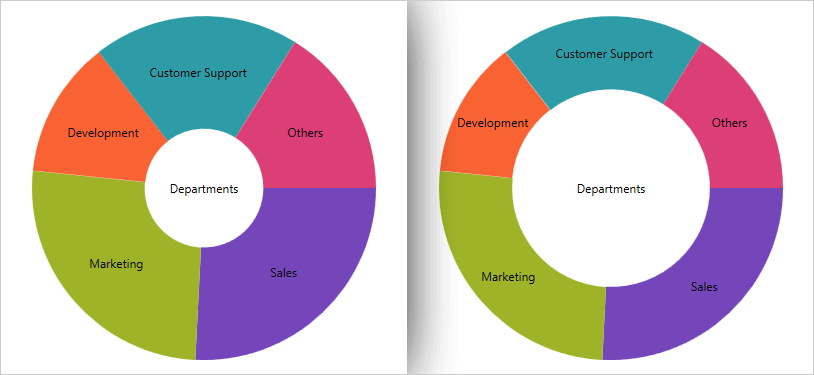
Configurable Inner Radius
The inner radius of the Doughnut Chart center is configurable, which allows you to select the center as an object and extend the boundary, or set the inner radius via a property setting.
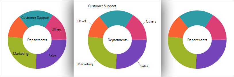
Slice/Selection Labeling
Control how slices or sections of the Doughnut Chart are labeled. Options to select how the labels are displayed include:
- No labels
- Labels displayed at the center inside of each section/slide
- Labels displayed outside of each section/slice, with a configurable LabelExtent distance
- A BestFit method which automatically chooses whether each label should be displayed inside or outside the chart
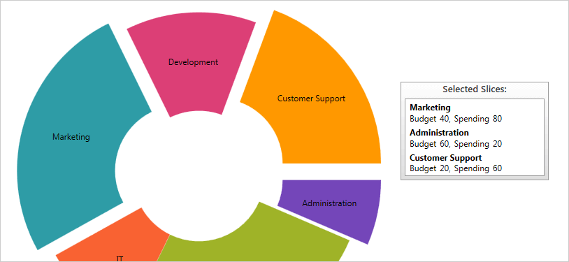
Slice Selection & Explosion
Users select slices and change the color of selected slices. Exploded slices are disconnected and drawn at a distance from the origin and the distance is controlled via a configurable property. Slices can be selected or exploded either programmatically or using touch and mouse gestures.
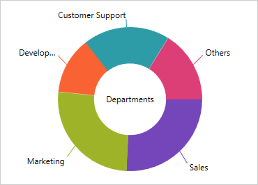
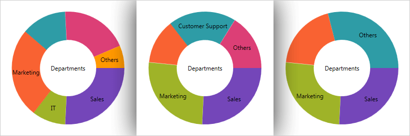
Others Category
The underlying data for a Doughnut Chart can often contain small value items too numerous to display in a significant manner via separate slices. Here, the Others category allows for automatic aggregation of several data values into a single slice. You can set the threshold to designate which values get their own slice and which values will get rolled under Others.
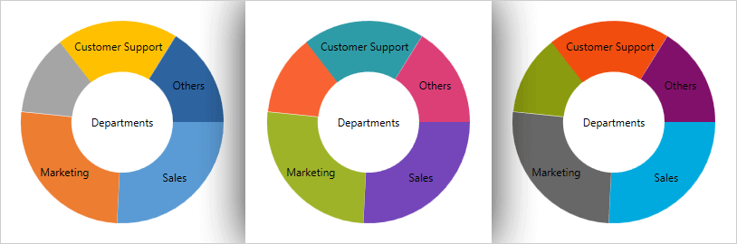
Styling & Theme
Customize and style the Doughnut Chart to your app design and your brand. Simple properties are exposed to easily style the outlines and brush fill colors of the slices, allowing you to use solid colors and as gradients. Set the theme property to one of the predefined themes or create your own to give your doughnut charts a consistent, color-coordinated look.
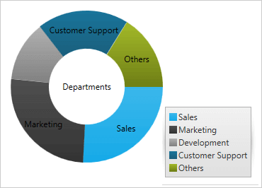
Legend Support
The Doughnut Chart supports the automatic display of a legend, which identifies each series displayed as a data ring and each slice/section within a data ring. The legend can be configured and docked to any of the chart's corners or borders.