

WPF Slider
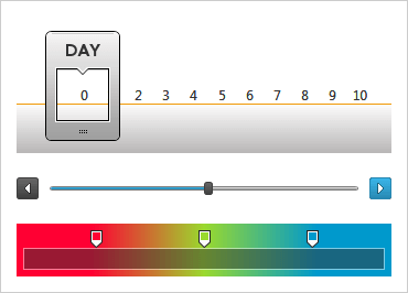
With the xamSlider™ family of controls your users enjoy an editing experience that relegates traditional edit boxes to the dust bin. From single-thumb sliders to range sliders, and from numbers to dates to Generic types, you get it all.
DOWNLOAD WPF SamplesRange Slider
Customizable
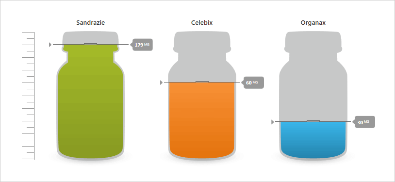
xamSlider has generic base classes that can be trivially extended for your own data types.
Interaction Modes
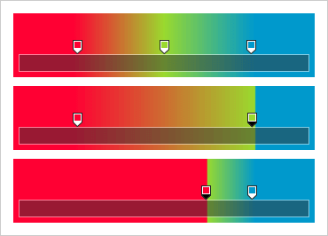
xamSlider thumbs can exhibit free, locked, or push behaviors when they encounter other thumbs on the track.
Template Track & Thumb
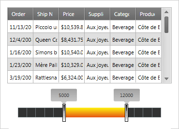
xamSlider has full template support for both the styling of its track and sliding thumbs.
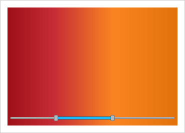
Customizable Look and Feel
xamSlider can appear horizontally, vertically, with, and without tick marks and labels.