WPF Category Chart
This touch-enabled charting control makes visualizing category data a breeze. Built on top of a high-performing and feature-rich data chart, the category chart filters the complexities of data visualization into a simplified API that anyone can use.
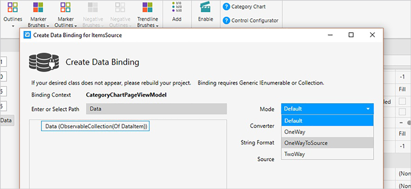
Use the new Ultimate UI for WPF Category Chart Configurator to quickly configure the control and bind data directly from XAML—no code required!
DOWNLOAD WPF SamplesEasy Data Binding
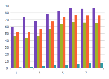
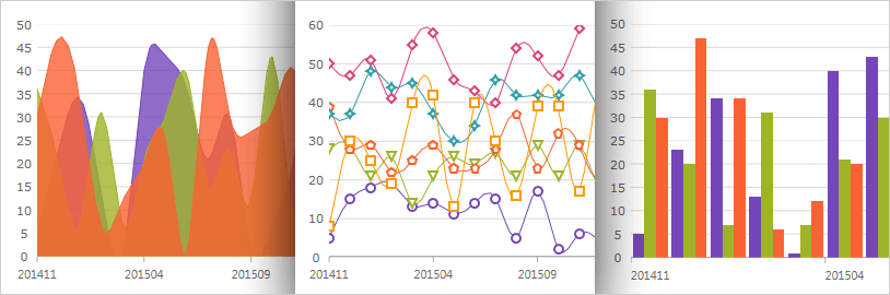
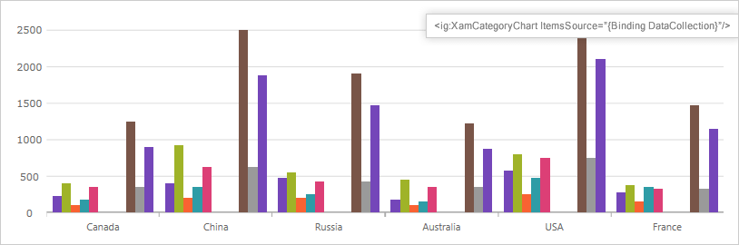
Bind a collection of data (or a collection of collections) to the ItemsSource property and the chart will analyze your data and automatically choose the best series to represent it. The chart will customize the look and feel for you.
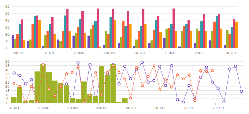
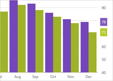
A Wide Variety of Chart Types to Choose From
Make the most of your data with a chart for every need, including Line, Area, Column, Point, Spline, Waterfall, and more.
Intelligence & Style By Default
You don't even need to set labels with this intuitive control. The category chart will use the first appropriate string property found within the data for your labels. Data is analyzed and the appropriate visualization is rendered for you, easily and quickly, using a smart Data Adapter.
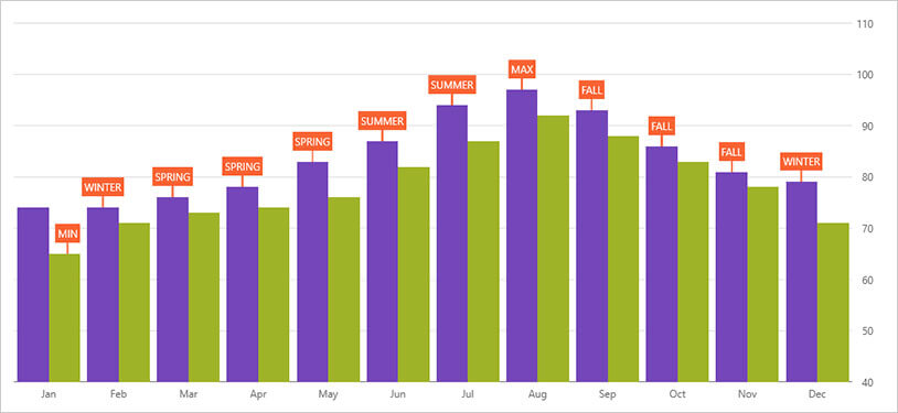
Callouts Layer
Annotate important data points or customize values in callout boxes based on your logic (i.e. calculate maximum values in your data source).
Crosshair Lines
Renders a horizontal line, vertical line, or both at cursor location. Crosshair lines can snap to data points or interpolate between data points that are closest to the cursor.
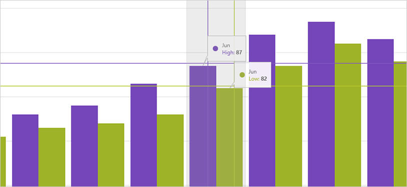
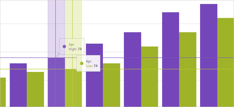
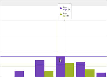
Crosshairs Annotation
Shows data point values at cursor location and renders these values in colored boxes over X and Y-axis labels.
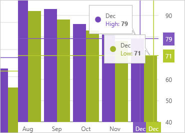
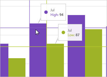
Final Values Annotation
Shows value of the last data point in your data source. Renders one colored box for each data source over Y-axis labels.
Category Highlight Layer
Renders a vertical rectangle that stretches the span of the category closest to the cursor.
Item Highlight Layer
Renders a semi-transparent vertical rectangle for data items in the category closest to the cursor.
Category Tooltip Layer
Renders a combined tooltip for all series in a data category.
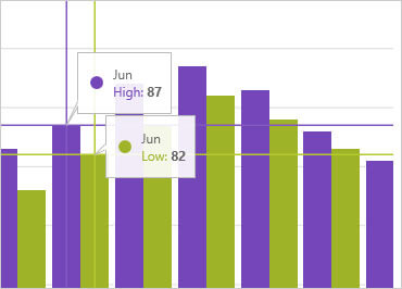
Item Tooltip Layer
Renders an individual tooltip for each series in a data category.
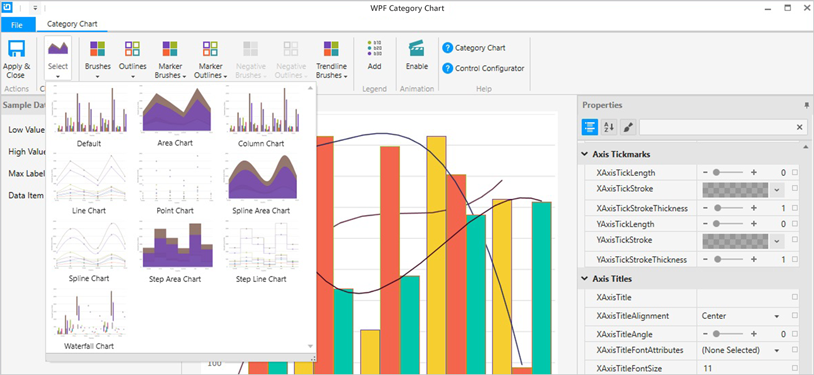
Category Chart Configurator
The control configurators shave off hours of development time by removing the complexity of learning the Category Chart API. Visually configure your entire chart in a WYSIWYG point-and-click experience. Allow your designers to style controls interactively and visually to get a pixel-perfect render of their design intent.
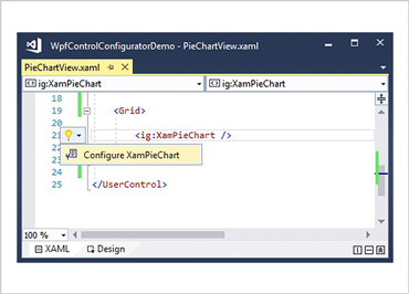
Launch the Category Chart Configurator with a Single Click
Select your control on the XAML editor and use the suggested actions lightbulb to launch the Category Chart Configurator.
Visually Configure Your Category Chart
Use the Ribbon Gallery items to visually customize almost every aspect of your category chart – from the initial chart layout, to the Interactivity, Layout, Brushes, and Legend configuration. All without needing to know anything about the API of the category chart!
Choose Your Chart Type
Make the most of your data with a chart for every need, including Line, Area, Column, Point, Spline, Waterfall, and more.
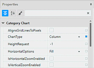
Property Editing with Ease
Conveniently find properties grouped by related features in the Property Editor. Features are also enabled or disabled by feature compatibility. This lets you customize any detail of the control, and it helps you learn by example, as you can see in real time how your changes affect the control.
Data Binding is a Breeze
You can quickly add dynamic data to inflate Low Value, High Value, and Label Length. Use the Binding Editor to easily set a binding for a control, including binding mode or your custom converter. We’ve even provided a handy formatter so you don’t need to think about how to display your values.