WPF Tree Grid
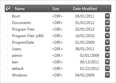
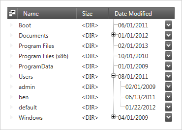
Showcase multi-column hierarchical data in tree form with the xamTreeGrid. Built on top of on our existing xamDataPresenter, this control inherits great features found in the Data Presenter, providing a familiar API and a seamless development experience for editing, filtering, sorting capabilities, summaries, and more.
DOWNLOAD WPF Samples
Powerful Editing
The xamTreeGrid uses the same powerful editors as the xamDataPresenter. Choosing an editor for a column is as simple as defining a field object such as the ComboBoxField, DateTimeField, MaskedTextField, or TemplateField.
Filtering Capabilities
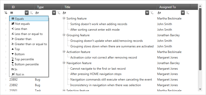
Allow your users to view a subset of the original data by applying this control’s filtering functionality. Uses range from simple filters to more complex drill-downs with conditional operators or combined filters.

Sorting Support
Sort bound data by clicking on a column header at runtime, or build sorting capabilities directly into your app at design time. You can sort your tree grid on multiple columns with the familiar CTRL-key selecting.


Summaries
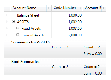
Obtain data analytics at a glance by displaying summaries. Aggregate functions allow you to perform and display calculating logic on your data, such as Sum, Max, Min, Count, and Average. Users can also create their own custom calculation summaries.
MVVM Friendly
Using the MVVM design pattern, the xamTreeGrid will work seamlessly, exposing SelectedDataItem and SelectedDataItems properties to access and control selections within a ViewModel. Field definitions also support more advanced binding scenarios through the use of the CellBindings property and a binding markup extension (FieldBinding) that simplifies the binding syntax when using MVVM.
